Figures & data
Figure 1. Solid tumor mortality in female mice irradiated with 1.9 Gy of radiation at 7 days of age (Sasaki and Fukuda Citation2005). Open symbols indicate the control group and closed symbols indicate the irradiated group. Panel A and B show a linear scale presentation while panel C shows a semi-log scale plot. Panel B is a magnified presentation of the data in the low mortality regions. The dotted lines represent shifted curves for the control group toward younger ages by 200 days. MD stands for Mouse·Days. Panel D shows a decreasing trend for relative risk with an increase in the attained age.
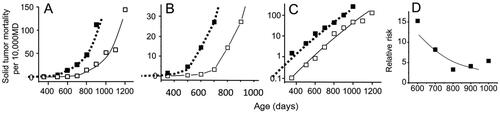
Table 1. Baseline cancer mortality rate in atomic bomb survivors who were 10 years old in 1945 and their estimated cancer mortality rates following an exposure to 1 Gy (per 10,000 Person-Years; Ozasa et al. Citation2012), and the estimated ERR at different dose levels.
Figure 2. Plots of estimated solid tumor mortality (which includes a small percentage of myeloid leukemia cases) calculated from two papers by Tanaka et al. (Citation2003, Citation2007). Mice were irradiated chronically with a mean dose rate of 20 mGy/day for 400 days (total dose 8 Gy). Open symbols indicate the control group and closed symbols indicate the irradiated group. The upper panels show the data for females and the lower panels for males. The solid lines represent control curves and the dotted lines indicate the control curves that were shifted toward younger ages by 110 days for females and 100 days for males. Panels A and D represent linear plots of the data in the low mortality regions, B and E represent semi-log scale plots, and C and F represent RR.
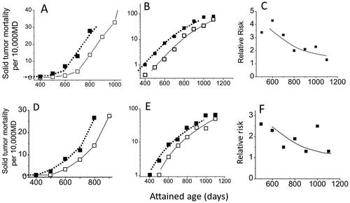
Figure 3. Graphic representations of estimated cancer mortality rates of A-bomb survivors who were 10 years of age at the time of radiation exposure (). Open symbols represent the control group and closed symbols represent the 1 Gy group. Panels A and B show plots with a linear scale while panel C is plotted in a semi-log scale. The dotted lines indicate a parallel shift of the control curve toward younger ages by 8.5 years.
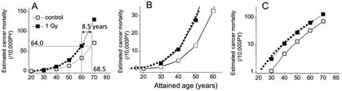
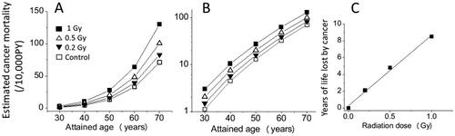
Figure 4. Estimated temporal changes of solid cancer mortalities for 0, 0.2, 0.5, and 1 Gy groups of A-bomb survivors who were 10 years old in 1945. Panels A and B show the estimated cancer mortality with linear and semi-log scales, respectively, and panel C shows the dose response for the estimated years of life lost if one died from cancer.