
Figures & data
Table 1. Demographic characteristics of study sample presented by group. Data are presented as mean values or scores (standard deviation).
Figure 1. Box plots representing the accelerometer reports for each test per limb-placement. (a) The 10-m walking at comfortable pace test (10-mWT); and (b) the 10-m walk/run test (10-mW/RT) which implies the fastest pace performed. (c) The DM1 group sub-divided into classic and mild phenotypes (classification explained in methods). Values on the y-axis represent the average of acceleration (ENMO-mg) per minute for each test. Values on the x-axis showed the two groups tested: DM1 and healthy controls.
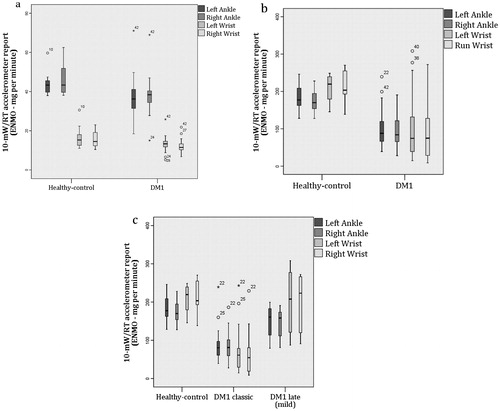
Table 2. Mean acceleration units for each performed task presented by group.
Table 3. Spearman’s (rho) correlation values estimated between total distance (m) completed during the 6-min walking test (6MWT) and each of the accelerometer units reports (ENMO per minute).