
Figures & data
Table 1. Demographic baseline data.
Figure 1. Scatter plot showing BI versus active exercise in physiotherapy sessions as percentage of the session.
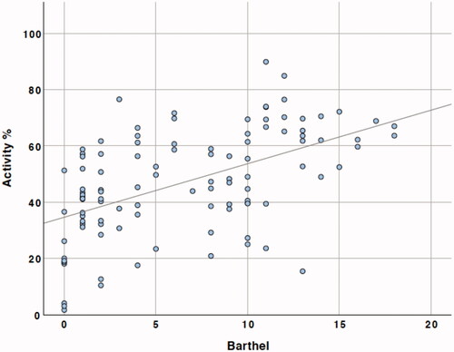
Table 2. Results from backwards stepwise regression at the first step and the final model.
Figure 2. Range bar showing mean active exercise percentage by stroke severity. Bars represent range of patient values with mean shown as horizontal lines with 95% confidence intervals. *Difference between group means significant at p = 0.001.
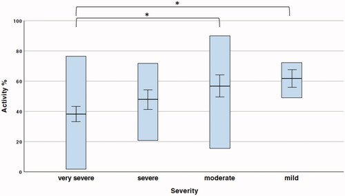
Table 3. Physiotherapy session times.