
Figures & data
Figure 1. Scatterplot for the PAM and the ActiGraph. The X and Y axis represents the total number of active minutes per participant.
A diagonal line is shown starting at the bottom left and ending almost at the upper right. The R-square of the line is 0.845. Ten points are shown close to and above the line, 6 points are shown below the line.
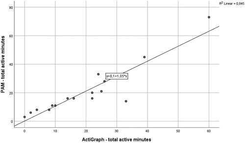
Figure 2. Bland–Altman plot for the PAM and ActiGraph. The X axis represents the mean of the active minutes of both accelerometers per participant. On the Y axis the middle line represents the mean difference between the two accelerometers, the upper and lower lines represent the limits of agreement (mean difference ± 1.96 SD).
Three horizontal lines are shown: the mean difference and the upper and the lower limits of agreement. Fifteen points fall within the two limits of agreement, one falls above the upper limit of agreement and one below the lower limit of agreement.
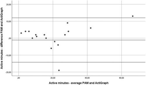
Table 1. Patient characteristics.
Table 2. Physical activity outcomes and level of agreement statistics.
Supplemental material