
Figures & data
Table 1. Demographics for the overall group and split by PDOC status at the end of the programme (Part 1).
Figure 1. Shows the receiver operating characteristic (ROC) curve illustrating the trade-off between sensitivity and specificity to define the optimal cut-off point in Total UK FIM + FAM score for “remaining in MCS” versus “emerged into consciousness”. The area under the curve was 0.910, and the optimum cut-off value was 35/36, which identified those who emerged with 87% sensitivity and 88% specificity.
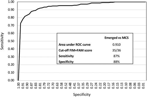
Table 2. Total FIM + FAM scores by PDOC status at discharge (Part 1).
Figure 2. Shows a breakdown by year of the number of patients to specialist Level 1 and 2 rehabilitation units in England: Patients with FAM + FAM scores ≤35 on admission (meeting the criteria for PDOC).
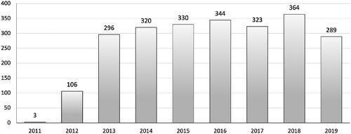
Table 3. Demographics for the overall group and split by PDOC status at the end of the programme (Part 2 – National Cohort).
Table 4. Dependency and care costs on admission and discharge split by PDOC status at the end of the programme (Part 2 – National Cohort).
Figure 3. Shows box and whiskers plot of the Total FIM + FAM scores on discharge for the three groups of patients: MS/MCS-minus, MCS-Plus and Emerged. (X marks the mean). Patients who remain in PDOC showed little variation in the Total FIM + FAM score. Those who emerged showed a wide range of scores (some even achieving full or near-full independence), but the majority of patients still had scores in the lower range of the scale indicating severe physical cognitive and communicative disability.
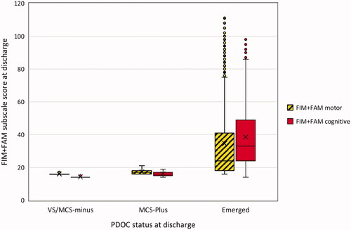
Figure 4. The radar chart (or “FAM-splat”) provides a graphic representation of the disability profile from the FIM + FAM data. The 30-scale items are arranged as spokes of a wheel. Scoring levels from 1 (total dependence) to 7 (total independence) run from the centre outwards. Thus a perfect score would be demonstrated as a large circle. This composite radar chart illustrates the median scores on admission and discharge. The yellow-shaded (lighter) portion represents the median score on admission for each item. The blue-shaded (darker) area represents the change in median score from admission to discharge.
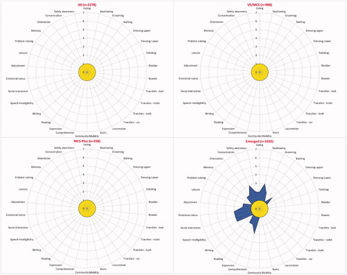
Table 5. Cost efficiency of admission, overall and by PDOC status at discharge (Part 2 – National Cohort).
Data availability statement
As the UKROC dataset is a live clinical dataset, for reasons of confidentiality and data protection data sharing is not available at the current time.