
Figures & data
Figure 1. Participant flow.
A flow diagram of participants in the study. The diagram starts with number of people assessed for eligibility n=692) and shows the number excluded (n=34) and the number not in paid work at the time of diagnosis (n=98). This leads to the next box showing n=560 people included, the flow then bifurcates into two further boxes that shows n=370 'in work' and n=190 'no longer in paid work'.
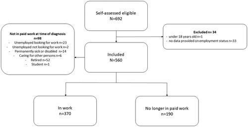
Table 1. Comparison of participants in work to those no longer in paid work.
Figure 2. Kaplan–Meier’s curve of estimate average years of lost potential employment according to age at diagnosis.
A Kaplan-Meier curve that shows years of potential employment lost (x-axis) against cumulative survival (y-axis). Career establishment, mid working and nearing retirement groups lines are plotted and show a greater employment potential lost trajectory for Career establishment, compared to mid working and mid working compared to nearing retirement.
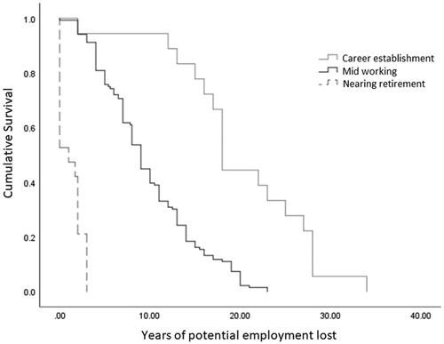
Table 2. Comparison between ages categories of factors associated with leaving work and factors that may have support remaining in work.
Figure 3. Economic evaluation participant classification over time horizon.
A histogram showing yearly increments (0-10 years) on x-axis and number of people on y-axis. The cumulative number of people reduces over time, primarily due to the reduction in number of people in paid work. The number of people not in paid work peaks at year 4.
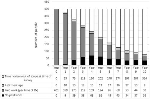
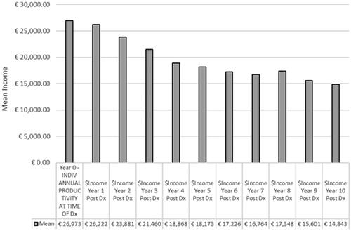
Figure 4. Mean income over time horizon.
A histogram showing yearly increments (0-10 years) on x-axis and mean income on y-axis. The mean income generally reduces over time and decline is steepest between 1 and 4 years.
Supplemental material