Figures & data
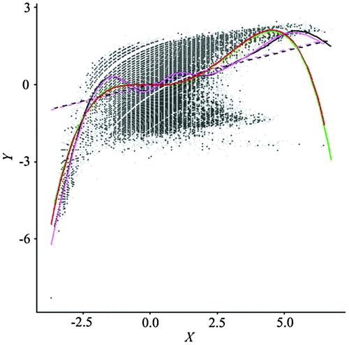
Figure 1. Scatterplot and a GAM fitted line for Normalized Difference Vegetation Index (NDVI) (Y) and ETM + Band 4 (X). Data are standardized. The R package mgcv was used to fit the GAM (Wood Citation2006; Hastie and Tibshirani Citation1990).
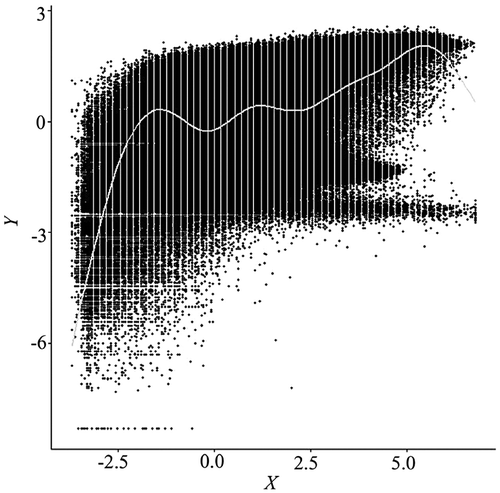
Figure 2. Alpha blending scatterplot of a subset (1000 × 1000) of the same data in Figure 1, with alpha value set to 0.05. The alpha value specifies the level of transparency for the data points, ranging from 1 for opaque to 0 for black. Even at such a low alpha level, excessive overplotting remains a problem.
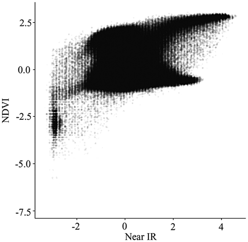
Figure 3. Two-dimensional binned kernel smoothing scatterplot.
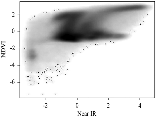
Figure 4. Scatterplot with contours. Due to the lack of sufficient memory to render the plot with the large data-set in Figure 2, 10,000 data points are randomly generated from a standard normal distribution.
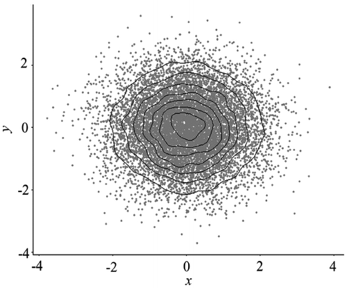
Figure 5. Binned scatterplot with the same data in Figure 2.
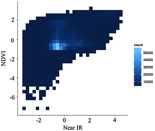
Figure 6. Nested lattice hexagon binning with the same data in Figure 2.
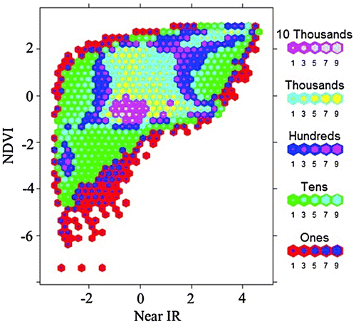
Table 1. Summary statistics of the simulated data-set.
Figure 7. Simulated data-set X (left) and Y (right).
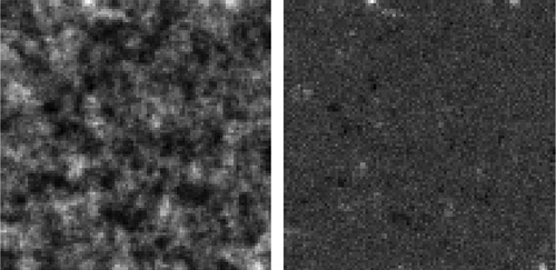
Figure 8. Scatterplot with a local regression fit for the simulated data-set X and Y.
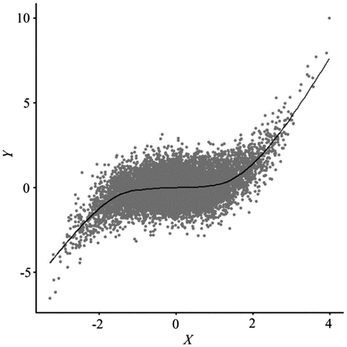
Figure 9. Remote sensing data-set used in the experiment.
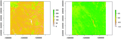
Table 2. Summary statistics of the remote sensing data-set.
Figure 10. Illustrations of sample sites for three sampling schemes: random (left), regular (center), and hexagon stratified random (right). The background image is for the variable X, with 100 rows by 100 columns. Variable Y is not shown here. Effective sample size () was calculated based on ρx = 0.9658, ρy = 0.5136, ρxy = 0.4688. Due to geometric restrictions, actual sample sizes are 2809, for regular sampling, and 2438, for hexagon stratified random sampling.
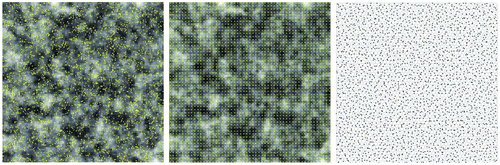
Table 3. Summary statistics for simulated variables from the resampled sets.
Figure 11. Spatially simplified scatterplot consisting of the point cloud and local/global fitting lines overlays on the same graphic features from the original data.
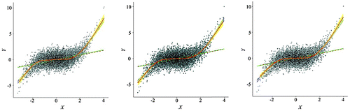
Figure 12. Spatially simplified scatterplots (point clouds with local/global fits) from three resampling schemes (left: random sampling; center: regular sampling; right: hexagon stratified sampling).
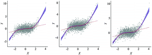
Figure 13. A random sample (n = 1326, right) of the hexagon stratified random sample set (n = 2438, left).
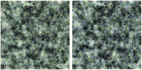
Figure 14. Spatially simplified scatterplot of the simulated data using a two-stage resampling scheme.
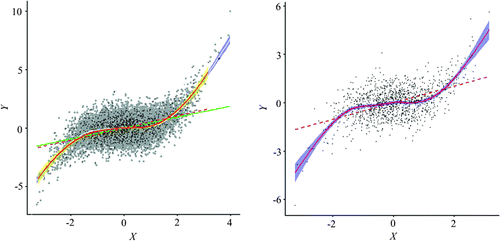
Table 4. Summary of resampling statistics for the remote sensing data-set.
Figure 15. An overlay of scatterplots from the original data and the resampled set.
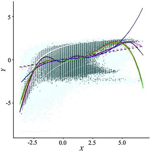
Figure 16. Scatterplot of data from the stage-two regular resampling.