Figures & data
Figure 1. Distribution of tweets per user and user counts by tweets after filtering potential Twitterbots and overly active users. The red line in both charts represents the JC dataset and the green line represents the NE dataset.
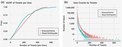
Figure 2. Plots of CDFs and Power Law best fit lines after noise filtering. The lines indicate the best fit Power Law of the dataset. The red line represents the JC dataset fitting with α of 2.22; and the green line represents the NE dataset fitting with α of 2.5.
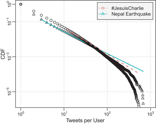
Figure 3. Average posts/user behavior in the top 30 U.S. populated cities and MSAs. In both sub-figures, the x-axis represents the list of urban regions descending by population from left to right. The first y-axis on the left represents the average number of posts, with its value shown as blue. The secondary y-axis is for the average user behavior with value indicated by red horizontal bars.
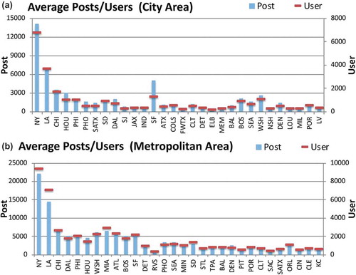
Figure 4. Twitter activity by day of the week. The red boxes represent activity of the top 30 U.S. populated cities, and activities for the MSAs are shown by blue boxes.
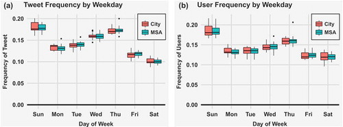
Figure 5. Hourly tweet and user activity in top U.S. populated regions. The red boxes represent activity of the top 30 U.S. populated cities, and activities for the MSAs are shown by blue boxes.
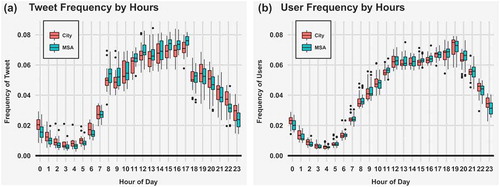
Figure 6. Differential information landscape map of geotagged tweets for two topics; red indicates more Nepal Earthquake attention than #JesuisCharlie; blue indicates more #JesuisCharlie than Nepal Earthquake.
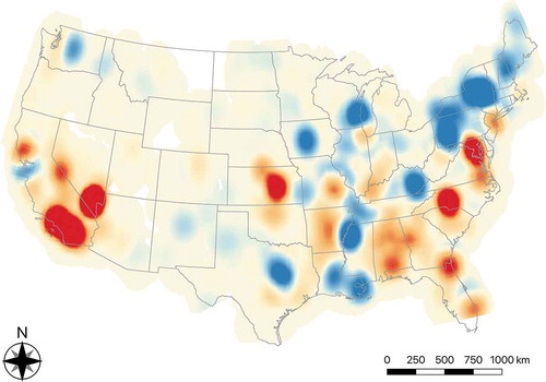
Figure 7. Correlation matrix of the statistical features. First row: correlation matrix of all features before reduction (19 features); Second row: showing all features after reduction (10 features).
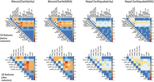
Figure 8. Multidimensional scaling of the top 30 U.S. cities; color indicates population class of each urban region.
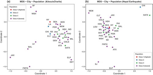
Figure 9. Multidimensional scaling of the top 30 U.S. cities; color indicates population density class of each urban region.
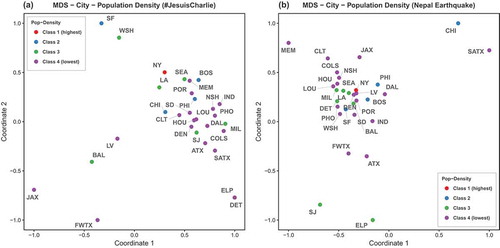
Figure 10. Multidimensional scaling of the top 30 U.S. MSAs; color indicates population class of each urban region.
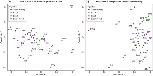
Figure 11. Multidimensional scaling of the top 30 U.S. MSAs; color indicates population density class of each urban region.
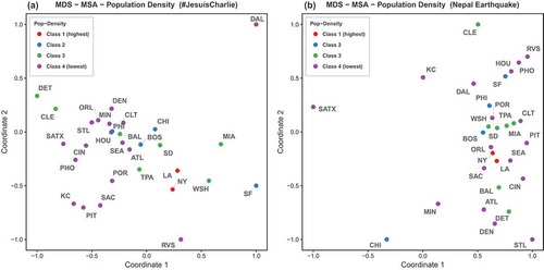
Figure 12. Multidimensional scaling of the top 30 U.S. MSAs; color indicates GDP class of each urban region.
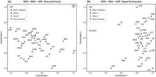
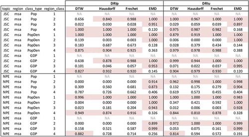
Figure 13. Comparison of within-class city similarity to random sampled city similarity. Red indicates that within-class mean is smaller than random sampled mean more than 800 times out of the 1000 iterations.
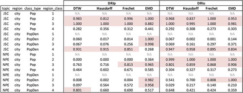
Figure 14. Comparing within-class MSA similarity to random sampling MSA similarity. Red indicates that within-class mean is smaller than random sampled mean in more than 800 times out of the 1000 iterations.