
Figures & data
Figure 1. Data classification using equidistant (left), quantile (middle) and aChor method (right): With the first two methods, the local extreme value region (outlined; with value 4.14) falls in same class/color as some neighbors, while the aChor method preserves the extreme value information graphically (own figure)
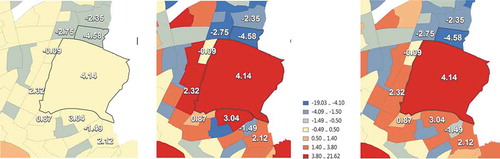
Figure 2. Example of geometric point clutter (topic: pubs in the UK; source: Google maps)
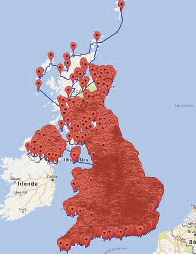
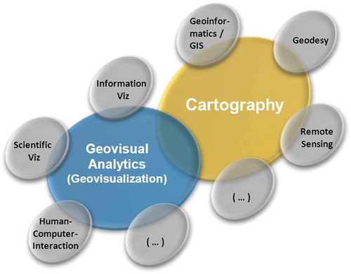
Figure 3. Interplay of cartography with other disciplines, including Geovisualization and Geovisual analytics (source: Schiewe Citation2013)
Data and Method Availability Statement
Data set presented in (deprive index of Hamburg, 2016) is open data: http://suche.transparenz.hamburg.de/dataset/sozialmonitoring-integrierte-stadtteilentwicklung-bericht-2016-anhang
Methods for the project aChor (section 3.2; ) are available under the GitHub account: https://github.com/Ariel505/aChor