
Figures & data
Figure 1. Study region and the public transit network of Shenzhen City. We excluded Dapeng New District (green region in the bottom right overview map) because this area has very limited public transit services. The remaining nine districts are shown in the map. Within the overview map, area in purple represents the downtown of Shenzhen City
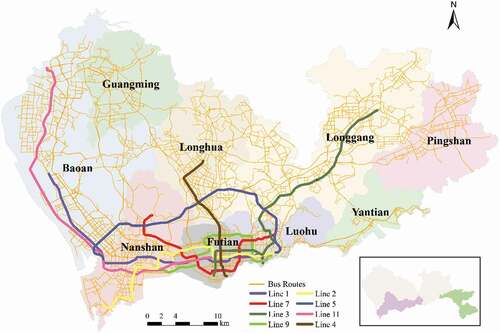
Table 1. Data description
Figure 2. Discovering popular GOCs based on the Lorenz curve
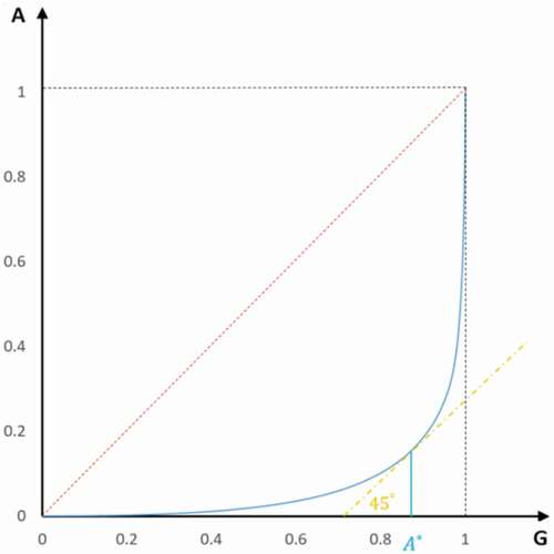
Figure 3. Identified popular GOCs. Dots are placed at the centroid of GOCs to represent identified popular GOCs. The sizes of dots represent the values of attractiveness
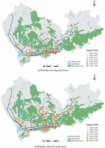
Figure 4. Difference between the rank of central and attractive subway stations. The difference is computed by subtracting the rank of attractiveness by the rank of betweenness centrality for a subway station
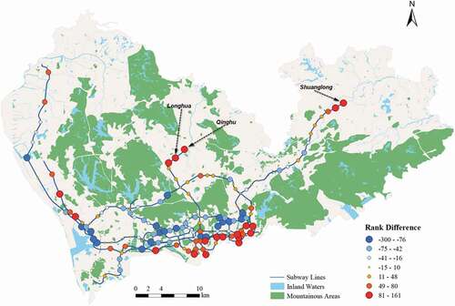
Figure 5. Accessibility maps of weekday peak-hours. Zero accessibility was caused by lack of SCD records or areas having no trips toward popular GOCs
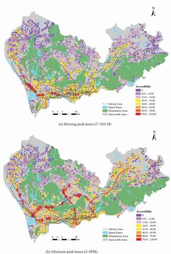
Figure 6. Accessibility differences between weekday morning and afternoon peak-hours (afternoon accessibilities minus morning counterparts)
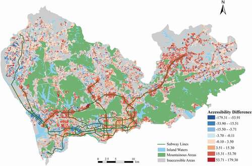
Figure 7. Accessibility maps of weekend peak-hours
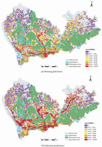
Figure 8. Accessibility differences between weekdays and weekends (weekday accessibilities minus weekend counterparts)
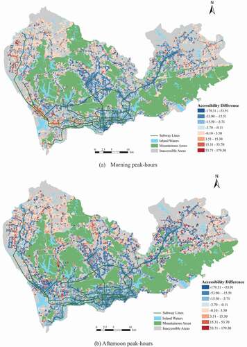
Figure 9. Normative accessibility to top-ranking central subway stations in the downtown area. The size of the circle symbol is proportional to the betweenness centrality of a subway station
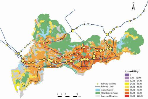
Figure 10. Positive accessibility to top-ranking central subway stations in the downtown area. The size of the circle symbol is proportional to the betweenness centrality of a subway station
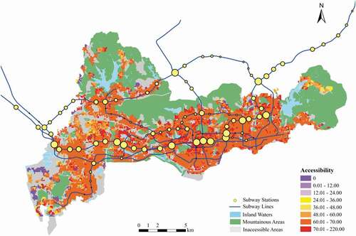
Figure 11. Comparison of travel times to central subway stations and to popular GOCs
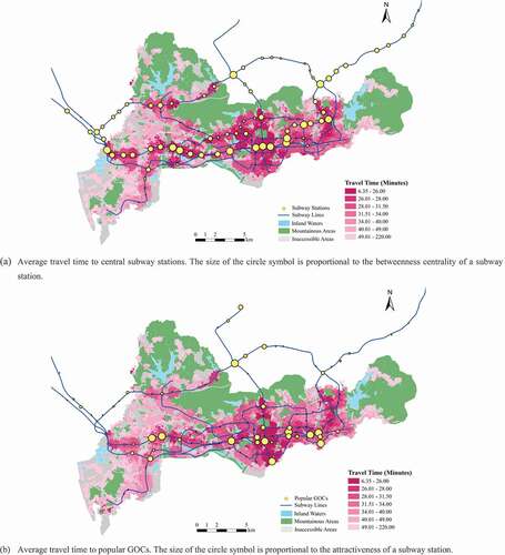
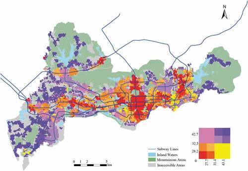
Figure 12. Travel times to both central and to popular GOCs. A bivariate color scheme is shown in the right bottom corner: horizontal axis represents average travel time to central GOCs and vertical axis represents average travel time to popular GOCs
Data availability statement
The data that support the findings of this study are available from Transport Bureau of Shenzhen Municipality. Restrictions apply to the availability of these data, which were used under license for this study. Data are available from the authors with the permission of Transport Bureau of Shenzhen Municipality.