Figures & data
Figure 1. Resilience phases of a system (Bešinović Citation2020).
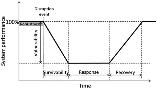
Table 1. Definitions of resilience from a data-driven perspective summarized from literature.
Figure 2. Map of London railway stations and bus stations.
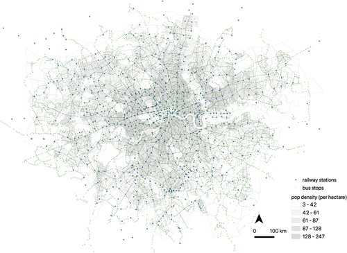
Figure 3. Trend of total weekly entries.
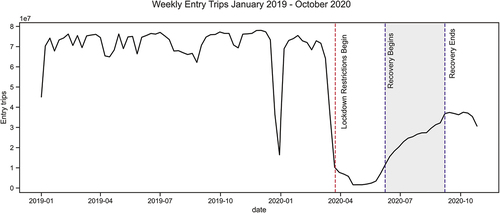
Table 2. Explanatory features used in this analysis.
Table 3. Summary of regression models utilized.
Figure 4. Lockdown lifted: trend of percent actual trips versus counterfactual estimate.
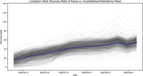
Figure 5. Boxplot of SRM by subregion.
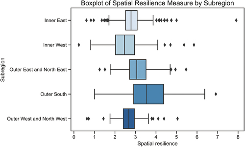
Figure 6. LISA.
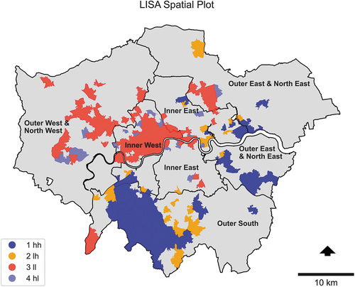
Table 4. Summary of regression models.
Figure 7. Bivariate analysis of most significant features.
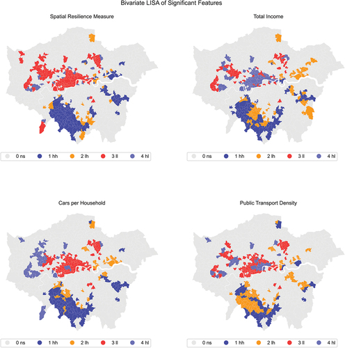
Figure C1. Histogram of R-Squared for all linear regression models.
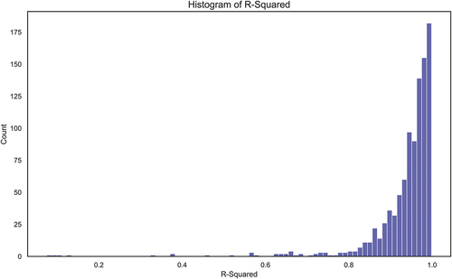
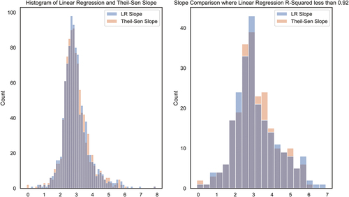
Figure C2. Histogram of linear regression slope and Theil–Sen Slope estimator.