Figures & data
Figure 1. Location of Grand Lake in Oklahoma and the United States. Arrows indicate direction of water flow from major tributaries the Neosho River (NR), the Spring River (SR), and the Elk River (ER) and minor tributaries Tar Creek (TC), Buffalo Creek (BC), and Honey Creek (HC) through the reservoir and into the Grand River (GR). Circles indicate locations where water and suspended sediment samples were collected, although samples were not collected at all locations on all sampling excursions. Gray-black shading indicates relative depth between the shoreline and the dam face, where water is usually 36 m deep. Map adapted from OWRB (Citation2009).
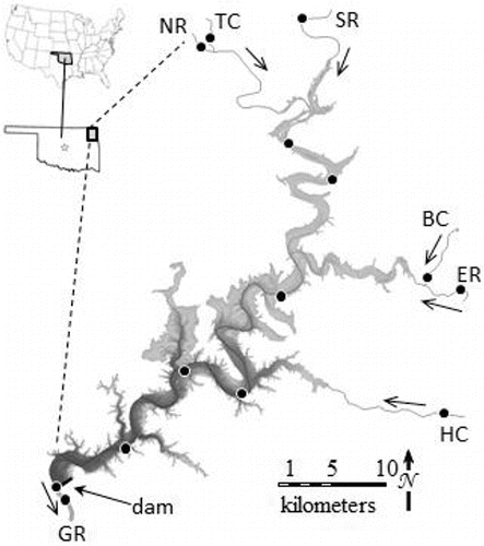
Figure 2. Distribution of trace element concentrations in filtered water samples. Data are depicted along several one-dimensional number lines sorted by sampling location and excursion. Circles denote samples collected upstream of Grand Lake in tributaries. Diamonds denote samples collected <8 m deep in the water column (the bottom of the summertime surface mixed layer). Triangles denote samples collected ≥8 m deep. Squares denote samples collected downstream of Pensacola Dam. Symbols appear at the median values of each subset of data, and error bars extend to the 5th and 95th percentiles of each subset of data. The numbers above the panel showing iron (Fe) concentrations indicate the number (n) of observations in each subset of samples, and these apply to the corresponding number lines for all panels other than Fe. Labels at the bottom of each panel identify sampling excursions.
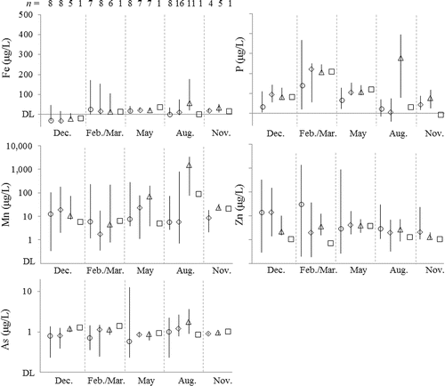
Figure 3. Distribution of trace element concentrations in suspended sediment samples. Because the detection limit varied between samples, only the approximate maximum detection limit is denoted where appropriate. Other details are as in .
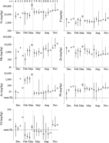
Table 1. Water flux (GL/day) and mass flux of elements in () filtered samples (kg/d) and () suspended sediment samples (kg/d).
Figure 4. Biplot of principal component analysis of elemental concentrations in filtered samples. Loadings are depicted as open double circles and correspond to upper and right-hand axes. Scores are other symbols and correspond to lower and left-hand axes. Scores are represented as: (filled diamonds) upstream samples from February-March and May (i.e., months of high flow); (open diamonds) other upstream samples; (filled squares) summertime surface mixed layer; (open squares) other lake samples from <8 m deep; (filled triangles) summertime metalimnion and bottom water; (open triangles) other lake samples from ≥8 m deep; and (filled circles) downstream samples. PC1 and PC2 described 38% and 21% of the variance in the dataset, respectively.
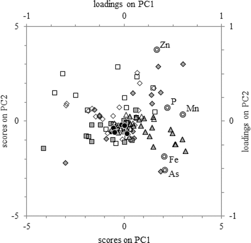
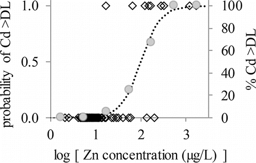
Figure 5. Plot of logistic function relating occurrence of detectable Cdf to logarithm of Znf concentration by showing observed values (open diamonds, left vertical axis), the percentage of Cd observations that exceeded the detection limit for a given 0.5-log-unit window on the horizontal axis (gray circles, right vertical axis), and the logistic function fitting the observed data (dotted line, left vertical axis).