Figures & data
Figure 1. Map displaying the 151 rock samples locations and the 46 dose rate measurement points superimposed over the simplified geological sketch. Coordinate system: International_1924_Transverse_Mercator.
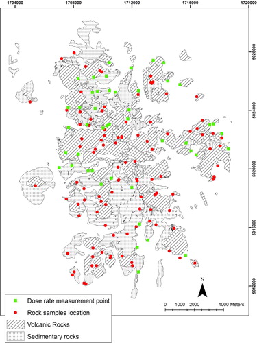
Table 1. 232Th, 226Ra and 40K activity concentrations in the 46 rock samples; calculated (TG-ADER) and measured (ADER) ambient dose equivalent rate in the same sampling location. ADER values have been reported without decimal numbers.
Table 2. Descriptive statistics of the content in radioisotopes and of the calculated (TG-AGER) and measured dose rate (AGER) values.
Figure 2. Box plot for calculated (TG-ADER) and measured dose rates (ADER). Each box ranges between the 25th and 75th percentiles. The solid line within each box represents the median, the dashed line the mean, and the whiskers are the 10th and 90th percentiles, respectively, while the points are the 5th and 95th percentiles, respectively.
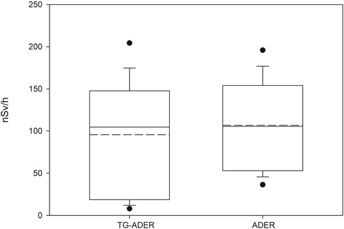
Figure 3. Rate of ambient dose equivalent: measured values (ADER) vs. calculated values (TG-ADER).
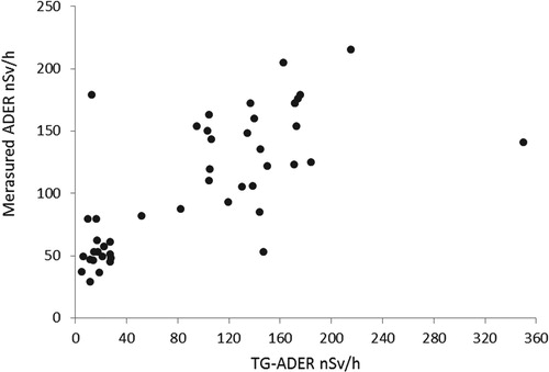
Figure 4. Residuals. The dash-dot lines represent the limiting value of Tukey’s prescription.
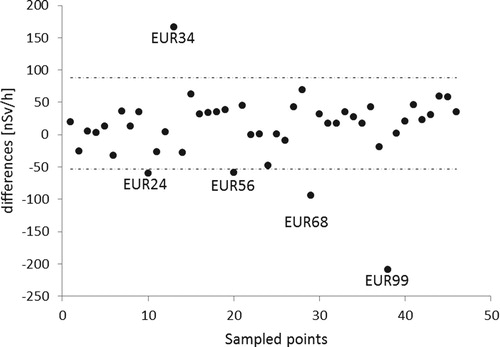
Figure 5. Scatter plot of the 41 points.
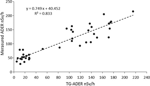
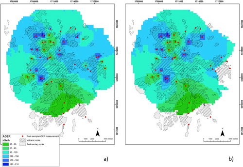
Figure 6. Maps of ambient dose equivalent rate in nSv/h using the entire database (a) and the database excluding outliers (b) superimposed over the simplified geological sketch. Coordinate system: International_1924_Transverse_Mercator.