Figures & data
Table 1. Design specifications of the IMPROVE and CSN samplers
Figure 1. Location of the 12 urban sites with collocated IMPROVE and CSN carbon measurements and the time period the samplers were operating.
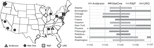
Figure 2. Comparison of CSN TC and IMPROVE TC concentrations from collocated monitors for 2005–2006 data. The data are color-coded based on the CSN sampler. The regression line is for the Met One data.
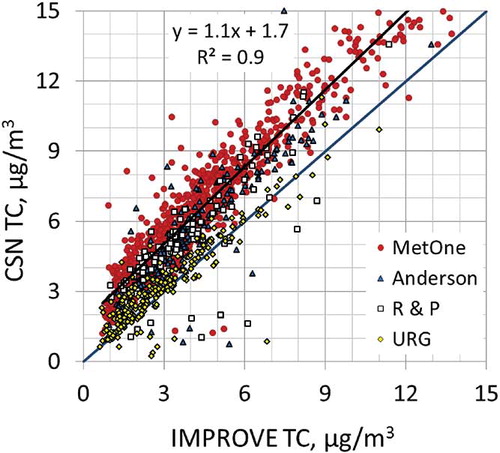
Figure 3. Comparison of CSN EC and IMPROVE EC concentrations from collocated monitors for 2005–2006 data. The data are color-coded based on the CSN sampler. The regression line is for the Met One data.
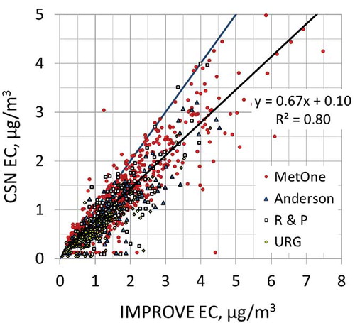
Table 2. The multiplicative artifact (1 + b OC) and the monthly positive organic artifact (a) used to relate the CSN and IMPROVE carbon concentrations
Figure 4. The CSN and IMPROVE TC, OC, and EC concentrations for all collocated IMPROVE and CSN Met One samplers that collected data in 2005 and 2006. The lighter data points are for the reported CSN carbon concentrations and the darker data points are for the adjusted CSN carbon concentrations.
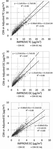
Figure 5. Stacked bar charts showing average concentrations of each species for all and each season for IMPROVE, CSN suburban, and CSN center city.
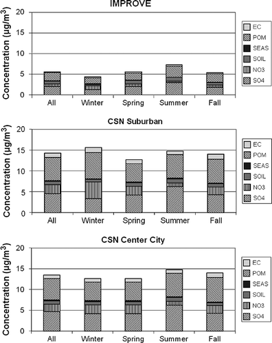
Figure 6. Temporal plot of PM2.5 − PM2.5avg and the percent difference between reconstructed and gravimetric mass for Brigantine National Wildlife Refuge. The red line is a sinusoidal curve fit to the percent difference between reconstructed and gravimetric mass.
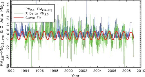
Figure 7. Average percent seasonal variability (b 2) and percent difference (b 1), as represented by Equationeq 13, between reconstructed and gravimetric mass for the IMPROVE and CSN monitoring networks. Green represents a positive value, whereas red represents a negative bias.
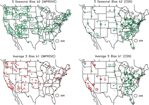
Table 3. Summary of the percent seasonal variability and average difference of reconstructed versus gravimetric mass
Table 4a. Results of OLS regression analysis using Equationeq 15 for the IMPROVE monitoring data
Table 4b. Results of OLS regression analysis using Equationeq 15 for the CSN/suburban monitoring data
Table 4c. Results of OLS regression analysis using Equationeq 15 for the CSN/urban monitoring data
Figure 8. Average fractional increase in sulfate and nitrate mass, a 1, due to retained water for the IMPROVE and CSN monitoring networks.
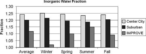
Figure 9. Average fraction of nitrate volatilized from a Teflon filter, (1 − a 2/a 1), for the IMPROVE and CSN monitoring networks.
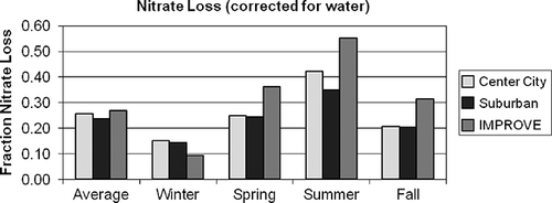
Figure 10. Average Roc factor, a 3, for the IMPROVE and CSN monitoring networks.
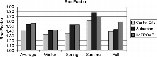
Figure 11. The estimated average difference between gravimetric and assumed forms of the various aerosol species contributing to PM 2.5 for IMPROVE. The differences are estimated as 1.375·SO4 × (a 1 − 1), 1.29·NO3 × (a 2 − 1), OC × (a 3 − 1.8), and Other × (a 4 − 1) for sulfates, nitrates, organics, and Other, respectively.
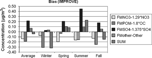
Figure 12. The estimated average difference between gravimetric and assumed forms of the various aerosol species contributing to PM 2.5 for CSN center city. The differences are estimated as 1.375·SO4 × (a 1 − 1), 1.29·NO3 × (a 2 − 1), OC × (a 3 − 1.8), and Other × (a 4 − 1) for sulfates, nitrates, organics, and Other, respectively.
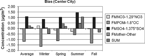
Figure 13. The estimated average difference between gravimetric and assumed forms of the various aerosol species contributing to PM 2.5 for CSN suburban. The differences are estimated as 1.375·SO4 × (a 1 − 1), 1.29·NO3 × (a 2 − 1), OC × (a 3 − 1.8), and Other × (a 4 − 1) for sulfates, nitrates, organics, and Other, respectively.
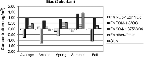
Figure 14. Average difference between gravimetric and estimated true PM2.5 mass concentration for the IMPROVE and CSN data sets (see Equationeq 16).
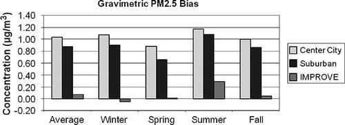
Figure 15. Average difference between reconstructed and estimated true PM2.5 concentrations for the IMPROVE and CSN data sets (see Equationeq 17).
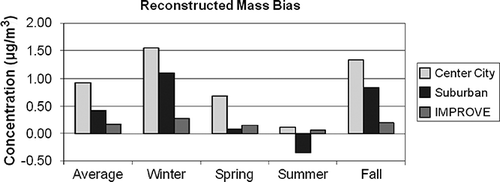
Figure 16. Seasonal and spatial variability in difference between gravimetric and true mass concentration (PM2.5 − TPM2.5) for the CSN monitoring network. Green color refers to positive and red to negative numbers.
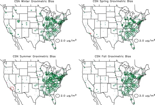
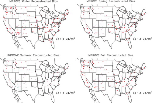
Figure 17. Seasonal and spatial variability in difference between gravimetric and true mass concentration (PM2.5 − TPM2.5) for the IMPROVE monitoring network. Green color refers to positive and red to negative numbers.
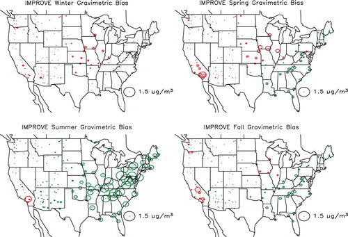
Figure 18. Seasonal and spatial variability in difference between true and reconstructed mass concentration (TPM2.5 − RPM2.5) for the CSN monitoring network. Green color refers to positive and red to negative numbers.
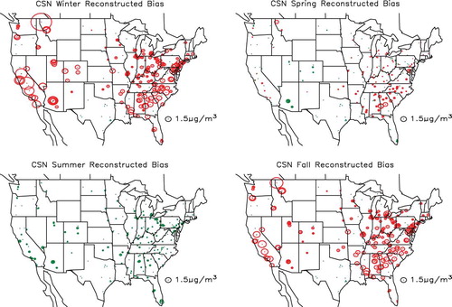
Figure 19. Seasonal and spatial variability in difference between true and reconstructed mass concentration (TPM2.5 − RPM2.5) for the IMPROVE monitoring network. Green color refers to positive and red to negative numbers.