Figures & data
Figure 1. Different flow regimes above and below the dividing surface used in ADMS when Fr < 1.
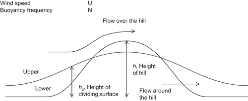
Table 1. Stack parameters for the stacks in each of the cases
Figure 2. Terrain contour map and isometric projection for Clifty Creek. The stack is marked with a white star, the heights are in meters.
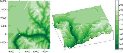
Figure 3. Terrain contour map and isometric projection for Ribblesdale. The stacks are marked with white stars, the heights are in meters.
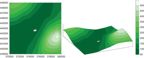
Table 2. Meteorological parameters used in the Clifty Creek and Ribblesdale calculation
Figure 4. Wind roses of wind data used for the (a) Clifty Creek and (b) Ribblesdale model calculations.
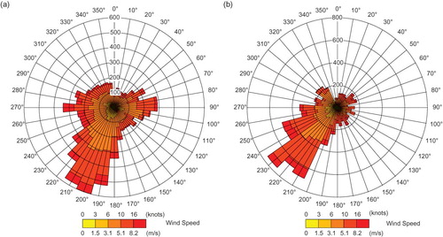
Table 3. Maximum (and minimum) values for the average and maximum normalized concentrations for Clifty Creek
Figure 5. Clifty Creek annual average concentrations normalized by the emission rate. Terrain elevation contours (black) are shown in the top two plots. The first four plots show concentrations calculated by the models, the second four plot differences in concentrations.
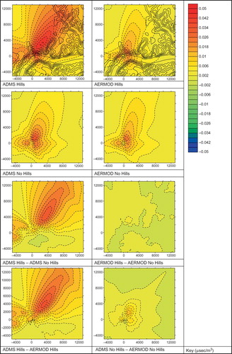
Table 4. Maximum (and minimum) values for the average and maximum normalized concentrations for the Ribblesdale case
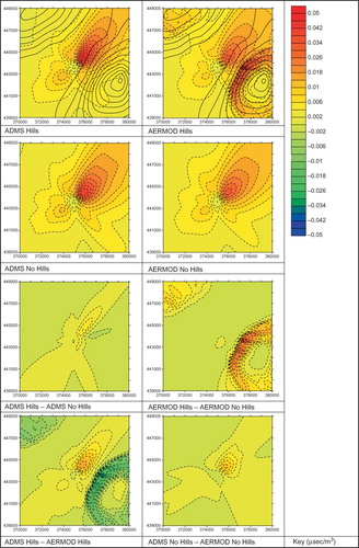
Figure 6. Ribblesdale annual average concentrations normalized by the emission rate. Terrain elevation contours (black) are shown in the top two plots. The first four plots show concentrations calculated by the models, the second four plot differences in concentrations.