Figures & data
Figure 1. Gene distribution and expression profiles. (A) Length distribution of transcripts and unigenes. (B) Box plot showing overall RPKM expression values of each sample. (C) The RPKM density distribution of unigenes. (D) Principal component analysis (PCA) of the gene expression data (the principal components 1 and 2 accounted for 59.7 and 37.5 of variance).
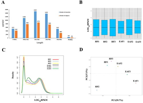
Table 1. Summary of sequencing reads aligned with the Sus scrofa genome and mapped genes.
Figure 2. Volcano map and hierarchical clustering analysis showing the expression profiles between HF and EAF. (A) Volcano maps show the detected DEGs. Red dots represent the DEGs with corrected p < 0.05 and |log2(fold change)| ≥ 1, FDR < 0.05, and RPKM > 100. (B) The heatmap shows the hierarchical clustering of DEGs. Yellow represents the upregulated genes, and blue represents the downregulated ones.
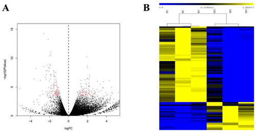
Figure 3. GO enrichment analysis of DEGs. The No. of genes indicates the number of inputs of DEGs annotated to the category, and the X-axis represents − log10 (p value).
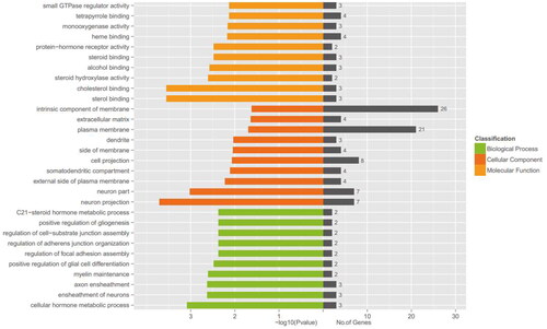
Figure 4. The pathway analysis of DEGs. (A) KEGG enrichment analysis of DGEs. The size of each dot represents the number of DEGs enriched in the corresponding pathway. (B) The ovarian steroidogenesis pathway with DEGs is highlighted in pink.
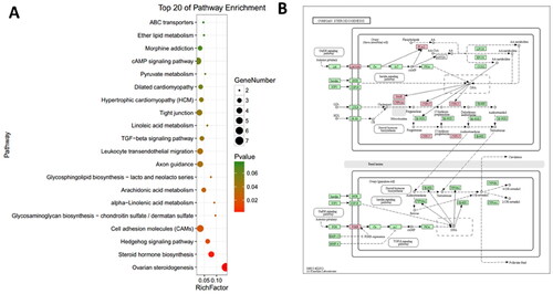
Figure 5. Protein–protein interaction network of DEGs. Lines of different colors represent seven types of evidence used in predicting associations. red: fusion evidence; green line: neighborhood evidence; blue: co-occurrence evidence; purple: experimental evidence; yellow: text mining evidence; light blue: database evidence; black: co-expression evidence.
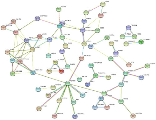
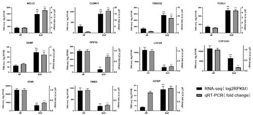
Figure 6. qPCR validation of 11 DEGs between HF and EAF. The black columns represent the log2RPKM value (left Y-axis) generated by RNA-seq, and the grey columns represent the qPCR fold changes (right Y-axis) and are expressed as means of three samples. **p < 0.01.