
Figures & data
Table 1. Data filtering statistics after Illumina sequencing.
Figure 1. Cell viability of MAC-T cells treated with LPS. *p < 0.05; **p < 0.01; **p < 0.001 versus the value for cells cultured without LPS.
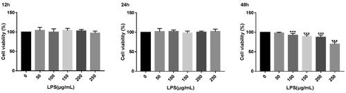
Figure 2. Effect of LPS on the expression of inflammatory factors related to MAC-T cells. *p < 0.05; **p < 0.01; ***p < 0.001 versus the value for cells cultured without LPS.
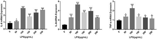
Table 2. Summary of clean reads mapped to the reference genome.
Figure 3. Volcano map of DEGs. The two vertical dotted lines are the threshold of the differential expression. The horizontal dotted line is the threshold FDR at 0.05. Up-expression and under-expression genes are shown as red and blue dots, respectively, and gray dots represent non-significantly differentially expressed genes.
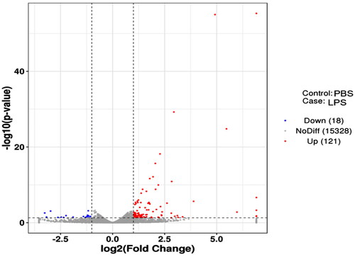
Figure 4. Heatmap analysis of DEGs. The horizontal lines represent genes, and each column is a sample. Red represents high-expression genes, and the green represents low-expression genes. The X-axis is the sample number, and the Y-axis is the DEGs.
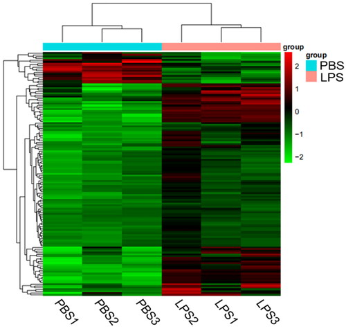
Figure 5. GO enrichment analysis displaying the top 10 significantly enriched GO terms.
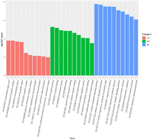
Figure 6. Bubble diagram of GO enrichment analysis. The size of the dots indicates the number of genes in the GO term, and different colors indicate different levels of significance.
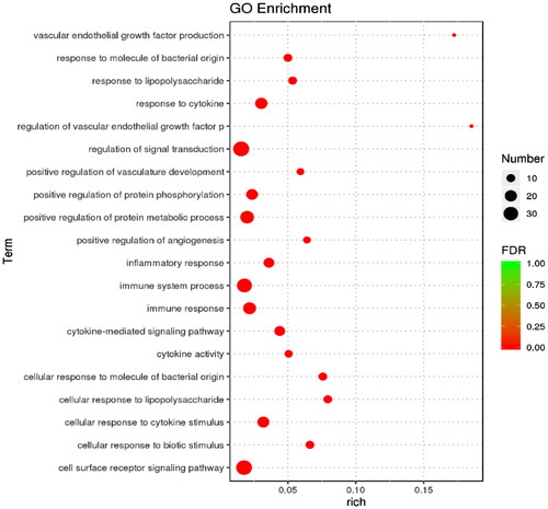
Figure 7. Histogram of KEGG pathway enrichment result. Abscissa is the name of the pathway, and the ordinate is the − log10 (p-value) of each enriched pathway.
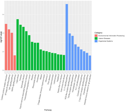
Figure 8. KEGG enrichment analysis displaying the top 20 significantly enriched KEGG terms.
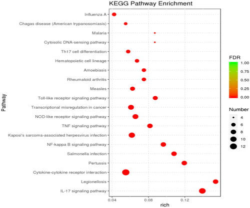
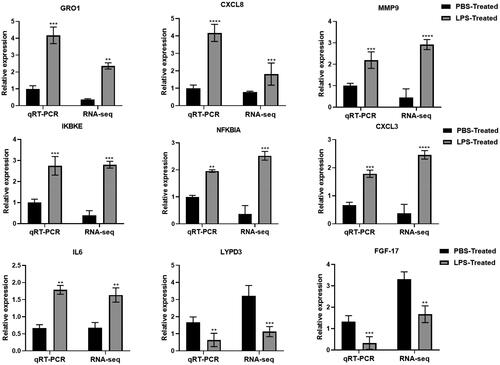
Figure 9. Validation of RNA-seq results using QRT-PCR.
Supplemental Material
Download MS Word (17.3 KB)Supplemental Material
Download MS Word (16.3 KB)Supplemental Material
Download JPEG Image (32.3 KB)
Data availability statement
The raw data supporting the conclusions of this article will be made available by the authors, without undue reservation.