Figures & data
Figure 1. Infographic showing percent of museum educators who experienced changes in their employment status.
Five rows of people icons, with 20 people per row. The icons are gray. Six icons have a red X mark indicating the proportion of museum educators laid off. Eight icons have a yellow / mark over them indicating the proportion of museum educators furloughed. Eight icons have a green $ over them indicating the proportion of museum educators with pay cuts. Eight icons have a blue O over them indicating the proportion of museum educators with hours reduced. Five icons have a purple diamond over them indicating proportion whose employment status was affected in another way.
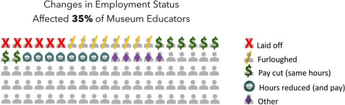
Table 1. Table of employment status by race showing greater effects on some BIPOC groups.
Figure 2. Infographic showing percent of museums that experienced budget cuts in education and public programming.
Five rows of dollar signs, with 20 dollar signs per row. 67 dollar signs are black and crossed out showing percent of museums that experience budget cuts in education and public programming. 33 dollar signs are gray and not crossed out indicating percent of museums that did not experience budget cuts in education and public programming.
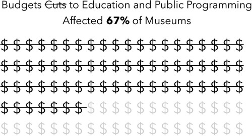
Figure 3. Horizontal bar graph showing museum staff positions most affected by layoffs and furloughs.
The horizontal bar graph has 8 bars, each one representing a different museum staff position. One bar is black, indicating education. The other bars are gray. Bars are organize descending with the most affected staff at the top and least affected at the bottom.
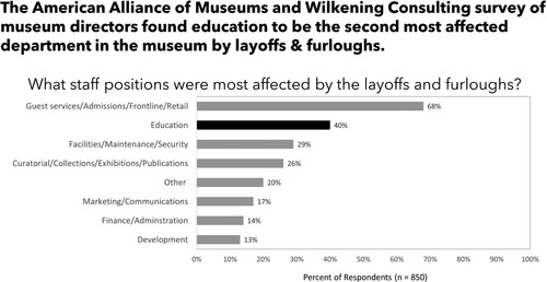
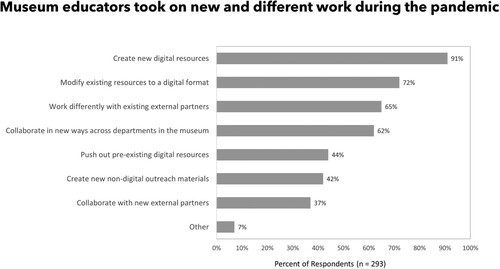
Figure 4. Horizontal bar graph showing new and different roles museum educators took on in the pandemic.
The horizontal bar graph has 8 bars, each one representing a new or different role museum educators took on in the pandemic. All bars are gray. Bars are organize descending with the most reported role appearing at the top and least reported role appearing at the bottom.