
Figures & data
Fig. 1 Illustration of the PARAFAC/CP decomposition method for immunoprofiles measured longitudinally. The white color represents missing data in the time direction. The three-way tensor is approximated as the sum of rank-one tensors
. Each rank-one tensor
can be expressed using a factor along the subject direction
, a factor along the feature direction
, and a factor along the time direction
. The factors associated with the tensor decomposition can be used in downstream analysis.
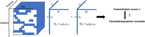
Fig. 2 Reconstruction evaluation by the correlation between the estimates and the true signal tensor. In each subplot, the x-axis label indicates different J and observing rate, the y-axis is the achieved correlation, and the box colors represent different methods. The corresponding subplot column/row name represents the signal-to-noise ratio SNR1/SNR2.
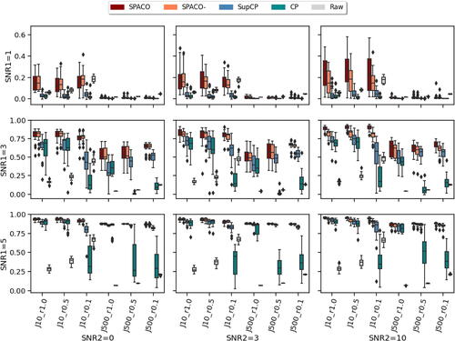
Fig. 3 Comparison of SPACO and SPACO- for reconstructing U at J = 10, SNR2. In each subplot, the x-axis label indicates different component and observing rate, the y-axis is the achieved
, and the box colors represent different methods. The corresponding subplot column/row name represents the signal-to-noise ratio SNR1/component.
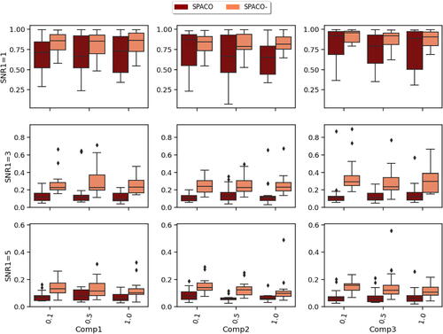
Fig. 4 Comparison of SPACO and SupCP for reconstructing at J = 10. In each subplot, the x-axis label indicates different component and observing rate, the y-axis is the achieved
, and the box colors represent different methods. The corresponding subplot column/row name represents the signal-to-noise ratio SNR1/SNR2.
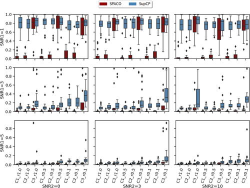
Fig. 5 Achieved Type I errors at observing rate r = 0.5. In each subplot, x-axis label indicates different combination of feature dimension J and targeted level , while the y-axis represents the achieved Type I errors. Different bar colors represent different tests (partial or marginal). The two dashed horizontal lines correspond to levels 0.01 and 0.05.
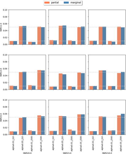
Fig. 6 Achieved power at observing rate r = 0.5. In each subplot, the x-axis label indicates different combinations of feature dimension J and targeted level , the y-axis indicates the achieved power. Different bar colors represent different tests (partial or marginal).
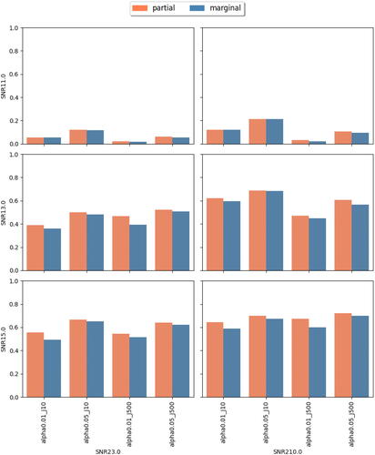
Fig. 7 Comparisons between subject scores estimated from SPACO and SPACO- as well as the static risk factors. Panel A displays the high concordance in the correlations between estimated subject scores from SPACO and SPACO-. Panel B shows the correlations with clinical responses (row label) using subject scores from the most distinct component, C2, estimated with SPACO and SPACO-. The associated permutation p-values, which assess the improvement in correlations with the four clinical responses using SPACO, are shown beneath the row label. Panel C shows the correlation between clinical responses and the two most significant risk factors identified through conditional independence testing, COVIDRISK_3 and BMI.
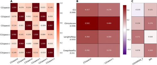
Table 1 Results from randomization test for the second component (C2).