Figures & data
Figure 1. Random Responses from Underlying Linear Regression Model. Faint dotted line is “true” model; each symbol is a random response from one of three random samples, with least-squares lines shown for each sample.
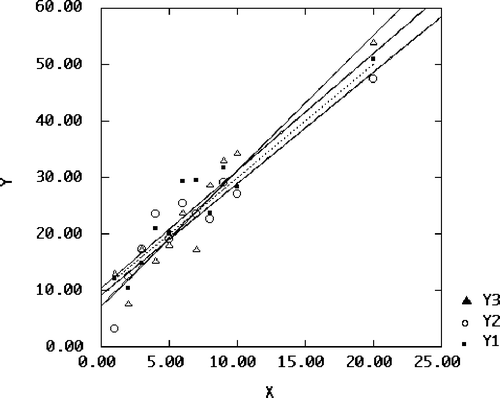
Table 1: FRB Data, Velleman and Welsch (1981)
Figure 2. Federal Reserve Board Data, Unadjusted Scatterplot of Unemployment (UN) vs. Industrial Production Index (IP).
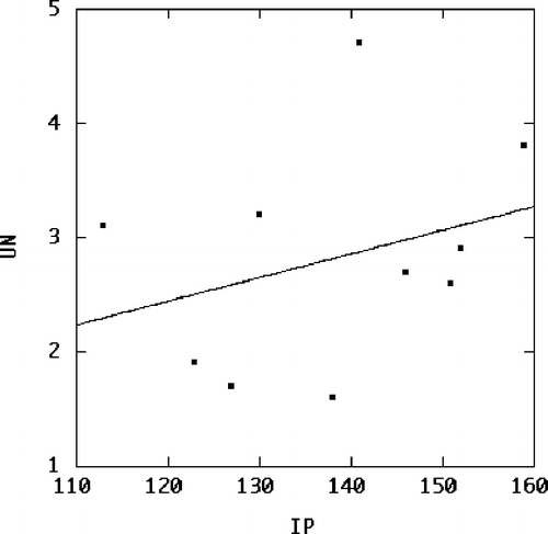
Figure 3. Federal Reserve Board Data, Scatterplot of Unemployment (UN) vs. Industrial Production Index (IP), Adjusted for Effect of Year (YR).
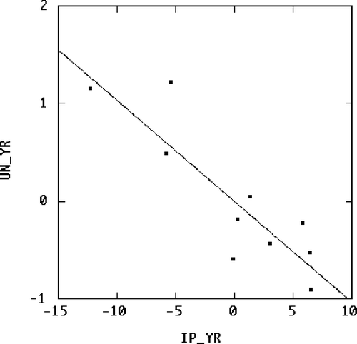
Table 2: Data of Mickey, Dunn, Clark (1967)
Figure 4. Scatterplot of Aptitude Score vs. Age at Which First Word Spoken; Data fromCitationMickey, Dunn, and Clark (1967). Individual variables are shown as marginal boxplots; least-squares lines are shown with and without influential Case 18.
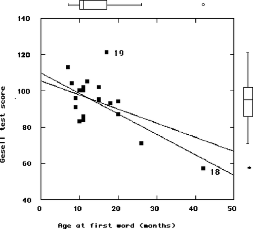
Table 3: Collinear (X1, X2) and Orthogonal (X3, X4) Predictors (Myers 1990, p. 125)
Figure 5. 3-D Plots of Random Responses vs. Collinear Predictors (left) and Orthogonal Predictors (right). Least-squares planes are added.
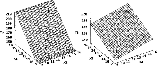
Figure 6. Plot of Surviving Bacteria vs. Time, on Additive Scale (left) and Multiplicative Scale (right). Scale in right-hand plot is logged to base two.
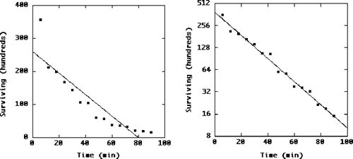
Figure 3. Federal Reserve Board Data, Scatterplot of Unemployment (UN) vs. Industrial Production Index (IP), Adjusted for Effect of Year (YR).
