Figures & data
Figure 1. Plasma Concentration vs. Time Curves for Subject 8. The y-axes for EE are not the same as the y-axes for NET. (a) EE OCD; (b) EE OC; (c) NET OCD; (d) NET OC.
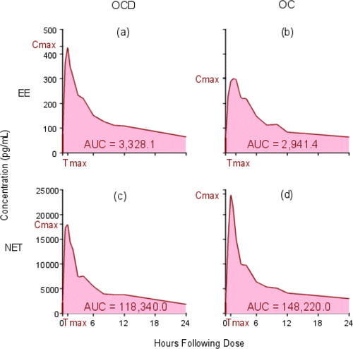
Figure 2. Individual Within-Subject Natural Log Transformed Ratios, log OCD/OC. The y-axis is labeled with antilog values. The target bioequivalence (interaction) limits are indicated by the horizontal dotted lines located at 0.8 and 1.25 on the y-axis.
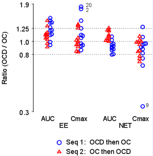
Figure 3. Individual Subject Profile (“Spaghetti”) Plots Ordered by Treatment. The y-axes are labeled with antilog values. The y-axes are all different. (a) log EE AUC; (b) log EE Cmax; (c) log NET AUC; (d) log NET Cmax.
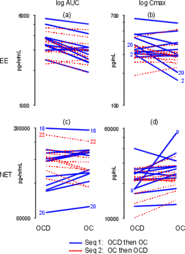
Figure 4. Individual Subject Profile (“Spaghetti”) Plot Ordered by Study Period – log NET AUC. The y-axis is labeled with antilog values.
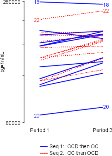
Figure 5. Scatter Plots. The x- and y-axes are labeled with antilog values. The x-axes are all different; the y-axes are all different. (a) log EE AUC; (b) log EE Cmax; (c) log NET AUC; (d) log NET Cmax.
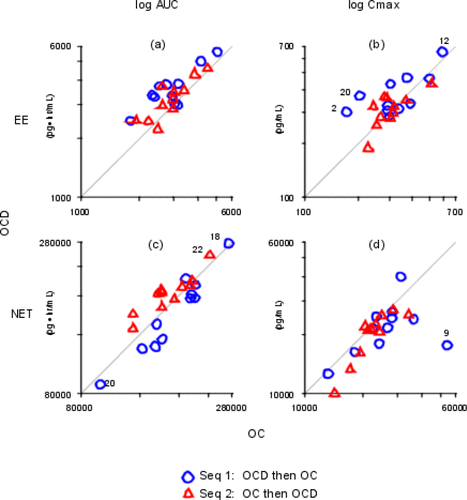
Table 1. Normal theory mixed effects ANOVA results.
Table 2. Summary of normal theory interaction analyses.
Figure 6. Point Estimates and 90% Confidence Intervals – Normal Theory. The y-axis is labeled with antilog values. The target bioequivalence (interaction) limits are indicated by the horizontal dotted lines located at 0.8 and 1.25 on the y-axis.
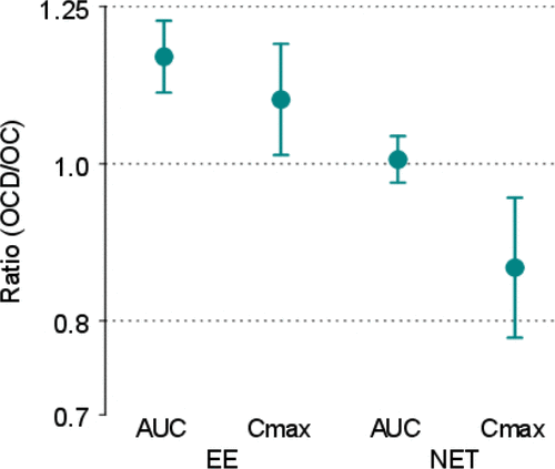
Figure 7. Sum and Difference Plots. The y-axes are labeled with log values. The y-axes are all different. The horizontal bars represent sample means. (a) Treatment effects; (b) Period effects; (c) Carryover effects.
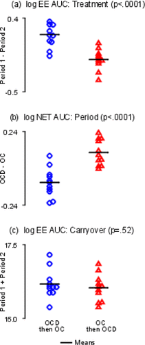
Figure 8. Sum and Difference Plots. The y-axis is labeled with log values. The y-axes are both different. The horizontal bars represent sample means. (a) Outlier; (b) Possible heteroscedosticity.
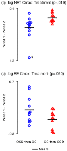
Figure 9. Mean Log Response Plots. The y-axis is labeled with antilog values. The y-axes are both different.
(a) Treatment effects; (b) Period effects.
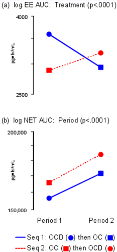
Figure 10. Normal Probability Plots. The x- and y-axes are labeled with log values. The x-axes are all different. The y-axes are all different. (a) log EE AUC; (b) log EE Cmax; (c) log NET AUC; (d) log NET Cmax.
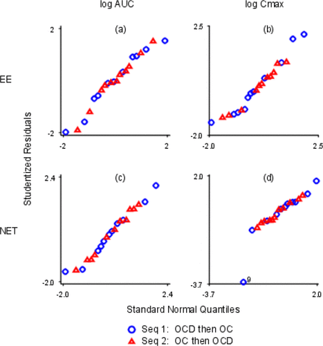
Figure 11. Observed vs. Fitted Values. The x- and y-axes are labeled with log values. The x-axes are all different. The y-axes are all different. (a) log EE AUC; (b) log EE Cmax; (c) log NET AUC; (d) log NET Cmax.
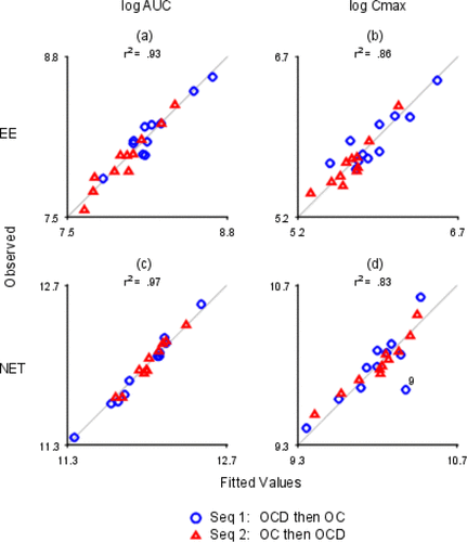
Figure 12. Studentized Residuals vs. Fitted Values. The x- and y-axes are labeled with log values. The x-axes are all different; the y-axes are all different. (a) log EE AUC; (b) log EE Cmax; (c) log NET AUC; (d) log NET Cmax.
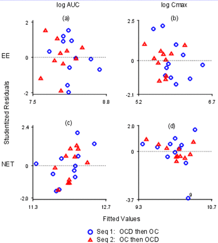
Table 3. Summary of distribution-free interaction analyses.
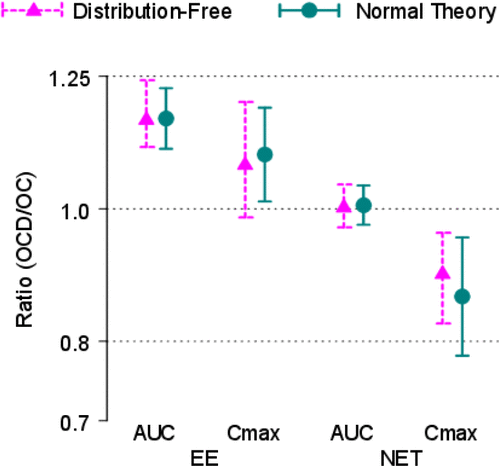
Figure 13. Point Estimates and 90% Confidence Intervals – Distribution-Free and Normal Theory. The y-axis is labeled with antilog values. The target bioequivalence (interaction) limits are indicated by the horizontal dotted lines located at 0.8 and 1.25 on the y-axis.