Figures & data
Figure 1. Our first motivational example based on the transistor count data.
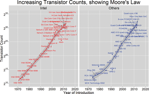
Figure 2. Our second motivational example based on the child eye data. A sequential color palette represents child age. Positive/negative values of visual acuity correspond to long/short sight.
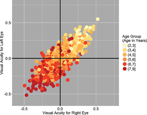
Figure 3. Our second motivational example based on child eye data. The use of faceting shows in detail how children become more short sighted as they grow.
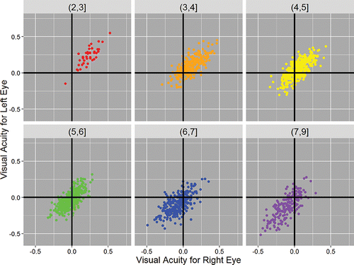
Figure 4. A simple plot, produced using base R functions, with a legend. This can be used to explain the meaning of simple summary statistics.
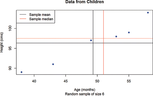
Figure 5. A wordcloud for the plymouthargylefc Facebook page. Plymouth Argyle is a local football club, known as the Pilgrims. The size and prominence of a word depends on the number of times that it appears.
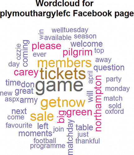
Figure 6. A sentiment analysis for the plymouthargylefc Facebook page. Each post was assigned a sentiment score calculated as the number of positive minus the number of negative words that it contained.
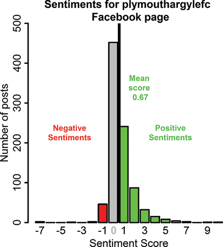
Figure 7. An illustration of principal component analysis. Retaining only the values along the first principal component preserved 99% of the information in the data points.
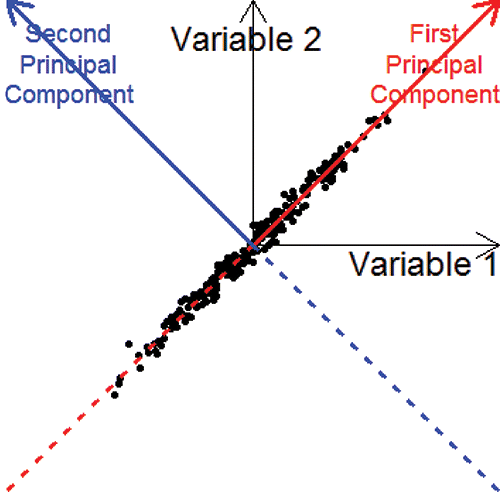
Figure 8. Slides from a group presentation based on the RSPCA and Paignton Zoo Facebook pages. Left plot: the average number of likes, comments, and shares, and the number of posts across four months for the RSPCA page. Right plot: the top 10 words on Paignton Zoo's page.
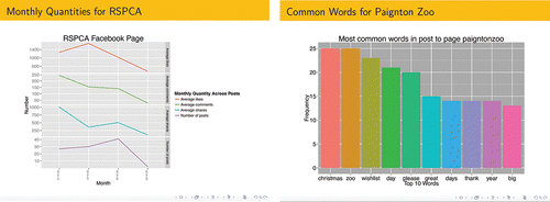
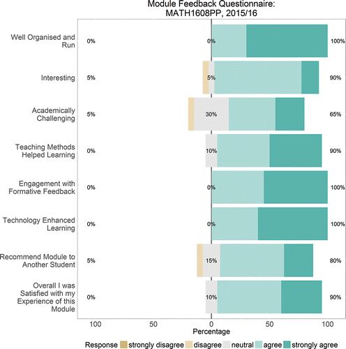
Figure 9. Some student feedback results. The number on the left is the percentage strongly disagreeing or disagreeing, while the number of the right is the percentage agreeing or strongly agreeing. The percentage who responded neutral is also shown in the middle.