Figures & data
Fig. 1 A flowchart outlining the data-scientific cycle discussed by Grolemund and Wickham (Citation2017).
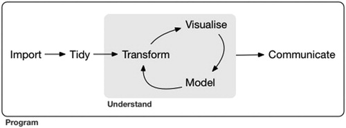
Fig. 2 Scatterplot of the sales price against above-ground living area for homes in Ames, IA.
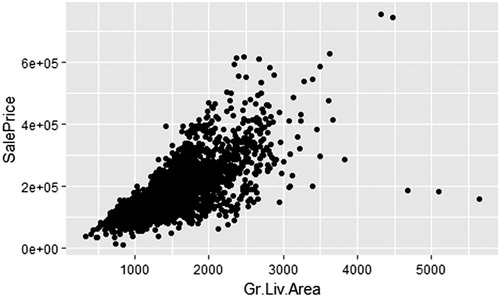
Fig. 3 Scatterplot of the sales price against above-ground living area for homes in Ames, IA. Color and shape represent the quality of the kitchen.
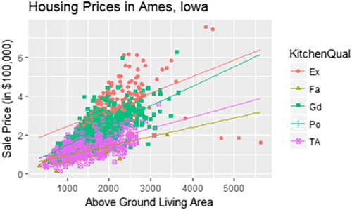
Fig. 4 A histogram (left) and density plot (right) of the sales price of homes in Ames, IA.
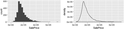
Fig. 5 A schematic displaying the relationships between key variables in the salaries and teams data tables.
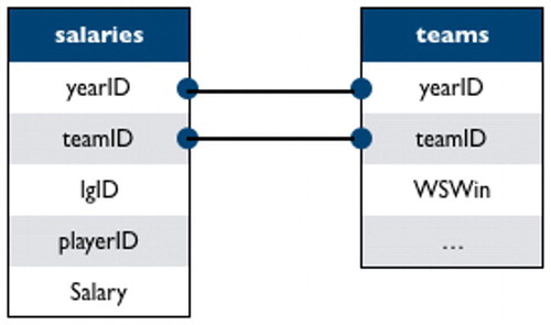
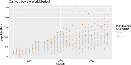
Fig. 6 Team payroll for each MLB team since 1987. Color denotes whether or not a team won the World Series in that season.
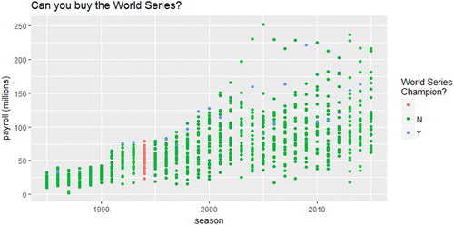
Fig. 7 Team payroll for each MLB team since 1987. The winner of the World Series in each season is highlighted in orange.