
Figures & data
Fig. 1 Steps required to calculate murder rate data for Puerto Rico by year and police district.
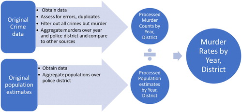
Table 1 Top five 2015 murder rates (per 100,000 people) in U.S. cities and San Juan, Puerto Rico.
Table 2 Murder rate per 100,000 residents in some of U.S. states and Puerto Rico.
Fig. 2 Number of vehicle stops and searches by race in San Diego in 2016.
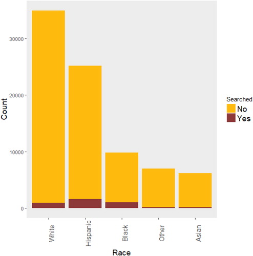
Fig. 3 Number of vehicle stops and searches by race and gender in San Diego in 2016.
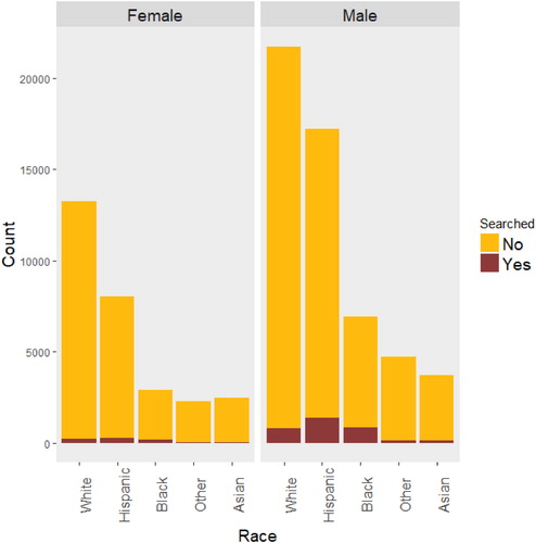
Fig. 4 Left panel displays the time series plot of monthly nonresident hotel registrations in Puerto Rico (in thousands). Right panel shows the separate distributions of monthly nonresident registrations (in thousands) for each calendar month.
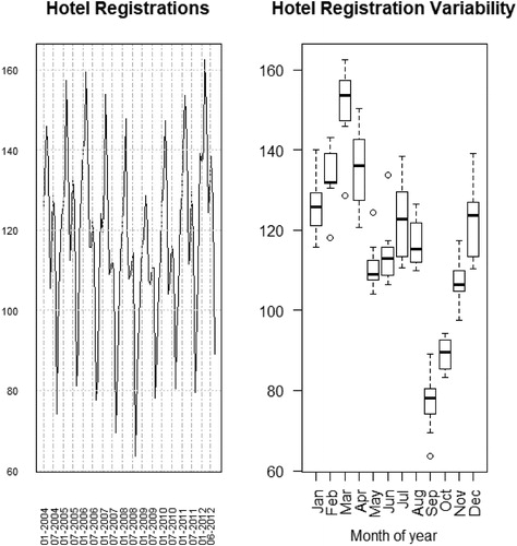
Fig. 5 Screen shot of the Baltimore housing variables motion chart, showing percent of residential properties vacant versus percent of properties under mortgage foreclosure. Variables to show can be selected from pull down menus that appear when the arrows are pressed (black circles). Selecting a community (green circle) and then running the animation will track the chosen community over time.
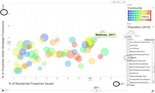
Fig. 6 Annual average of Standardized Precipitation Index (SPI), McKee, Doesken, and Kleist (Citation1993), for accumulation of rain every 3 months across many weather stations in Puerto Rico. Each line represents a station and each column indicates a year. Period covered is 1956 through 2015. Negative SPI indicates below average rain at the weather station while positive SPI indicates above average rain. Vertical lines for droughts of 1967, 1994, and 2015 serve as benchmarks.
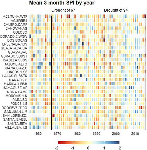
Fig. 7 Scatterplot of cheese fat percentage and moisture percentage color coded by cheese type, using Canada open data (https://open.canada.ca/en/open-data). It is hard to tell in this chart if cheese type has any influence in the association between fat percentage and moisture percentage.
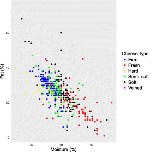
Fig. 8 Scatterplots of cheese fat percentage and moisture percentage per cheese type, using data from the Canada open data portal. It is easier to tell in this chart that cheese type has some influence in the association between fat percentage and moisture percentage. See supplementary materials for reproducible R code.
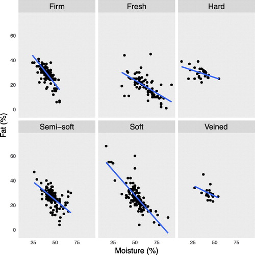
Table 3 A few more ideas for incorporating open data into introductory statistics.