
Figures & data
Table 1 Student demographics in the Reproducible Research course.
Fig. 1 Sample student submissions. The top panels show example student submissions for the simple plot that are of low (a) and high (b) quality. The bottom panels show example submissions for the complex plot that are of low (c) and high (d) quality. The left-hand plots in each section were made in base R, and the right-hand plots were made in ggplot2. For privacy reasons, none of these figures were made by students. These figures are recreations that show general types of figures that were commonly made by students.
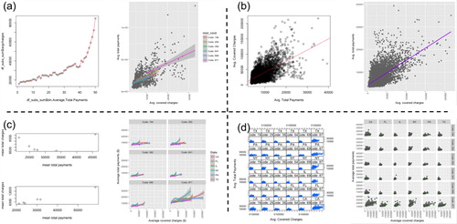
Table 2 Peer review rubric.
Table 3 Annotated features of plots.
Table 4 Compliance rates.
Table 5 Comparison of peer review responses in the base R and ggplot2 arms (all student submissions).
Table 6 Agreement in expert and student responses to the review rubric.
Table 7 Presence of plot features in student submissions.
Fig. 2 Student perceptions of clarity in plots with different features. The denominators of these fractions are the two colored numbers to the left of the dots. They represent the number of reviews for the plots that had the indicated feature (blue) and that lacked the indicated feature (red). Dots represent the fraction of those reviews indicating that the submitted plot was clear. Certain features were annotated only in the simple plots or only in the complex plots (). When the dots are close together, students’ perceptions of clarity (column questions) were not very dependent on the presence of the plot feature.
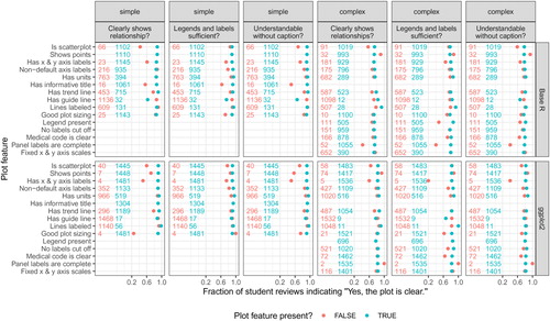
Fig. 3 Examples of types of complex plots. (a) A typical 36 panel plot. (b) A typical 12 panel plot with coloring has panels for the 6 states colored by medical condition and panels for the 6 medical conditions colored by state. A typical 6 panel plot would show one of these two rows. (c) A typical 2 panel plot has one panel colored by the 6 states and a second panel colored by the 6 medical conditions.
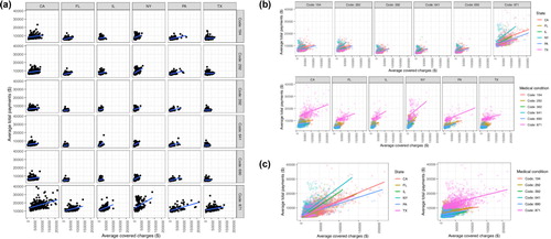
Table 8 Types of complex plots.
Table 9 Clarity of the different types of complex plots.