
Figures & data
Fig. 1 Student average daily engagement ratings over the course of the semester. Blue dots are proportional to the number of student responses. Day 1 shows 27 out of 29 students. Day 39 shows 2 out of 29 students. Dotted lines represent the time with no engagement responses. The red, horizontal line represents the average daily student engagement rating over the course.
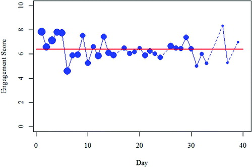
Fig. 2 Boxplots comparing student engagement ratings over the course of the semester sorted by student response rate. Response rate was categorized based on the number of daily surveys completed by the student. Very Low indicates fewer than 10 daily surveys, low indicates 10–14, moderate indicates 15–19, high indicates 20–24, and very high indicates 25 or more.
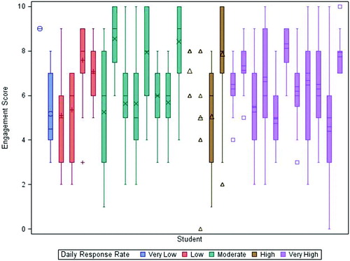
Table 1 Summary table of student daily engagement scores, final grades and professor daily engagement score.
Fig. 3 Scatterplot comparing average daily engagement scores versus final grades for each student. Points are proportional to each student’s response rate where larger dots indicate more frequent ratings. Note that the axes do not represent the entire possible range for each variable to show more detail in the data.
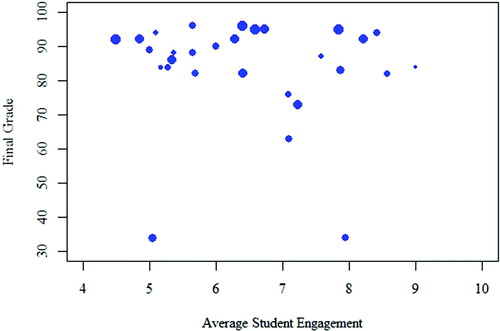
Fig. 4 Jittered scatterplot comparing professor (x-axis) versus student average engagement (y-axis) where each point represents a day, proportional to the student response rate. Note that the axes do not represent the entire possible range for each variable to show more detail in the data.
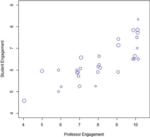
Table 2 Summary of student responses to the item: “To what extent did the course engagement help you better understand the course material?”
Table 3 Summary of student responses to the item: “To what extent do you agree with the following statement: in order for a lesson to be engaging, it must also be entertaining.”
Table 4 Counts and percentages of students who were asked to select which activities they found engaging (n = 21).