Figures & data
Fig. 1 John Snow’s Map 1 (1854). Source: http://www.ph.ucla.edu/epi/snow/snowmap1_1854_lge.htm (a larger version).
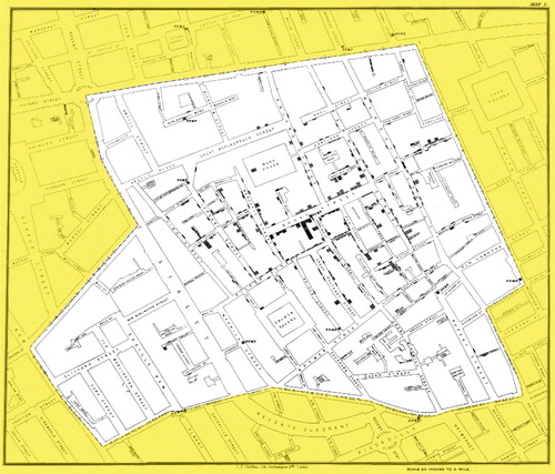
Fig. 2 Choropleth map that shows the number of people infected with the outbreak strain of Salmonella Mbandaka, by state of residence, as of June 14, 2018. Source: https://www.cdc.gov/salmonella/mbandaka-06-18/map.html.
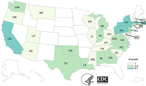
Fig. 3 Proportional symbol map showing the number of enplanements at the top 50 U.S. airports in 2015. Source: https://maps.bts.dot.gov/MapGallery/.
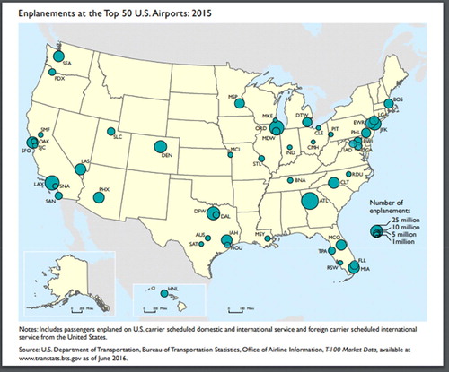
Fig. 4 Dot map showing the locations of U.S. highway crash fatalities in 2015. Source: https://maps.bts.dot.gov/MapGallery/.
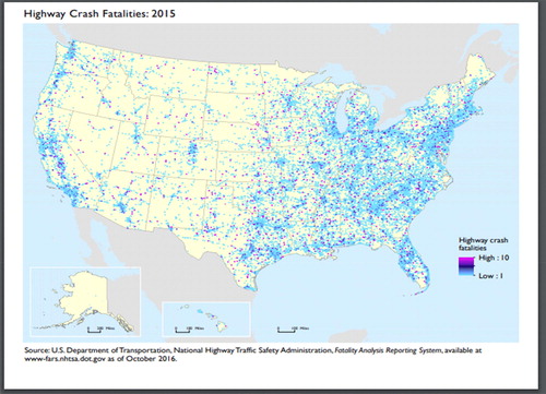
Fig. 5 Choropleth/dot map that displays the distribution of heart disease death rates in Alaska by gender and public health region between 2008 and 2012. Source: https://www.cdc.gov/dhdsp/maps/gisx/mapgallery/AK_HDGender.html.
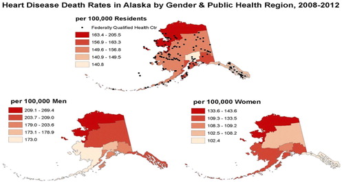
Fig. 6 Choropleth plot construction: (a) Each variable has a color “ramp”; (b) these two ramps are overlaid on top of each other (picture the Variable One ramp moving to the right on top of the Variable Two ramp); (c) the bivariate distribution of the two variables corresponds to a 3 by 3 array of colors.
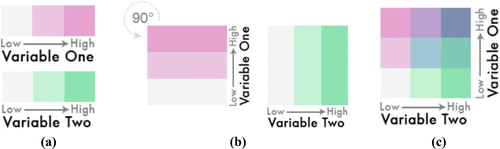
Fig. 7 Bivariate choropleth map that displays the relationship between reported sightings of Bigfoot between 1921 and 2013, and population density within each U.S. county. Source: http://www.joshuastevens.net/visualization/squatch-watch-92-years-of-bigfoot-sightings-in-us-and-canada/.
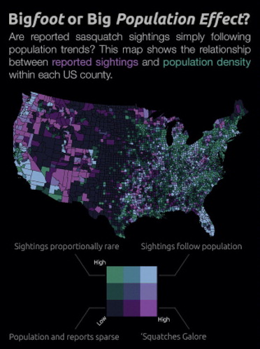
Fig. 8 Choropleth map that shows the distribution of the percentage of the obese adult population in each state based upon 3 year averages from 2014 to 2016. Source: http://calorielab.com/news/wp-images/post-images/fattest-states-2017-big.jpg.

Table 1 Poverty rate and obesity rate by state.
Fig. A1 Maps of 2016 U.S. presidential election results: (a) county-level choropleth map; (b) dot density map. Sources: (a) https://www.washingtonpost.com/news/politics/wp/2018/07/30/presenting-the-least-misleading-map-of-the-2016-election/; (b) http://arcg.is/1yLmOL.
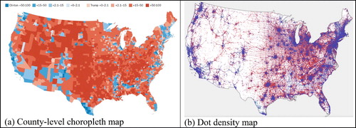
Fig. A2 Electoral Maps of 2016 U.S. presidential election: (a) traditional choropleth; (b) gridded hexagonal cartogram. Sources: (a) https://www.270towin.com/2016_Election/interactive_map; (b) https://gistbok.ucgis.org/bok-topics/2018-quarter-02/cartograms.
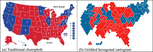
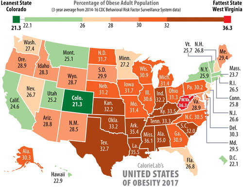

Fig. C1 Screen shot of the plotly Graph Maker interface after the data is imported.
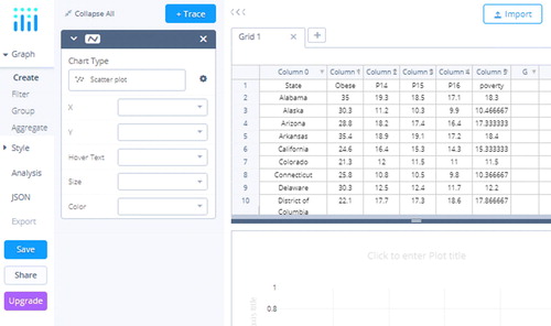
Fig. C2 Screen shot of the plotly Graph Maker interface after the scatterplot is created.
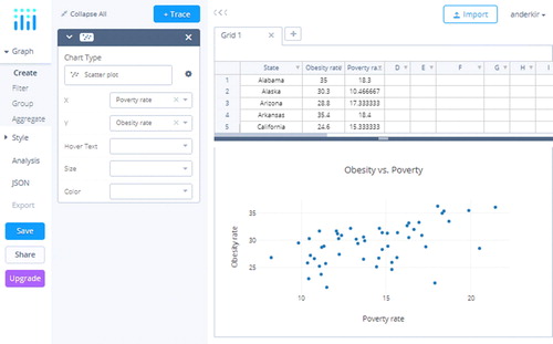
Fig. C3 Screen shot of the scatterplot with the regression line added.
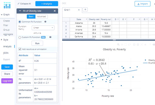
Fig. C4 Screen shot of the dialog box for creating a choropleth map. The choropleth map in the upper-right is selected, and variables are filled in on the right-hand side.
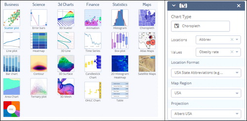
Fig. C5 Default plotly choropleth map (a) before and (b) after adding the title and label.
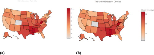
Fig. C6 Screen shot for changing the color scale.
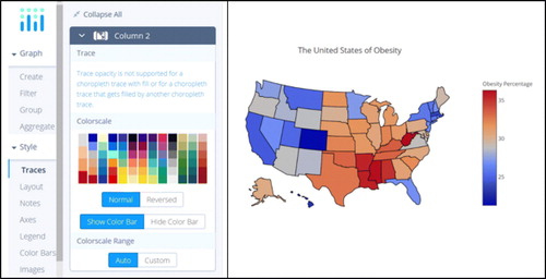
Fig. C7 Screen shot for changing the margins, including before and after maps.
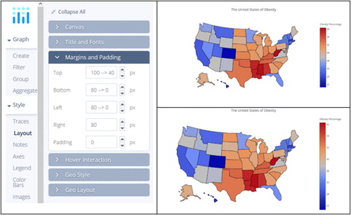
Fig. C8 Screen shot showing changing the resolution, including before and after maps.
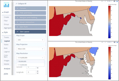
Fig. C9 The plotly dashboard.
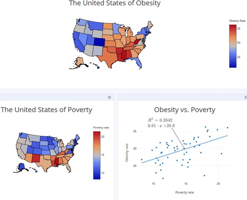
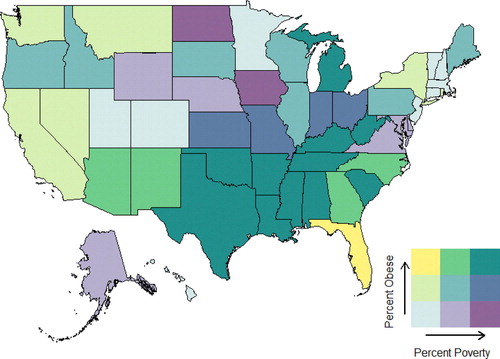
Fig. C10 Legend and corresponding scatterplot for obesity and poverty rates.
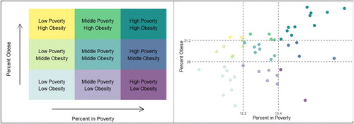
Fig. C11 Bivariate choropleth map for the percent obese/poverty data.