Figures & data
Table 1 Principles of graphic and analytical design.
Fig. M1 First example of exemplary student work. This data visualization employs a grid layout and makes good use of color. While the graphs are simple, they are clean and easy to read. The narrative adds to the story and does not reiterate characteristics that can easily be read from the graphs.

Fig. M2 Second example of exemplary student work. Students used Tableau to construct this data visualization. They have employed a variety of different graphs to tell their story. While the use of clip art is generally discouraged, the addition of the clip art stork works with this data visualization. The students have used color effectively. The justified text lends a clean, crisp look to the visualization.
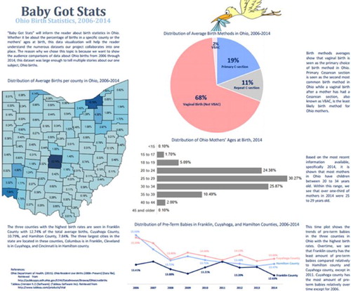
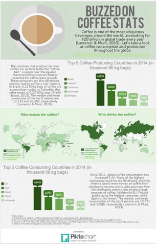
Fig. M3 Third example of exemplary student work. Students used Piktochart to create this data visualization. Notice the clean layout, good use of color, and playful designs created with the text.