
Figures & data
Figure 1. Population and estimated eigenvalues for a ten-dimensional CFA with 34 degrees of freedom. The × represent population eigenvalues, while the boxplots represent estimated eigenvalues across 200 replications at sample size n = 1500.
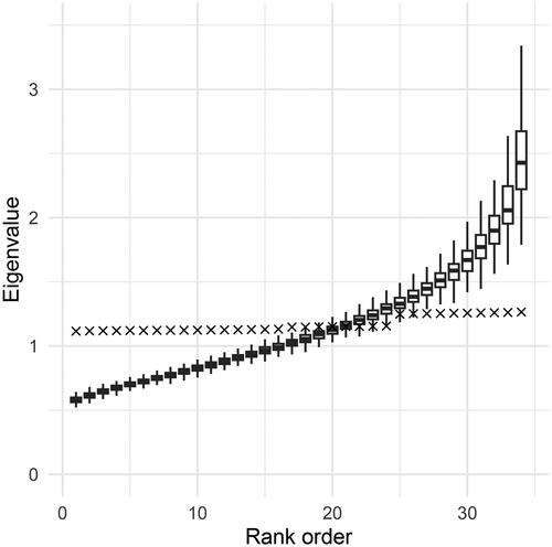
Figure 2. The sorted simulated data plotted against i/d for the curve in red is the theoretical quantile function. The curve in blue is the empirical quantile function. The dotted black values are the levels of the observations.
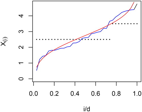
Figure 3. Estimated eigenvalues and associated weights for EBA and regression procedures. EBA2 = 2-block EBA, pEBA2 = penalized 2-block EBA, pOLS = penalized regression, SB = Satorra–Bentler.
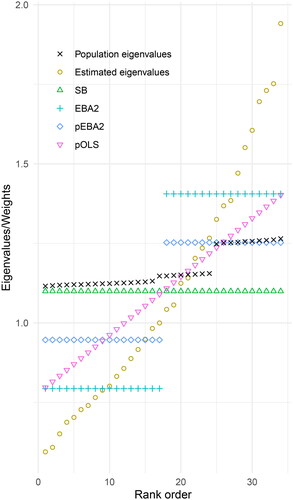
Table 1. Type I Error rates, normal data.
Table 2. Test performance across 6 non-normal distributions and 4 sample sizes, ranked in increasing RMSE order.
Table 3. Top ten robustified tests according to RMSE when aggregating 6 non-normal distributions, 4 sample sizes and 3 model sizes.
Figure 4. Rejection rates in % for six selected tests. Panel columns and rows correspond to model size and distribution, respectively.
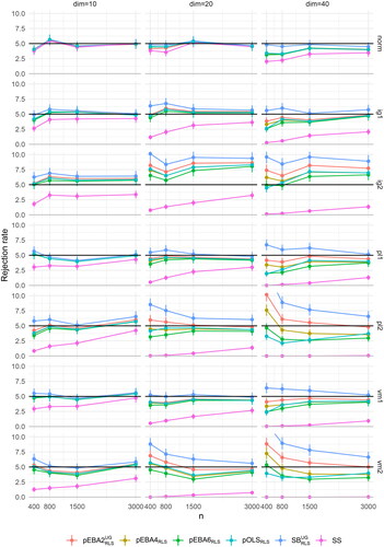
Table 4. Rejection rate in % for the bollen–stine bootstrap.
Table 5. Rejection rate in % for the test procedure, aggregated over all seven distributions.