Figures & data
Table 1. Groups of teacher-students.
Table 2. Categories used for data analysis.
Figure 1. (a) Number of posts by period. (b) Number of comments by period.
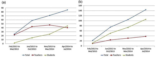
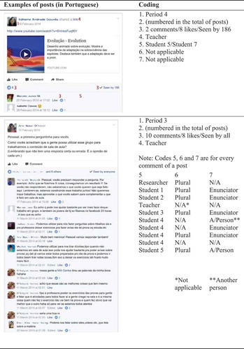
Figure 2. (a) Post from the first period analysed in this study: teacher posts, comments and students only “see” the post. (b) Post from the last period analysed in this study: teacher posts, students comment, like and see the post.
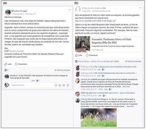
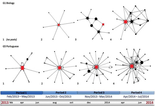
Figure 3. Network analysis from G1-Biology and G5-Portuguese during the four periods described in . The squares represent the teachers, and the circles represent students. G1-Biology has no graph for period 1 since the group started later than the other groups. Bigger figures represent the person interacted more inside the network.