Figures & data
Figure 1. Map of the South Coast Air Basin with approximate locations of relevant air quality monitoring stations.
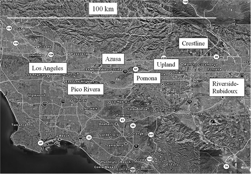
Figure 2. Trends in summer reactive organic gas and NOx emissions in tons per day for the South Coast Air Basin from 1975 to 2020 with 2008 base year (CARB, 2012b). Estimates for biogenic emissions are from the modeling inventory used in the 2012 SoCAB Air Quality Management Plan (SCAQMD, 2012).
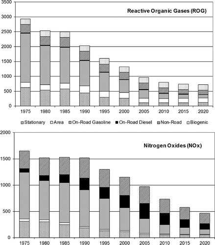
Figure 3. Trends in four-site (Los Angeles N. Main, Azusa, Pomona, and Rubidoux) average summer (May–October 1990–2010) Wednesday and Sunday 6–9 a.m. ambient CO, NOx, and CO/NOx.
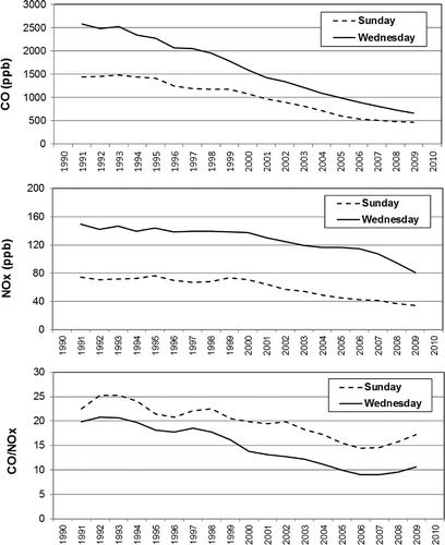
Figure 4. Trends in four-site (Los Angeles N. Main, Azusa, Pomona, and Rubidoux) average summer Wednesday and Sunday 6–9 a.m. ambient NMOC (ppbC) and NMOC/NOx ratios in the South Coast Air Basin.
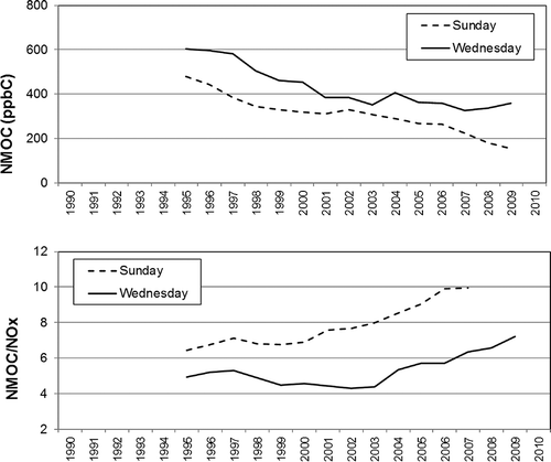
Figure 6. Trends in ozone exceedances (primary y-axis) by Sunday, Saturday, and weekdays for Los Angeles N. Main, Pomona, and Crestline and SoCAB design values (secondary y-axis).
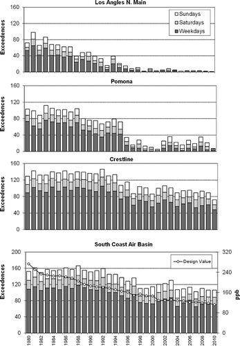
Table 1. Ozone, products of photooxidation, and indicator ratiosFootnote a predicted by box model simulations for 1985, 1995, 2005, and 2020 Footnote b
Figure 7. Mean 6–9 a.m. NMHC and NOx mixing ratios in the SoCAB during ozone episode days referenced to the 1987 SCAQS for 2010 and earlier based on ambient CO and NOx trends. Extrapolations to 2020 based on projected emissions from 2005 to 2020 of −10% NMHC and −40% NOx.
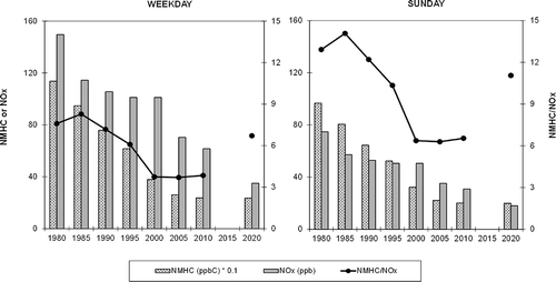
Figure 8. Predicted ozone mixing ratios (ppm) and formation rates (ppb/hr) from box model ozone simulations using the initial NMHC and NOx mixing ratios shown in Figure 7.
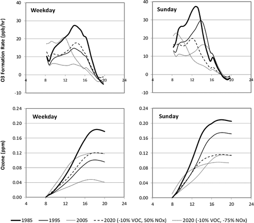
Figure 5. Trends in summer Sunday, weekday, and Sunday minus weekday mean maximum 8-hr ozone (ppb) during May–October 1980–2010 at Los Angeles N. Main, Azusa, Pomona, Upland, Riverside, and Crestline.
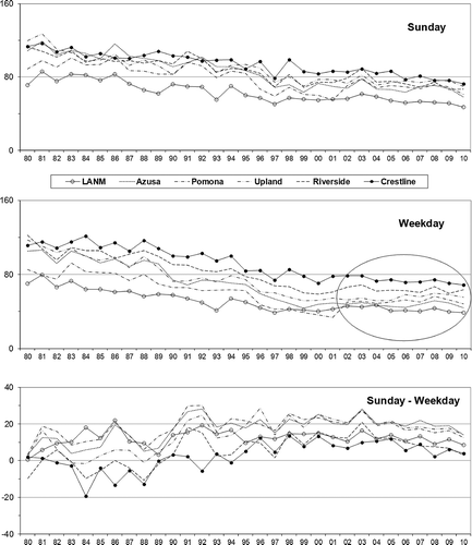
Figure 9. Ozone isopleth diagram for summer conditions in Los Angeles with initial weekday and Sunday NMHC and NOx mixing ratios from Figure 7. The two pairs of lines represent 2010 to 2020 changes of −10% VOC and −50% NOx (indicated by box) and −75% NOx (indicated by end of arrow). The left pair of lines represent an underestimation of VOC emission of a factor of 2 relative to the right pair of lines.
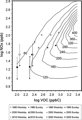
Figure 10. Ozone isopleth diagrams of VOC/NOx, ozone production efficiency, ozone formation rate, and nitric acid for summer conditions in Los Angeles.
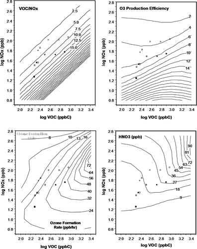
Figure 11. Trends in concentrations of PM2.5 mass (µg/m) and major components at Central Los Angeles and Rubidoux. Component data from 2003 to 2006 are from the Chemical Speciation Network, and PM2.5 mass data are from the CARB particulate matter monitoring program.
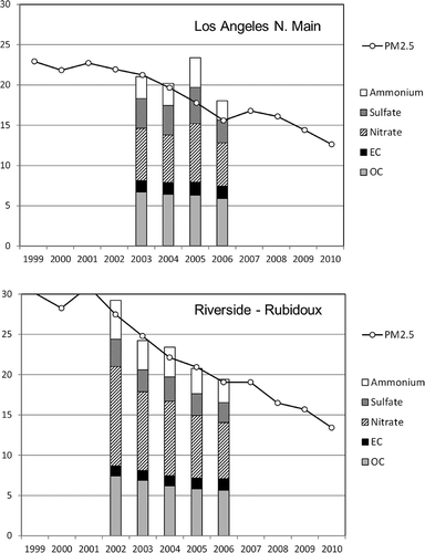
Table 2. Comparisons of ambient NMOC/NOx ratios measured at the SoCAB Photochemical Assessment Monitoring Stations with corresponding emissions inventory (E1) ratios for the nine 5 × 5-km grid cells surrounding the monitoring site for the month of July in 2009
Table 3. Trends in NMHC/NOx ratios of the average emissions in the month of July for the nine 5 × 5-km grid cells surrounding each of the five PAMS sites, five-site mean, and for basin-wide total and on-road motor vehicle (ORMV) emissions
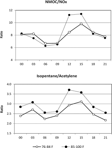
Figure 12. The combined mean diurnal variations in NMOC/NOx and isopentane/acetylene at Los Angeles N. Main and Azusa during summer 2009 for days with daily maximum temperature at downtown Los Angles of less than versus greater than or equal to 85 ˚F.