Figures & data
Table 1. Modeled and observed annual mean PM2.5 concentrations at LAQN sites in London in 2008. This also shows average daily traffic (ADT) and mean speed of the nearest roads for the roadside and kerbside stations
Figure 1. Study domain showing the road and street network, and location of the selected PM2.5 measurement locations in 2008. The geographical extent of the domain is 61 km × 52 km. Central London is located in the center of the domain with a dense road network. The suburban areas are in the outskirts with a relatively more sparse road network.
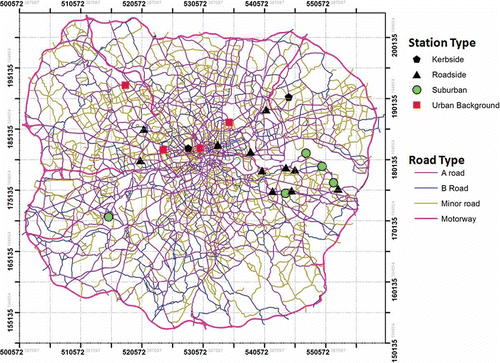
Figure 2. Time-series plot of modeled and observed daily mean concentrations at three selected sites in London in 2008.
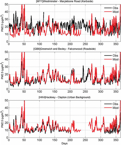
Figure 3. Scatter plot of modeled and observed hourly concentrations at three selected sites. These scatter plots include the counts of the data point to allow clearer interpretation of the results. The dotted lines indicate a factor of 2. The equation of the linear fit, R2, and correlation (ρ) are shown in the top left corner of each panel.
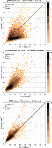
Figure 4. Box and whisker plot of the model performance evaluated against measured time series at 17 monitoring sites. The line in the middle of each box is the median. The tops and bottoms of each rectangle are the 25th and 75th percentiles. The whiskers (lines extending above and below each box) show the data range. Data beyond the whisker length are marked as outliers shown with + symbol. CORR: correlation, IOA: index of agreement, FAC2: factor of 2.
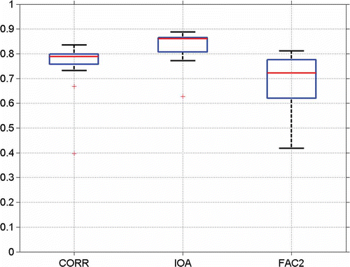
Figure 5. The scatter plot of the modeled against observed annual mean concentrations at urban background (circle), roadside (diamonds) and curbside (square) sites. There are 4 urban background, 12 roadside, and 2 curbside stations.
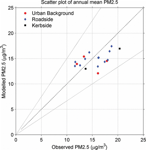
Table 2. Spatial evaluation statistics for annual mean PM2.5 using modeled against LAQN measurements at 18 sites
Figure 6. Mean modeled PM2.5 traffic increment at different perpendicular distances from the motorways, major roads, and other roads in London.
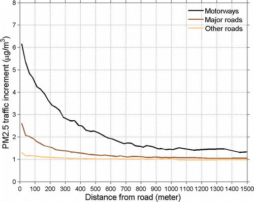
Figure 7. Box and whisker plot of the observed annual mean PM2.5 concentrations at different site types. Each whisker plot contains the variation of annual mean concentrations within a range of sites. The figure therefore also illustrates the total urban increments (i.e., the additional concentrations, compared with the rural background) at various site categories. The line in the middle of each box is the median. The tops and bottoms of each rectangular box are the 25th and 75th percentiles; the distances between the tops and bottoms are the inter-quartile ranges. Busy roads have been defined as the roads with ADT > 30,000 vehicles.
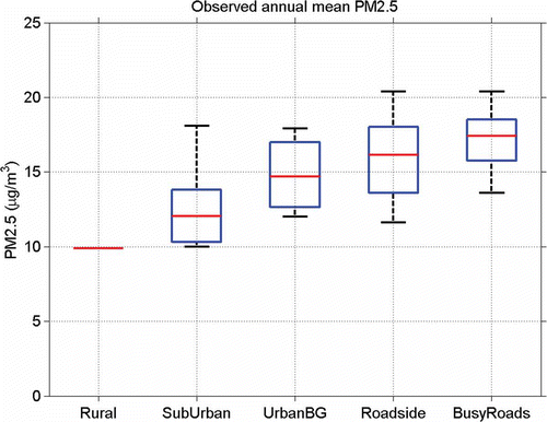
Figure 8. Predicted median urban traffic increment and median urban increment from all other urban sources except for urban traffic, and regional background at different categories of sites. The total urban increment is the sum of urban traffic and other sources (i.e., nontraffic) increments.
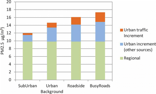
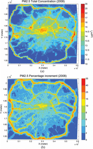
Figure 9. (a) Predicted spatial distributions of the annual mean PM2.5 concentrations in μg/m3, and (b) the urban traffic contributions to the total PM2.5 concentrations in percentages for London for the year 2008.