Figures & data
Figure 1. Site map of Gibson (a) and Petersburg/Ratts (b) study areas. The wind rose on the Gibson map represents wind speed and direction at the meteorological tower that is colocated with the East Road SO2 monitor and the wind rose on the Petersburg/Ratts map indicates wind speed and direction at the meteorological tower that is colocated with the Pike SO2 monitor.
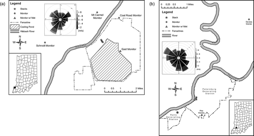
Table 1. Summary of emissions data for Gibson, Petersburg, and Ratts generating stations
Table 2. Summary of surface characteristics for Gibson, P/R, and KEVV
Table 3. DV ratios (predicted DV/observed DV) for 2010 at the six monitor–receptor sites under five modeling scenarios; “OS” and “NWS” refer to onsite and NWS meteorological data runs
Table 4. Robust Highest Concentration ratios (predicted RHC/observed RHC) for 2010 at the six monitor–receptor sites under five modeling scenarios; “OS” and “NWS” refer to onsite and NWS meteorological data
Figure 2. Q–Q plots of monitor vs. model hourly SO2 data for 2010 Gibson–Coal Road (a) and Petersburg/Ratts–Pike (b) data for five modeling scenarios: (1) AERMOD v12060, (2) AERMOD v12345 with No ADJ_U*, (3) AERMOD v12345 with ADJ_U*, (4) AERMOD v12345 with ADJ_U* and LOWWIND1, and 5() AERMOD v12345 with ADJ_U* and LOWWIND2. Coal Road and Pike data are presented because these two monitors are most often downwind of the source. Solid lines represent 1:1 agreement between the monitor and model, and the dotted lines represent a factor of 2 over- or underprediction.
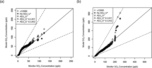
Figure 3. Hourly scatterplots of Gibson–Coal Road (a) and Petersburg/Ratts–Pike (b) for AERMOD v12345 with No ADJ_U* scenario.
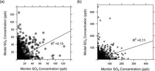
Table 5. Analysis of paired hourly monitor and model data using AERMOD v12345 No ADJ_U* model run with NWS meteorology (Cp = predicted concentration, Co = observed concentration)
Table 6. A summary of performance measures for the top 5% of hourly monitor and model data at all six sites using AERMOD v12345 No ADJ_U* model run with NWS meteorology (Cp = predicted concentration, Co = observed concentration)
Table 7. A summary of performance measures for the top 5% of Gibson–Coal Road and P/R–Pike monitor and model concentrations using AERMOD v12345 No ADJ_U* model run with NWS meteorology (Cp = predicted concentration, Co = observed concentration) under various meteorological conditions
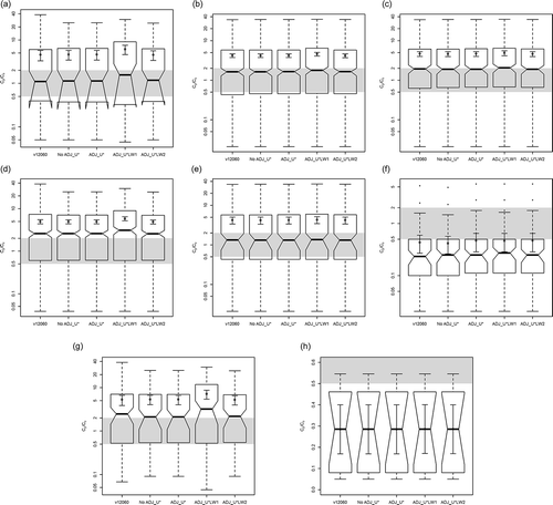
Figure 4. Adjusted box and whisker plots of Cp/Co at Coal Road for the upper 5% of data for each of eight meteorological scenarios: (a) wind speed <2 m/sec, (b) wind speed >2 m/sec, (c) wind speed >4 m/sec, (d) unstable, (e) stable, (f) neutral, (g) low wind and unstable conditions, (h) low wind and stable conditions. The thick, dark line represents the median and the notches in each box represent the 95% confidence interval around the median. The unfilled circle corresponds to the population mean with error bars representing the 95% confidence interval around the mean. The shaded area represents the range of values acceptable for a “good model,” as defined by CitationChang and Hanna (2004) and CitationKumar et al. (2006).