Figures & data
Table 1. PM monitors and samplers used in the CHS
Figure 1. Map of CHS communities.
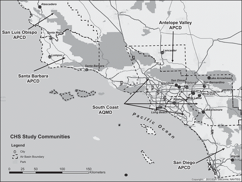
Figure 2. Air quality trends (1992–2011) in the CHS communities.
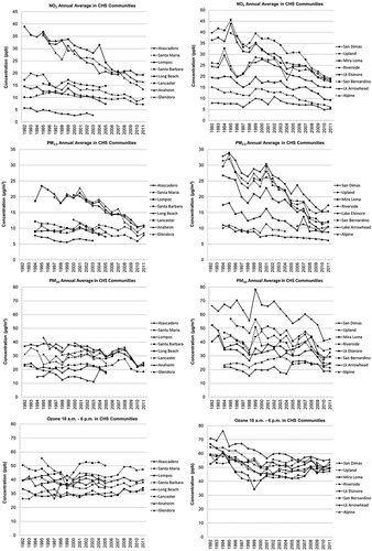
Table 2. Estimated emissions and emission reductions in the SoCAB (1993 to 2012)
Figure 3. Estimated NOx, ROG, PM2.5, PM10, and SOx emissions in the SoCAB from 1992 to 2012.
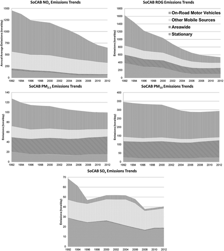
Table 3. Estimated emissions and emission reductions in Santa Barbara County (1993 to 2012)
Figure 4. Comparison of NO2 air quality and NOx emission trends, and PM2.5 air quality and PM2.5, PM10, NOx, and ROG emission trends. The normalized trends (right side) compare air quality and emissions to the baseline values (100%) in 1993 for NO2 and 1994 for PM2.5.
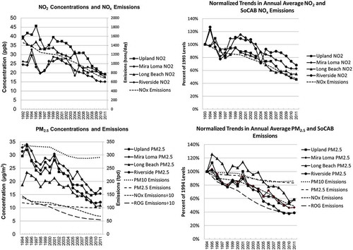
Table 4. Major regulatory policies affecting pollution and emission trends in California, 1985–2012
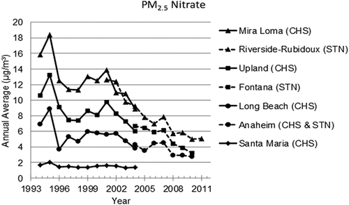
Figure 5. PM2.5 nitrate air quality trends at CHS and STN monitoring sites.