
Figures & data
Arlene M. Fiore

Table 1. Acronyms.
Table 2. Near-term climate forcing air pollutants (and precursors) with CO2 shown for comparison; although emissions for SLCPs are much smaller than CO2, they have much larger GWPsa over 100 years.
Figure 1. Globally averaged radiative forcing (RF; see Key Terms) of climate from preindustrial (1750) to present (2011) of air pollutants and their precursor emissions, as compared to carbon dioxide (CO2) emissions. PM components (also referred to as aerosols) include sulfate, nitrate, black carbon (BC), organic carbon (OC) and dust. The RF from aerosol–radiation interactions is shown for aerosol components except for “aerosol–cloud,” which is the effective radiative forcing (ERF; see Key Terms) from aerosol–cloud interactions. Values are the IPCC (Citation2013a) best estimates assessed by Myhre et al. (Citation2013a; their Table 8.SM.6; colored bars), with uncertainty ranges (their Table 8.SM.7; black vertical bars). Through atmospheric chemistry, many emitted species (methane [CH4], carbon monoxide [CO], nonmethane volatile organic compounds [NMVOC], nitrogen oxides [NOx], ammonia [NH3], and sulfur dioxide [SO2]) influence multiple atmospheric constituents (“Radiative Forcing Components”). Also shown are BC and OC RFs from biofuel and fossil fuel combustion (BF + FF), from biomass burning (BB) and from BC deposited on snow (Snow Alb.). Rapid adjustments to all aerosol-radiation interactions reduce the ERF by –0.1 W m2 (Table 8.6; Myhre et al., Citation2013a). The total global average anthropogenic RF for all components (including additional GHGs such as halocarbons and nitrous oxide, and land-use change) is +2.3 W m−2 (90% confidence range of +1.1 to +3.3 W m−2; Myhre et al., Citation2013a).
![Figure 1. Globally averaged radiative forcing (RF; see Key Terms) of climate from preindustrial (1750) to present (2011) of air pollutants and their precursor emissions, as compared to carbon dioxide (CO2) emissions. PM components (also referred to as aerosols) include sulfate, nitrate, black carbon (BC), organic carbon (OC) and dust. The RF from aerosol–radiation interactions is shown for aerosol components except for “aerosol–cloud,” which is the effective radiative forcing (ERF; see Key Terms) from aerosol–cloud interactions. Values are the IPCC (Citation2013a) best estimates assessed by Myhre et al. (Citation2013a; their Table 8.SM.6; colored bars), with uncertainty ranges (their Table 8.SM.7; black vertical bars). Through atmospheric chemistry, many emitted species (methane [CH4], carbon monoxide [CO], nonmethane volatile organic compounds [NMVOC], nitrogen oxides [NOx], ammonia [NH3], and sulfur dioxide [SO2]) influence multiple atmospheric constituents (“Radiative Forcing Components”). Also shown are BC and OC RFs from biofuel and fossil fuel combustion (BF + FF), from biomass burning (BB) and from BC deposited on snow (Snow Alb.). Rapid adjustments to all aerosol-radiation interactions reduce the ERF by –0.1 W m2 (Table 8.6; Myhre et al., Citation2013a). The total global average anthropogenic RF for all components (including additional GHGs such as halocarbons and nitrous oxide, and land-use change) is +2.3 W m−2 (90% confidence range of +1.1 to +3.3 W m−2; Myhre et al., Citation2013a).](/cms/asset/624b5f12-a704-4f38-8d9f-3a6a95073280/uawm_a_1040526_f0001_c.jpg)
Figure 2. Air quality and climate connections, following Figure 2 of Isaksen et al. (Citation2009), of Jacob and Winner (Citation2009), and of Fiore et al. (Citation2012). Anthropogenic and natural emitted species include CH4, CO, NMVOC, NOx, SO2, NH3, OC, BC, dimethyl sulfide (DMS; from oceanic biota), mineral dust, and sea salt. Orange text describes atmospheric processing (formation, removal, and transport) of air pollutants. Black text with black arrows indicates the sensitivity of these processes to climate warming; thinner arrows denote lower confidence or regional variability in the sign of the change (increase is up; decrease is down; double-headed arrow implies no clarity on the sign of change) in response to a warming climate. Dual black symbols in the parentheses indicate how (O3, PM) respond to the change indicated for each process (for double-headed arrows, the (O3, PM) response denoted is for an increase in the process): ++ consistently positive, + generally positive, = weak or variable; - generally negative, – consistently negative, ? uncertainty in the sign of the response, and * the response depends on changing oxidant levels. Not shown are primary biological aerosol particles (PBAP; e.g., pollen, fungi, bacteria, algae, and viruses), which may affect climate (Després et al., Citation2012).
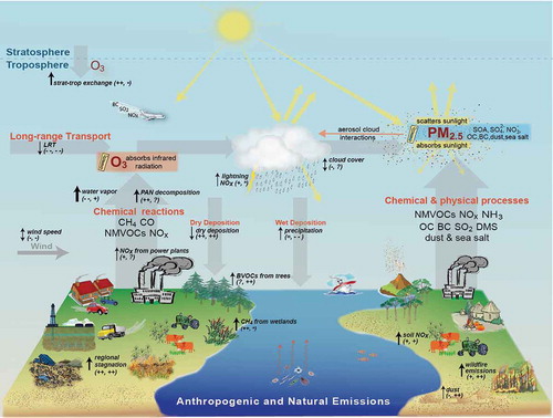
Figure 3. Interactions between aerosols and solar radiation and clouds. The top panel shows aerosol–radiation interactions, which include the direct influence of scattering and absorbing aerosol particles and albedo reduction of surface snow/ice cover by BC, and the rapid feedback due to atmospheric warming by BC, the semidirect effect. The lower panel depicts aerosol–cloud interactions and aerosol-induced changes in cloud properties, including higher albedo (left) and longer lifetime (right). The cloud albedo effect is often termed the first aerosol indirect effect (Twomey, Citation1977) and the cloud lifetime effect is often termed the second aerosol indirect effect (Albrecht, Citation1989). The aerosol–radiation interactions and aerosol–cloud interactions nomenclature is a recasting of the aerosol direct effect and aerosol indirect effects, respectively (Boucher et al., Citation2013). Radiative and effective radiative forcing estimates include 5th–95th percentile confidence intervals (Myhre et al., Citation2013a).
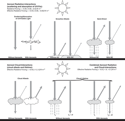
Figure 4. Estimated climate forcing from aerosols at selected historical and future time periods, and an example of changes in climate by the 2090s due to aerosol reductions. (a) Global mean ERF (see Key Terms) relative to 1850 estimated from multimodel (ACCMIP CCMs) time slice simulations at 1930, 1980, 2000, 2030, and 2100. Also shown are the spatial patterns of all aerosol ERF at 1980 and 2000 relative to 1850, and at 2030 and 2100 under RCP8.5 relative to 2000. (b) Estimated impact on climate from 21st-century reductions in atmospheric aerosol abundances as projected by one CCM (GFDL CM3) for RCP4.5; SO2 trends are similar to RCP8.5. Top panel: decrease in annual sulfate burden at the end of the 21st century. Middle and bottom panels: changes and temperature and precipitation, respectively, induced by the aerosol reductions. The changes in (b) are obtained by differencing a set of scenarios: One follows the RCP4.5 scenario for both GHGs and PM, and another holds PM and its precursors at 2005 levels but follows RCP4.5 for GHGs. White areas in the top two panels are where the difference between the two simulations is less than twice the standard deviation of annual variability in a control simulation (perpetual 1860 conditions). Adapted with permission from (a) Figure 18 of Shindell et al. (Citation2013) in accordance with the license and copyright agreement of European Geosciences Union, and (b) Figure 6 of Levy et al. (Citation2013) according to the license and copyright agreement of American Geophysical Union.
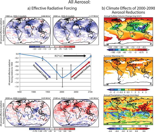
Figure 5. Illustrative approach comparing RF contributions by species from 13 major anthropogenic emission sectors with perpetual year 2000 emissions by (a) 2020 and (b) 2100, adapted with permission from Figure 1 of Unger et al. (Citation2010). The RFs from O3 and PM and their precursors are estimated using a CCM, while the RFs from CH4, nitrous oxide (N2O), and CO2 are estimated with a reduced complexity climate model (Table S1). The net RF is shown next to each sector. Reductions in emissions from sectors with positive RFs will produce a climate cooling, and vice versa. The RF from individual atmospheric constituents is shown in color, for example, of BC-rich sectors as household biofuel, and on-road transportation (largely from diesels). AIE denotes aerosol–cloud interactions formerly referred to as the aerosol indirect effect (). Sector rankings (from strongest warmers to strongest coolers) change from near-term (a) to long-term (b) due to different atmospheric lifetimes of species. Uncertainties in these estimates reflect poorly bounded emission magnitudes including for cooling versus warming agents and naturally arising climate variability, and are largest for household fossil fuel and biofuel, off-road (land) transportation, shipping, biomass burning, and agricultural waste burning.
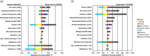
Figure 6. Covariance between O3 and temperature as measured at the Pennsylvania State Clean Air Status and Trends Network (CASTNet) site in Pennsylvania (41º N, 78º E, 378 m). (a) July mean maximum daily 8-hr average (MDA8) O3 (black line and circles; left axis) and July mean daily maximum temperature (red line and triangles; right axis) from 1988 to 2014. (b) Scatterplot of the time series in (a) for 1988–2001 (black) and 2002–2014 (red); ordinary least squares slopes and correlation coefficients are shown, illustrating the shift after 2002 induced by regional NOx emission controls (Bloomer et al., Citation2009). A color version of this figure is available online.
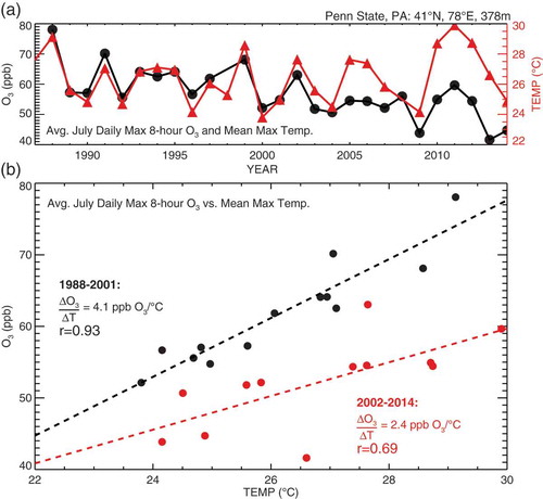
Figure 7. Accumulation and ventilation of eastern U.S. pollution modulated by synoptic weather events. Maximum daily 8-hr average (MDA8) O3 (top row), daily 24-hr average PM2.5 (middle row) measured by the EPA Air Quality System, and sea-level pressure (SLP, bottom row) during a late June 2012 heat wave event, following Figure 1 of Leibensperger et al. (Citation2008). On June 26, O3 and PM2.5 remain low as a high-pressure system begins to build in the Midwest behind a passing mid-latitude cyclone (low-pressure system). As the high pressure slowly migrates southeastward June 27–28, pollutants accumulate to maxima exceeding 90 ppb for MDA8 O3 and 25 μg m−3 for 24-hr PM2.5, degrading air quality. Relief arrives through ventilation by the cold front of a mid-latitude cyclone on June 29–30. SLP data are from the National Center for Environmental Prediction-Department of Energy Reanalysis 2, and synoptic analysis is based upon the NOAA Daily Weather Maps archive (http://www.hpc.ncep.noaa.gov/dailywxmap). A color version of this figure is available online.
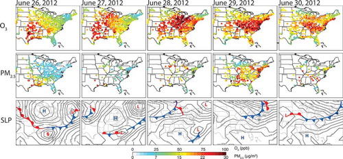
Figure 8. Models indicate a climate penalty (see Key Terms) on surface O3 over the northeastern U.S. but disagree over other regions. Simulated changes in summer mean MDA8 O3 (ppb) in surface air in 2050 relative to 2000 under climate warming, holding O3 precursor emissions constant at 2000 levels: (a) estimated with a GCM-CTM, the first to point out the climate penalty (reproduced with permission from Figure 2b of Wu et al. [Citation2008a] in accordance with the license and copyright agreement of American Geophysical Union); and (b) regional spatial averages from seven models, each represented by an individual bar, with each group of bars representing one of (c) five U.S. regions. The Harvard model bars in (b) are derived from the simulation shown in (a). Panels (b) and (c) are reproduced from Figures 6 and 7a of Weaver et al. (Citation2009). ©American Meteorological Society. Used with permission. A color version of this figure is available online.
![Figure 8. Models indicate a climate penalty (see Key Terms) on surface O3 over the northeastern U.S. but disagree over other regions. Simulated changes in summer mean MDA8 O3 (ppb) in surface air in 2050 relative to 2000 under climate warming, holding O3 precursor emissions constant at 2000 levels: (a) estimated with a GCM-CTM, the first to point out the climate penalty (reproduced with permission from Figure 2b of Wu et al. [Citation2008a] in accordance with the license and copyright agreement of American Geophysical Union); and (b) regional spatial averages from seven models, each represented by an individual bar, with each group of bars representing one of (c) five U.S. regions. The Harvard model bars in (b) are derived from the simulation shown in (a). Panels (b) and (c) are reproduced from Figures 6 and 7a of Weaver et al. (Citation2009). ©American Meteorological Society. Used with permission. A color version of this figure is available online.](/cms/asset/9abd8ea0-4f19-496f-82f6-e53f0d274637/uawm_a_1040526_f0008_oc.jpg)
Figure 9. Over the Northeastern U.S.A., NOx emission reductions may guard against a climate penalty (see Key Terms) on MDA8 surface O3 and may reverse the O3 seasonal cycle; rising CH4 induces a year-round O3 increase, most pronounced in winter when the O3 lifetime is longest. Simulated MDA8 surface O3 (ppb) over the northeastern U.S. (36–46° N, 70–80° W; land only) averaged over 2006–2015 (black) and 2091–2100 (gray) in the GFDL CM3 CCM. (a) A regional warming of 5.5°C increases O3 from May to September (gray vs. black triangles), diagnosed from a simulation in which well-mixed GHGs follow RCP8.5 but air pollutants are held fixed at 2005 levels (RCP8.5_WMGG; CH4 follows RCP8.5 for climate forcing but is held at 2005 levels for chemistry). (b) Under the RCP8.5 scenario, CH4 roughly doubles by the end of the century but NOx emissions decline, decreasing O3 during the warm season but increasing it during the cold season (black vs. gray circles). The NOx emission reductions yield summertime O3 decreases but wintertime increases, diagnosed with a sensitivity simulation in which CH4 is held at 2005 levels but all other air pollutants and GHGs follow RCP8.5 (RCP8.5_2005CH4; black vs. gray triangles). Doubling of global CH4 partially offsets the warm season decrease and amplifies the winter–spring increase (gray circles vs. gray triangles). Symbols show decadal averages from individual ensemble members where available; lines show ensemble means. Adapted with permission from Figure S3 of Clifton et al. (Citation2014) according to the license and copyright agreement of American Geophysical Union.
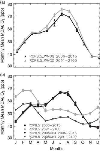
Figure 10. O3 and PM air quality improves under the RCP scenarios, except that O3 increases under RCP8.5 (reflecting the doubling of global CH4), with little variation across the RCP scenarios despite a wider published range. Decreases are generally largest over the eastern U.S., where present-day anthropogenic emissions are largest. The figure follows those by Fiore et al. (Citation2012) and Kirtman et al. (Citation2013), and shows projected changes in (a) summer (June–July–August), (b) winter (December–January–February) mean surface O3 (ppb mole fraction), and (c) annual mean surface PM2.5 (μg m–3 air; calculated as the sum of individual aerosol components except nitrate) from 1950 to 2100 following the historical (1950–2000) and RCP scenarios (to 2100) over seven contiguous U.S. regions defined in Melillo et al. (Citation2014). The discontinuity at 2006 occurs because the precursor emission projections used by the CMIP5/ACCMIP models were not yet harmonized to base year 2000 levels. Results shown are averaged over each of the shaded regions. Continuous colored lines denote the average of 4 or fewer CMIP5 CCMs. Colored dots denote the average of 3, 9, 2, and 11 (or fewer) ACCMIP models for 2010, 2030, 2050, and 2100 decadal time slice simulations, respectively. The shading about the lines and the vertical bars on the dots represent the full range across models. Changes are relative to the 1986–2005 reference period for the CMIP5 transient simulations, and to the average of the 1980 and 2000 decadal time slices for the ACCMIP models. The average value and model standard deviation for the reference period is shown in each panel (CMIP5 models at upper left and ACCMIP models at upper right). A color version of this figure is available online.
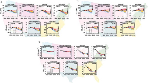
Figure 11. Extreme summer (JJA) MDA8 O3 pollution levels in near-surface air over the eastern U.S. characterized in terms of 1-year return levels (see Key Terms) for 23 sites in the U.S. Clean Air Status and Trends Network (CASTNet) for (A) 1988–1998 and (B) 1999–2009. Also shown are 1-year return levels projected with a CCM (GFDL CM3; bias corrected as described by Rieder et al., Citation2015). Panels C and D show 1-year return levels at mid-century (2046–2055); panels E and F show 1-year return levels for each 21st-century decade, spatially averaged over the region in C and D. Following RCP4.5 (C and E), both air pollutant emissions and GHGs change, but under RCP4.5_WMGG (D and F), air pollutant emissions are held at 2005 levels while GHGs follow RCP4.5. Observed decreases in (B) relative to (A) are attributed to NOx emission reductions (e.g., NOx SIP Call) during this period; additional NOx emission reductions projected under RCP4.5 (decreases of 60% by 2030, 75% by 2050, and 84% by 2100, relative to 2005 values over the eastern U.S.) produce even lower 1-year return levels in C and E. Increases in 1-year return levels induced by climate change are limited to a few ppb, with some regions experiencing decreases of up to a few ppb. (Rieder et al., Citation2015). Panels A and B are adapted from Figures 3a and 3c of Rieder et al. (Citation2013) in accordance with the Creative Commons Attribution 3.0 Unported (CC-BY) license available at http://creativecommons.org/licenses/by/3.0; panels C, D, E, and F are adapted with permission from Figures 5c, 7b, 7b, and 8b, respectively, of Rieder et al. (Citation2015), in accordance with the license and copyright agreement of American Geophysical Union. A color version of this figure is available online.
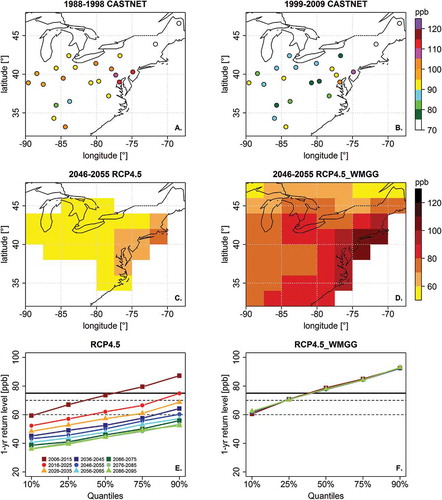
Figure 12. Comparison of GMST response to CO2 versus SLCPs. (a) Observed temperature evolution from 1970–2010 (black line) and future scenarios: reference (green line), control measures applied to anthropogenic emissions of CO2 to stabilize at 450 ppm (purple), and control measures phased in between 2010 and 2030 for CH4 (blue dotted line), CH4 plus BC (with technological measures only; blue dashed line), CH4 plus all BC (both technological and regulatory measures; solid blue line). Also indicated are 1ºC and 2°C temperature thresholds relative to 1890–1910. Adapted with permission from Shindell et al. (2012), in accordance with the license and copyright agreement of Science magazine. (b) Comparison of 21st-century GMST relative to preindustrial for “no CO2 mitigation” (RCP8.5) versus “with CO2 mitigation” (RCP2.6) pathways; color indicates contributions from specific NTCF control measures (see inset for larger view of their influence on GMST in 2100). Adapted with permission from Figure 1 of Rogelj et al. (Citation2014b). (c) Extension of the scenarios in (a) to 2200 shows that SLCP reductions absent CO2 controls can only delay the eventual CO2-driven warming (purple vs. blue lines), and may lead to greater decadal warming rates once SLCP controls are fully implemented (compare slopes of the purple line in the early vs. late 21st century). CO2 mitigation eventually slows the decadal warming rate (blue vs. purple lines in the second half of the 21st century). Combined CO2 and SLCP controls (pink line) lessen both near-term and long-term warming, and the rate of increase to peak warming. Adapted with permission from Figure 2 of Shoemaker and Schrag (Citation2013) in accordance with the license and copyright agreement of Climatic Change.
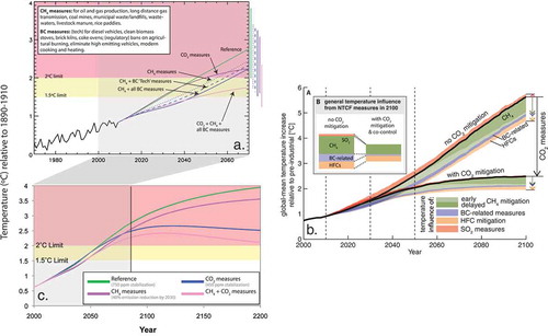
Table 3. Recommendations to fill current knowledge gaps.