Figures & data
Figure 1. Study area, Mumbai city.
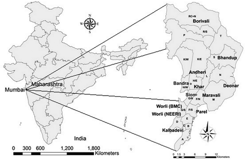
Figure 2. Annual average concentration of SO2, NO2, and SPM.
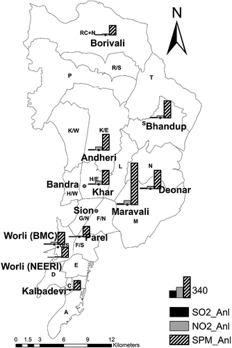
Table 1. Seasonal average concentration and standard deviation in the seasons.
Figure 3. Comparison of interpolated SO2 concentration with observed concentration at two locations.
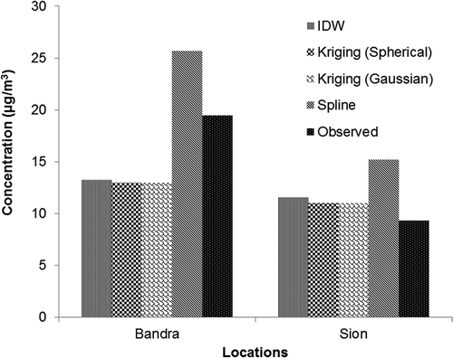
Table 2. Concentration-response coefficients of pollutants for health impact.
Figure 4. Comparison of interpolated NO2 concentration with observed concentration at two locations.
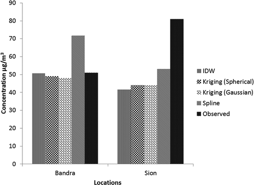
Figure 5. Comparison of interpolated SPM concentration with observed concentration at two locations.
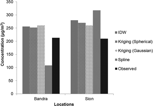
Figure 6. Population of Mumbai 2011 census.
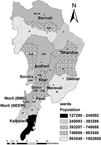
Figure 7. Annual average baseline and monitored concentration for pollutants at various locations.
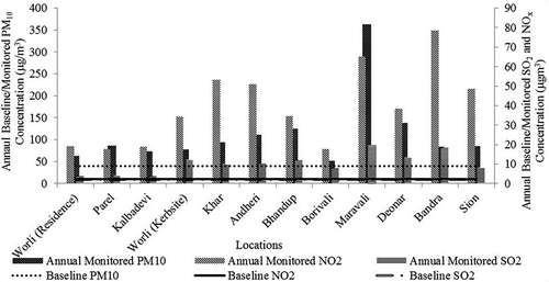
Figure 8. Population exposed by (a) PM10, (b) NO2, and (c) SO2 at various locations.
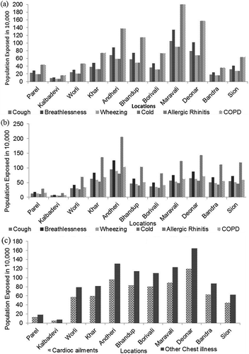
Figure 9. Health cost in millions USD for (a) NO2 and (b) PM10 at various locations.
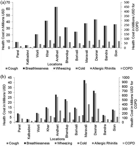
Table 3. Total health impact and cost of health impact for the disease and pollutants.
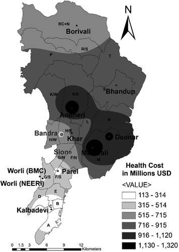
Figure 10. Contour plot for health cost in millions USD for total cost from NO2 and PM10 at various locations.