Figures & data
Figure 1. The locations of the particulate matter and temperature monitoring stations in the interior of British Columbia, Canada, as well as the boundaries of the local health areas (LHAs) included in this study.
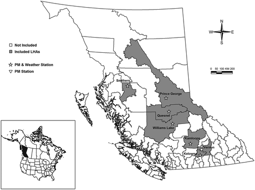
Figure 2. The study period was 2003–2015, but complete data were not available for each community. This visual summary indicates the data availability for PM10, PM2.5, temperature, relative humidity, and the influenza season in each community, ordered by the size of the population.
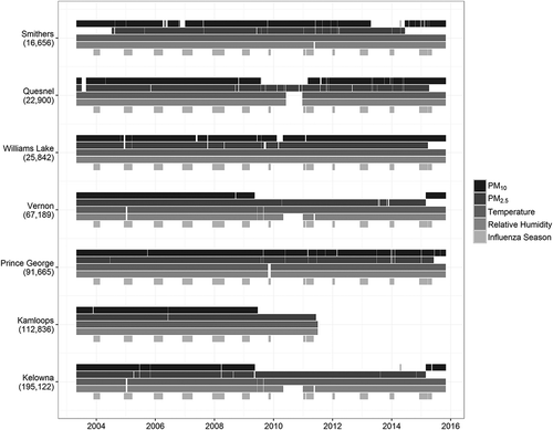
Figure 3. These heat maps visualize the seasonal variation in particulate matter (PM) for the seven communities contributing to the analyses. Each of the PM2.5, PM10, and PM10-2.5 categories for each community is normalized to itself, where darker shades represent months of higher PM in that community, and lighter shades represent months of lower PM.
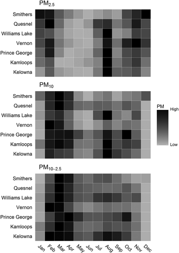
Table 1. Summary demographic information, mean daily values for the health indicators, and median particulate matter (PM) concentrations (μg/m3) during the study seasons for seven communities located within seven local health areas (LHAs) that were included in the study.
Figure 4. Poisson regression and random effect meta-analysis results for the relationship between salbutamol sulfate dispensations and a one interquartile range (IQR) increase in different categories of particulate matter (PM) stratified by season and ordered by population size. The bottom panels show PM2.5 adjusted for PM10-2.5 and PM10-2.5 adjusted for PM2.5, respectively. The y-axis is the percent change in dispensation rates, and is on a different scale for the meta-analysis boxes. Arrows represent confidence intervals extending past the boundaries of the plots.
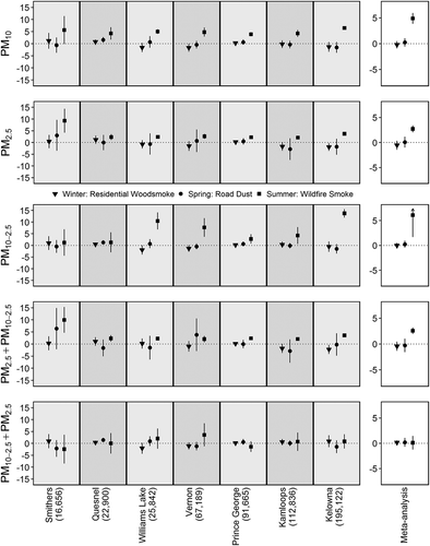
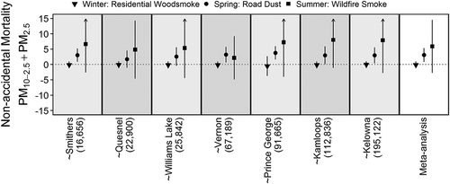
Figure 5. Poisson regression and random effect meta-analysis results for the relationship between nonaccidental mortality and a one interquartile range (IQR) increase in different categories of particulate matter (PM) stratified by season and ordered by population size. The bottom panels show PM2.5 adjusted for PM10-2.5 and PM10-2.5 adjusted for PM2.5, respectively. The y-axis is the percent change in mortality rates, and is on a different scale for the meta-analysis boxes. Arrows represent confidence intervals extending past the boundaries of the plots.
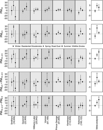
Figure 6. Lag time sensitivity analyses for the random effect meta-analysis results between nonaccidental mortality and PM10-2.5 adjusted for PM2.5 during road dust season (top) and between salbutamol sulfate dispensations and PM2.5 adjusted for PM10-2.5 during the wildfire smoke season (bottom). Plots show the same-day (lag0) reported in the results and the estimates for the exposures averaged over 0–1 days (lag01) and 0–4 days (lag04).
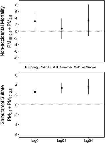
Figure 7. Leave-one-out sensitivity analyses for the random effect meta-analysis results between non-accidental mortality and PM10-2.5 adjusted for PM2.5. The tilde identifies the community that was removed from the meta-analysis, ordered by population size. For example, the panel corresponding to ~Vernon indicates that the estimate for the wildfire smoke season was attenuated when data from Vernon were omitted. The y-axis is the percent change in mortality rates, and arrows represent confidence intervals extending past the boundaries of the plots.