Figures & data
Table 1. Summary of regulatory and recommended exposure limits for carbon monoxide.
Table 2. Characteristics of the homes included in the study.
Figure 1. A typical wood storage container (bag) used for storage of bulk pellets. The temperature and CO monitors are shown in the upper left corner.
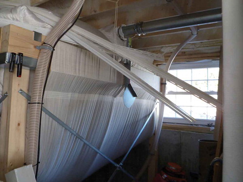
Table 3. Mean ± standard deviation of the CO concentrations in ppm measured by each monitor over approximately 1-hr intervals for each calibrated CO test. Note. The calibration concentrations are shown as the column headings. No calibration data are available for CO monitors 1, 18, and 24.
Figure 2. Histograms showing the frequency distributions for CO monitors in the laboratory and control homes. Measurements resolution was 5 min. Black lines demarcate complete bins up to and including 9 ppm (to the left) and greater concentrations (to the right).
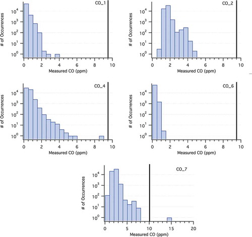
Figure 3. Histograms showing the frequency distributions for CO monitors in the homes with outdoor pellet storage. Black lines demarcate complete bins up to and including 9 ppm (to the left) and greater concentrations (to the right).
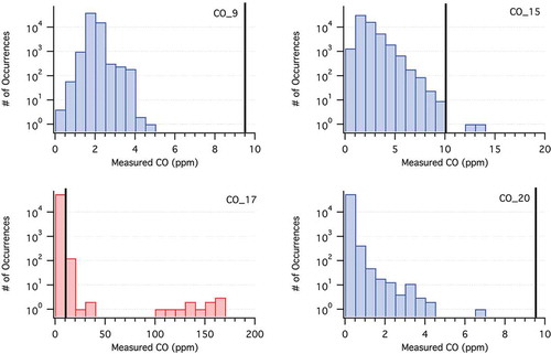
Figure 4. Histograms showing the frequency distributions for CO monitors in the homes (3, 5, 8, 10–14) with indoor pellet storage. Black lines demarcate complete bins up to and including 9 ppm (to the left) and greater concentrations (to the right).
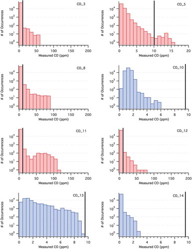
Figure 5. Histograms showing the frequency distributions for CO monitors in the homes (16, 18, 19, 21–25) with indoor pellet storage. Black lines demarcate complete bins up to and including 9 ppm (to the left) and greater concentrations (to the right).
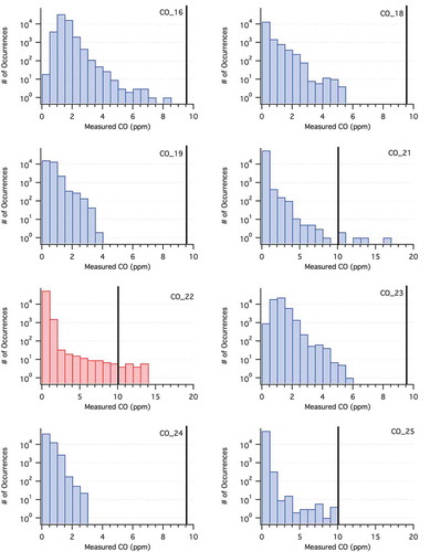
Figure 6. Example calibrated final CO and temperature (T) time series plots for the Controls homes. The CO is identified with blue curves (left axes) and T with gray curves (right axes).
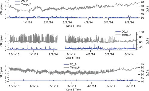
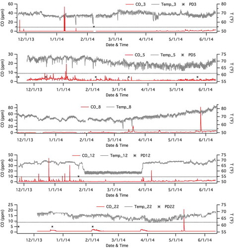
Figure 7. Example plots of calibrated final CO (red curves, left axes) and T (gray curves, right axes) time series for homes with indoor pellet storage where levels of CO exceeded 9 ppm. Final CO (red curves, left axes) and T (gray curves, right axes) data for homes with indoor pellet storage. The 9-ppm threshold is approximately denoted by a horizontal dashed black line in each panel. Pellet deliveries are denoted by asterisks indicating the date of delivery. Not all participants provided pellet delivery information.