Figures & data
Figure 1. Study area and data collection sites.
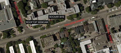
Figure 2. The traffic simulation network (using the PTV Vissim platform).
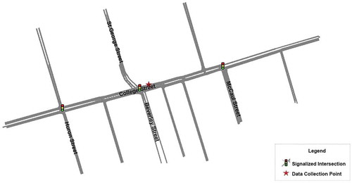
Figure 3. Comparison of hourly traffic volumes between radar records and manual counts in (a) the WB direction and (b) the EB direction.
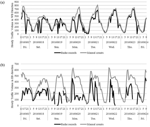
Figure 4. Hourly truck volumes and truck proportions on Thursday and Sunday. (Based on webcam/manual results.)
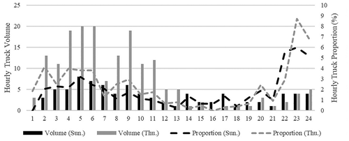
Figure 5. Box plots of hourly emission factors (EFs) derived from emission model and plume-based method for weekday and weekend: (a) distribution of hourly nitrogen oxide (NOx) emission factors; (b) distribution of hourly carbon monoxide (CO) emission factors. Boxes represent the interquartile range (25th to 75th percentiles), and whiskers indicate the minimum and maximum values. Dots indicate outliers, and crosses refer to mean values.
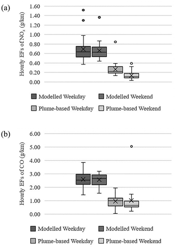
Figure 6. Box plots of hourly segment emissions (left) and stacked bar charts of average proportions of transit buses, trucks, and other vehicles (right) for transit bus and streetcar networks: (a) distribution of hourly carbon monoxide (CO) emissions (left) and contribution of vehicle classes (right); (b) distribution of hourly nitrogen oxide (NOx) emissions (left) and contribution of vehicle classes (right); (c) distribution of hourly elemental carbon (EC) emissions (left) and contribution of vehicle classes (right). The transit bus and streetcar in the parentheses refer to transit bus network and streetcar network, respectively. Boxes represent the interquartile range (25th to 75th percentiles), and whiskers indicate the minimum and maximum values. Dots indicate outliers, and crosses refer to mean values.
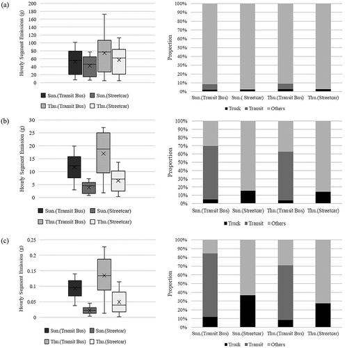
Figure 7. Stacked bar charts of relative contribution of vehicle classes to air quality: (a) relative contribution of vehicle classes to CO concentrations; (b) relative contribution of vehicle classes to NOx concentrations; (c) relative contribution of vehicle classes to EC concentrations.
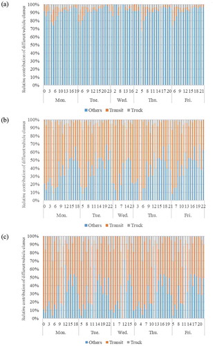
Table 1. Ratios of EFs between transit bus and fleet average, and ratios of per passenger emissions between transit bus and private vehicles.
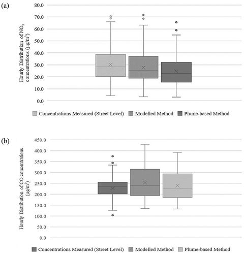
Figure 8. Box plots of hourly concentrations derived from emission model and plume-based method, as well as measured concentrations at street level, for two pollutants: (a) distribution of hourly nitrogen oxide (NOx) concentrations; (b) distribution of hourly carbon monoxide (CO) concentrations. Boxes represent the interquartile range (25th to 75th percentiles), and whiskers indicate the minimum and maximum values. Dots indicate outliers, and crosses refer to mean values.