Figures & data
Figure 1. Map of the South Coast Air Basin with approximate locations of the PM2.5 monitoring sites that reported daily mass concentration in 2008 and were used in this study. Filled dots indicate sites that also reported chemical speciation data.
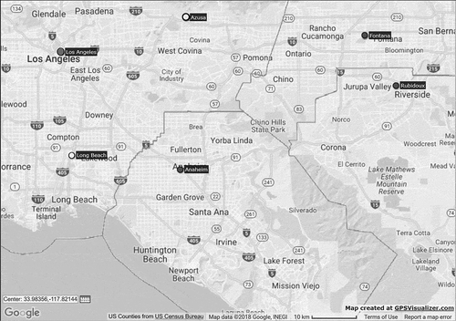
Figure 2. Trend in annual mean and 98th percentile of daily PM2.5 concentrations at the Central Los Angeles and Rubidoux sites.
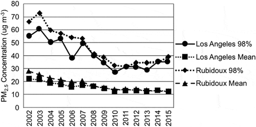
Figure 3. Trends in nitrate concentrations at the Central Los Angeles and Rubidoux sites are shown. The top plot shows the trend in the annual mean average, while the lower plot shows the nitrate contribution to the NAAQS PM2.5 design value.
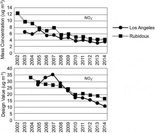
Figure 4. Trends in sulfate concentrations at the Central Los Angeles and Rubidoux sites are shown. The top plot shows the trend in the annual mean average, while the lower plot shows the sulfate contribution to the NAAQS PM2.5 design value.
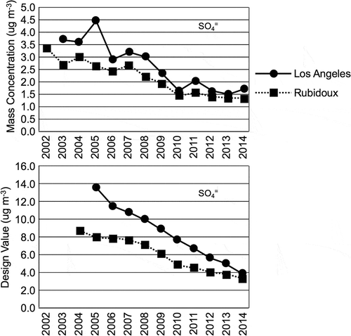
Figure 5. Trend in annual mean and 98th percentile of CSN protocol organic and elemental carbon concentrations at the Central Los Angeles site. A change in the analysis method for carbon fractions was implemented in 2007, so data collected before and after 2007 may not be fully comparable.
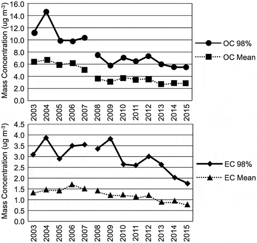
Figure 6. Daily PM2.5 concentration data by month for the years between 2002 and 2015 are shown for the Central Los Angeles site. Plotted are the 98th percentiles of the PM2.5 concentrations (upper lines) and the number of days during the time period when the PM2.5 concentrations were greater than 35 μg m−3 (lower line).
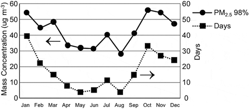
Figure 7. Top panel presents a time-series plot of daily mean PM2.5 concentrations for September 2008. The dashed-line box signifies the period selected for modeling. Lower panel presents a time-series plot of daily mean PM2.5 concentrations for November 2008. The dashed-line box signifies the period selected for modeling.
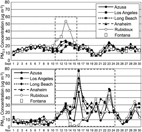
Figure 8. Range of simulated daily mean mass of PM2.5 at six monitoring sites in the SoCAB. The adjustments to VOC emissions were made for 2008 and the adjustments to NOx emissions were made for 2030. The box and whisker plots indicate the minimum, first and third quantile, maximum, and mean (+) values during two high PM2.5 episodes, September 12–15, 2008, and November 11–24, 2008. The red line shows the 35 μg m−3 NAAQS standard.
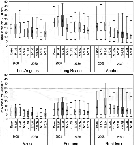
Table 1. The 2008 and 2030 model simulations with baseline total VOC, NOx, and NH3 emissions and sensitivity cases with varying adjustments to baseline emissions. The VOC/NOx ratios are given in units of moles carbon/moles nitrogen.
Table 2. Statistics for the CMAQ simulated PM2.5 mass concentrations: mean bias (MB), normalized mean bias (NMB), root mean square error (RMSE), normalized mean error (NME), unpaired peak ratio (UPR), paired mean normalized gross error (PMNGE), and mean paired normalized bias (MPNB).
Table 3. Differences between 2008 and 2030 base case predictions of primary PM, organic carbon, and elemental carbon concentrations at Rubidoux on November 20 for the 2008 and the 2030 future-year simulations.
Figure 9. Range of simulated daily average total ammonium nitrate mass concentrations for various adjustments to VOC and NOx emissions at six monitoring sites in the SoCAB. The adjustments to VOC emissions were made for 2008 and the adjustments to NOx emissions were made for 2030. The box and whisker plots indicate the minimum, first and third quantile, maximum, and mean (+) values during two high PM2.5 episodes, September 12–15 and November 11–24. Ammonium nitrate was estimated from the sum of Aitken and accumulation mode aerosol nitrate, assuming it had all converted to NH4NO3.
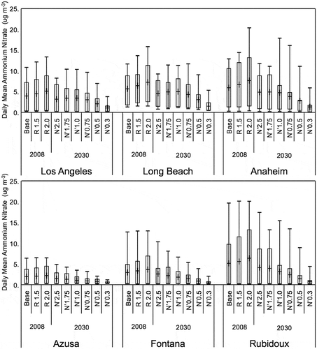
Figure 10. Upper panel presents a stack plot of simulated daily-average particulate matter mass concentrations by component on November 20 for 2008 and 2030 at Los Angeles. The components are secondary organic aerosol (SOA), ammonium nitrate (AmNit), ammonium sulfate (AmSul), unidentified PM2.5 (unid PM2.5), elemental carbon (EC), primary organic matter (primary OM), and coarse mass. Lower panel presents daily HNO3 production for differing initial VOC and NOx concentrations.
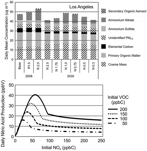
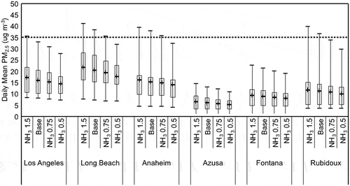
Figure 11. Range of predicted daily average PM2.5 mass concentrations for several adjustments to NH3 emissions at six monitoring sites in the SoCAB. The box and whisker plots indicate the minimum, first and third quantile, maximum, and mean (+) values during two high PM2.5 episodes, September 12–15 and November 11–24. The dashed line is the level of the current NAAQS.