Figures & data
Figure 1. (a) Map of India. (b) Map of Tamil Nadu. (c) Map showing the study area at Gummidipoondi (domain size: (length × height: 1.5 km × 2.4 km). (a), (b) Image source: maps of India. (c) Image source: Google Earth Pro.
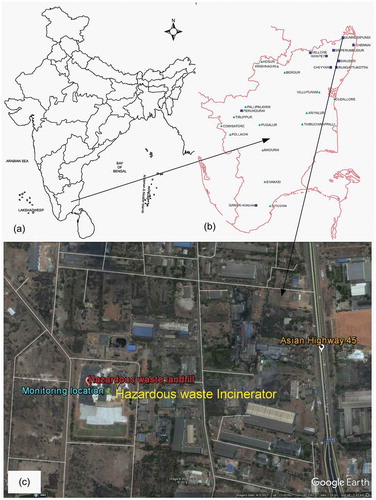
Figure 2. Processes involved in model development of ensemble bagging tree.
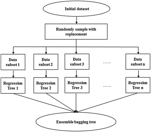
Figure 3. Schematic diagram showing the proposed modeling methodology.
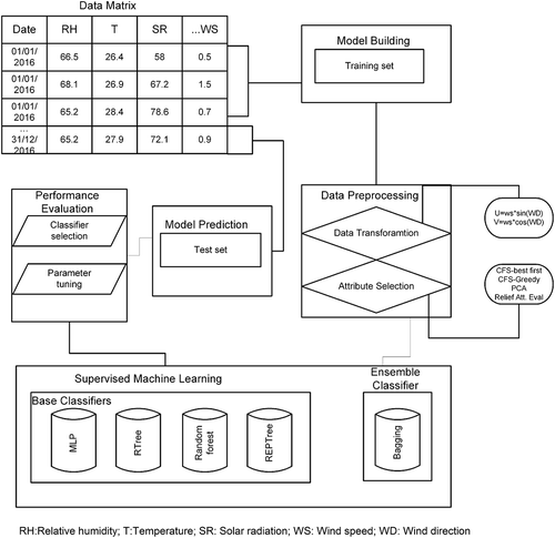
Table 1. Statistics summary of the attributes for the prediction of ground-level O3 concentration during the study period.
Figure 4. (a) Time-series plot of O3 across the entire study period (January 2016–December 2016). The dashed line indicates the threshold limit value of hourly ambient O3 concentration (180 μg/m3). Observed O3 concentration greater than 180 μg/m3 marked using red circles are considered as peak values. (b) Time-series plot of O3 during summer season (March 2016–May 2016). The interpretations of the dashed line and red circles are the same as in (a). (c) Hourly variation of relative humidity, temperature, and wind speed (March 2016–May 2016).
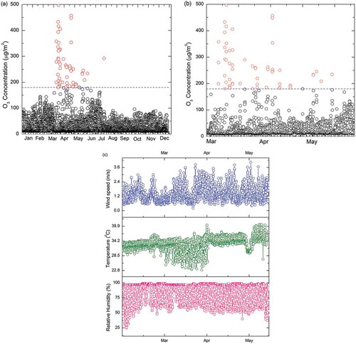
Figure 5. Seven days air mass back trajectory using HYSPLIT reaching the monitoring location (March 2016–May 2016).
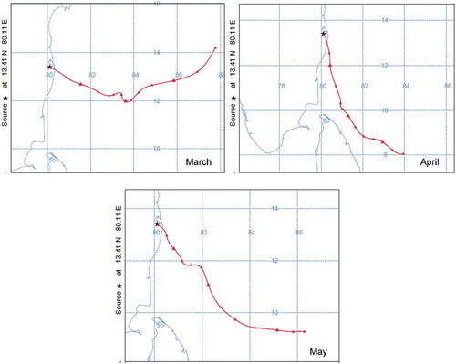
Table 2. Performance of the bagging classifier for predicting ground-level O3 concentration.
Figure 6. Improvement of R2 statistic for various iteration and cluster size in case of bagged random forest.
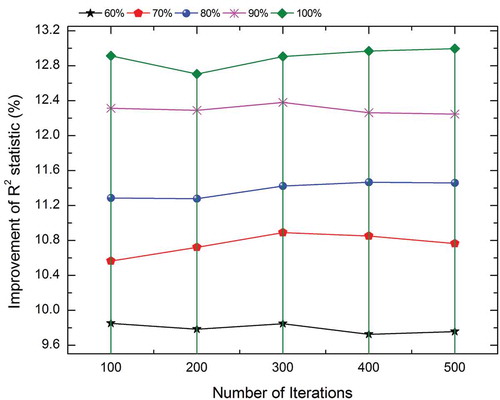
Table 3. Wilcoxon signed rank test for base classifiers and bagged classifiers.
Figure 7. Box plot representation of observed vs. predicted concentration for single base models and bagged ensemble models.
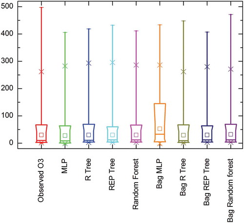
Figure 8. Scatter plots of observed vs. predicted ozone for (a) random forest and (b) bagged random forest. The interpretations of the dashed line and red circles are same as in .
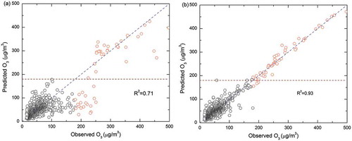
Table 4. Number of peaks (values >180 μg/m3) having PEP (%) less than the specified range.
Table 5. Performance of the Bagging classifier for predicting ground-level O3 concentration using a test data set.
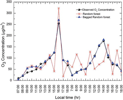
Figure 9. Prediction of hourly O3 concentration using random forest and bagged random forest for an independent test set (April 10, 2016, and March 28, 2016).