Figures & data
Figure 2. ECG waveform definitions. All waveform definitions were defined using ecgAUTO (see text for full definitions). Waveform libraries were assembled for each mouse using data acquired during a one-week baseline period immediately preceding the start of the exposure. Changes in ECG morphology in exposed mice were determined by comparing daily waveform measurements against baseline values. Circled numbers in the ECG trace correspond to defined contraction (orange shading) and relaxation (green shading) events in the heart highlighted on the right of the image.
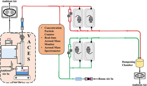
Figure 1. Schematic of VACES and exposure setup. Red lines indicate CAPs atmosphere. Green lines indicate filtered air exposure.
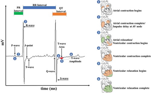
Table 1. Exposure parameters and atmosphere characteristics for both high and low PCA Concentrated Ambient Particles (CAPs) PM2.5. Data presented as exposure averages ± standard deviation.
Table 2. Relevant ambient air quality standards for ozone, PM2.5, carbon monoxide (CO), and nitrogen dioxide (NO2). Los Angeles Basin measurements taken 80 m from nearest freeway.
Figure 3. Oxygen-to-carbon ratios of PM1 sampled during different seasons compared to UV radiation flux at Earth’s surface. Closed green markers indicate late fall/early winter of 2014, closed purple markers indicate late winter of 2015, closed red markers indicate late spring/early summer of 2016, and closed blue markers indicate late fall/early winter of 2016. Open red and blue markers indicate CAPs measurement for late fall/early winter 2015 and 2016, respectively. UV flux was taken at 30°N latitude (close to Irvine) at 12:00 pm PST accounting for the monthly change in solar zenith angle 39. Exposure periods for this study occurred during periods designated by red and blue dots.
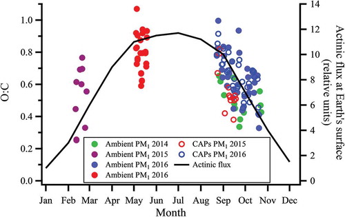
Table 3. Average baseline values for all measured endpoints. Significant differences between cohorts during each experimental period assessed at P≤ 0.05 using Student’s T-test and indicated by italics.
Figure 4. Blood pressure changes induced by particle exposure. Data represent weekly aggregates of change from baseline values for control and exposed animals during periods of high or low photochemical activity (± SEM, n = 3–5/group depending on acquisition scheduling). High PCA data set is complete and sporadic due to system availability. Low PCA CAPs data from week 2 is missing due to acquisition program errors. Significance assessed at p ≤ 0.05; *CAPs significantly different than air over the entire exposure period.
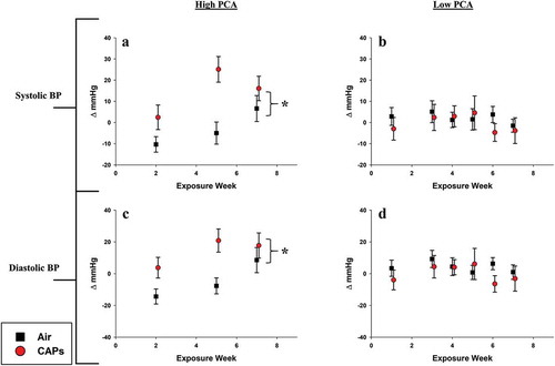
Table 4. Summary of ANOVA-derived significant values. Overall differences between control and CAP-exposed animals for both high and low PCA time periods. Partial Eta (η2) is provided and represents the proportion on variance accounted for by each dependent variable. *indicates P ≤ .05 while #indicates P ≤ 0.1 by Bonferroni-corrected two-way ANOVA for repeated measures. Italic font indicates significant differences.
Figure 5. HRV averages for high and low PCA CAPs exposure. Data represent weekly aggregates of change from baseline values for control and exposed animals during periods of high or low photochemical activity (± SEM, n = 3–5/group depending on acquisition scheduling). Low PCA CAPs data from week 2 is missing due to acquisition program errors. *p ≤ 0.05; CAPs significantly different than air over the entire exposure period. # p ≤ 0.1; CAPs significantly different than air over the entire exposure period.
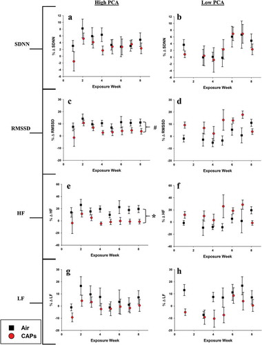
Figure 6. Heart rate-related ECG waveform changes. Data represent weekly aggregates of change from baseline values for control and exposed animals during periods of high or low photochemical activity (± SEM, n = 3-5/group depending on acquisition scheduling). Low PCA CAPs data from week 2 is missing due to acquisition program errors. Significance assessed at * p ≤ 0.05 or # p ≤ 0.1 for CAPs compared to controls over the entire exposure period.
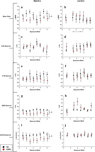
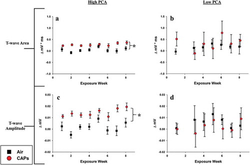
Figure 7. T-wave-related ECG waveform changes. Data represent weekly aggregates of change from baseline values for control and exposed animals during periods of high or low photochemical activity (± SEM, n = 3-5/group depending on acquisition scheduling). Low PCA CAPs data from week 2 is missing due to acquisition program errors. Significance assessed at p ≤ 0.05; *CAPs significantly different than air over the entire exposure period.