Figures & data
Figure 1. Figure shows how annual average temperatures for the contiguous United States differed (in degrees Fahrenheit) from the 20th-century (1901–2000) average. Data are shown for 1895 through 2020. Blue indicates years that were cooler than the 20th-century average, and red indicates years that were warmer than the 20th-century average. Temperatures at the national scale show more year-to-year variability than globally averaged temperatures but still reflect a notable warming trend in recent decades. Every year in the 21st century has been warmer than the 20th-century average. Source: USGCRP Citation2021c
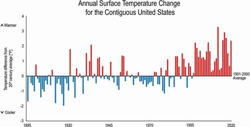
Figure 2. Figure illustrates some of the interactions between climate, weather, human activities, and natural processes that can influence the production, removal, and transport of three key contributors to poor air quality—ground level ozone, PM2.5, and pollen. See Fiore et al. Citation2015 for details on these interactions. Source: Adapted from Fiore et al. Citation2015. © Owned by the Air & Waste Management Association, reprinted by permission of Informa UK Limited, trading as Taylor & Francis Group, www.tandfonline.com on behalf of the Air & Waste Management Association, www.awma.org
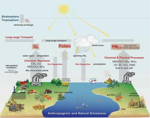
Figure 3. Figure from the USGCRP Climate and Health Assessment illustrates some of the ways in which changes in climate can influence exposure to poor air quality and the resulting health outcomes, as well as the important influences of environmental, institutional, social, and behavioral factors—factors that can themselves be influenced by climate change. Source: Fann et al. Citation2016
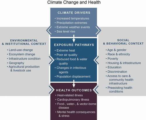
Figure 4. Figure from NCA4 shows model projections of changes in summer average maximum daily 8-hour ozone concentration in 2050 (top) and 2090 (bottom) compared to the 1995–2005 average for the lower scenario (RCP4.5, left) and the higher scenario (RCP8.5, right). Sources: Nolte et al. Citation2018, adapted from EPA Citation2017b
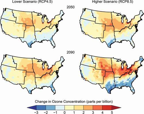
Figure 5. Figure from NCA4 depicts how many factors in the biophysical environment interact with climate change to influence forest productivity, structure, and function, ultimately affecting the ecosystem services that forests provide to people in the United States and globally. Sources: Vose et al. Citation2018, U.S. Forest Service
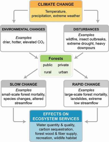
Figure 6. Figure updated from NCA4 shows the annual wildfire area burned in the United States (red) and the annual federal wildfire suppression spending (black), adjusted to 2020 U.S. dollars. Trends for both area burned and wildfire suppression costs indicate about a fourfold increase over a 35-year period. Sources: Adapted from Vose et al. Citation2018, U.S. Forest Service
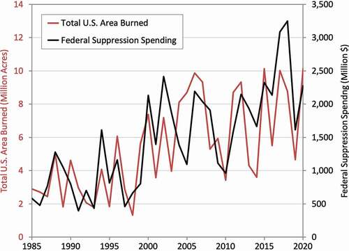
Figure 7. Figure from NCA4 depicts how extreme weather and climate change can potentially impact all components of the Nation’s energy system, from fuel (petroleum, coal, and natural gas) production and distribution to electricity generation, transmission, and demand. Sources: Zamuda et al. Citation2018, adapted from DOE Citation2013
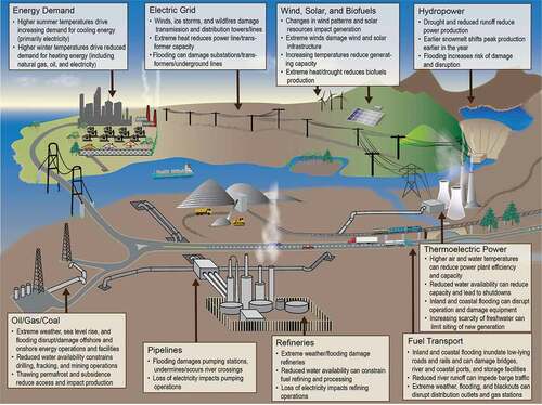
Figure 8. Figure from NCA4 shows that heavy precipitation is becoming more intense and more frequent across most of the United States, particularly in the Northeast and Midwest, and that these trends are projected to continue in the future. This map shows the observed (top; numbers in black circles give the percentage change) and projected (bottom) change in the amount of precipitation falling in the heaviest 1% of events (above the 99th percentile of the distribution). Observed historical trends are quantified in two ways. The observed trend for 1901–2016 (top left) is calculated as the difference between 1901–1960 and 1986–2016. The values for 1958–2016 (top right), a period with a denser station network, are linear trend changes over the period. The trends are averaged over each National Climate Assessment region (see Hayhoe et al. Citation2018 for full methodology). Projected future trends are for a lower (RCP4.5, bottom left) and a higher (RCP8.5, bottom right) scenario for the period 2070–2099 relative to 1986–2015. Data for projected changes in heavy precipitation were not available for Alaska, Hawai‘i, or the U.S. Caribbean. Sources: Hayhoe et al. Citation2018; top maps adapted from Easterling et al. Citation2017
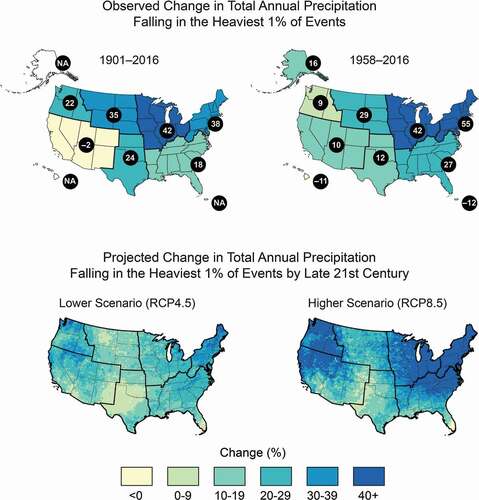
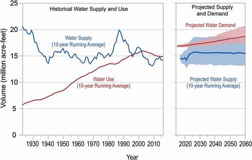
Figure 9. Figure from NCA4 shows the Colorado River Basin historical water supply and use (left) and projected water supply and demand (right). For the projections, the dark lines are the median values, and the shading represents the 10th to 90th percentile range. Sources: Lall et al. Citation2018, adapted from U.S. Bureau of Reclamation Citation2012