
Figures & data
Figure 1. (a) Map of the Carlsbad Caverns National Park measurement site (CAVE, black square) with respect to major roads (gray lines), urban areas (orange outlines and text labels), and producing O&G wells (cyan dots) in NM and TX. Active drilling sites during the 2019 study period (purple diamonds) are also shown. (b) Expanded view of the red dashed area in (a) showing the locations of the Guadalupe Mountain National Park (GUMO), Carlsbad, NM city limits (CCLM), and Hobbs-Jefferson (HOBBS) O3 monitors (circular symbols) with respect to the CAVE site (black square). Monitoring sites are colored by the goodness of fit (r) from linear least squares regression of scatter plots of MDA8 O3 values at each site relative to those measured at the CAVE site (square) during the 2019 study period.
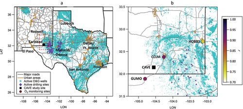
Figure 2. Rose plots of (a) Winds in the morning between 06:00 and 10:00 MDT and (b) Winds during afternoon between 12:00 and 18:00 MDT as well as mixing ratios of (c) O3, (d) PAN, (e) NOx, and (f) Propane measured at the CAVE site throughout the 2019 study period. Roses are binned by wind direction every 15 degrees with 0° representing north. Axes represent the 0–1 probability in a given wind direction bin; colors represent the range of measured wind speeds and mixing ratios.
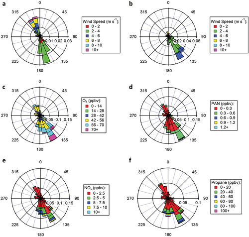
Figure 3. MDA8 O3 measured at the CAVE and CCLM sites between January 1, 2015 and December 31, 2022 (open symbols). The current NAAQS for O3 of 70 ppbv and a threshold of 65 ppbv also utilized in this work are denoted by the solid and dashed horizontal gray lines, respectively. Colored symbols indicate the number of days in each year with MDA8 O3 > 70 ppbv (orange) and 65 < MDA8 O3 ≤ 70 ppbv (blue). Note that the ticks on the x-axis and the corresponding vertical dashed lines indicate the middle of summer (i.e., July 1st) for each year, and numbers in orange font represent the number of days when MDA8 O3 > 70 ppbv for each year. Measurements at CAVE are only available during the summer months; a gap in the measurements between November 1, 2018 and July 18, 2019 indicates when the CAVE O3 monitor was moved to a different location within the park.
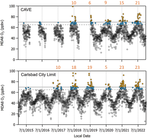
Figure 4. Time series of hourly (a) O3, (b) PAN, and (c) NOx measured at CAVE during the study period between July 25 and September 5, 2019. Five days with MDA8 O3 > 70 ppbv are highlighted by the orange shaded bars. Eight days when 65 < MDA8 O3 ≤ 70 ppbv are highlighted by the blue shaded bars. In panel (a), the 70 ppbv NAAQS for O3 and a threshold of 65 ppbv also utilized in this work are denoted by the solid and dashed horizontal gray lines, respectively, and purple arrow indicates the date range when NMVOC measurements are available.
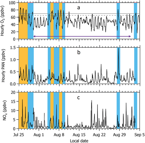
Figure 5. Scatter plots of (a) Methane, (b) Ethane, (c) Propane, and (d) CO versus NOx.
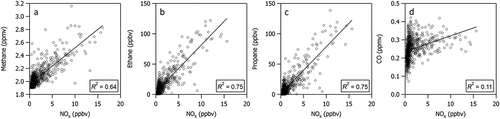
Figure 6. Diel profiles of (a) NOx, (b) O3, and (c) PAN measured at the CAVE site during the 2019 study period and (d) the sum of the three O&G factor contributions associated with primary emissions, (e) The longer-lived secondary factor contribution, and (f) the short-lived secondary factor contribution determined from the PMF analysis. Gray shaded areas demonstrate time periods when pollutant/precursor mixing ratios and PMF factor contributions are at a maximum.
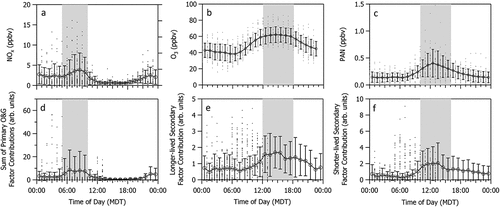
Figure 7. (a–c) Scatter plots of NOx versus the individual PMF factor contributions associated with primary O&G missions. Scatter plots of (d) NOx versus the sum of the three factor contributions associated with primary O&G emissions (e) O3 versus a longer-lived secondary PMF factor contribution, and (f) PAN versus a shorter-lived secondary PMF factor contribution.
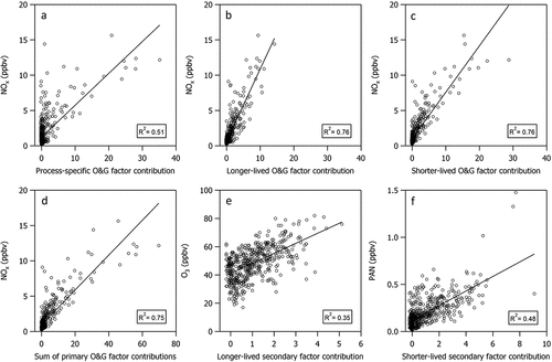
Figure 8. Average PMF factor contributions to sumVOC in units of ppbC (colored bars). Days during the 2019 study period are grouped by wind sector (denoted by the vertical dashed lines) according to the average wind direction (denoted by the wind sector labels) during peak photochemical production (12:00 to 18:00 MDT). Dates are ordered chronologically within each wind sector. Black arrows denote the 7 days when NMVOC measurements are available and MDA8 O3 > 65 ppbv. The high O3 day on August 28, 2019 also exhibited the highest observed mixing ratio of PAN (1.5 ppbv) throughout the study period.
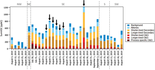
Figure 9. Scatter plots of (a) SumVOC versus NOx, (b) Reactivity-weighted sumVOC versus NOx, and (c) O3 versus NOy-NOx. Gray data points in each plot represent N = 705 hourly averaged data points from the entire 2019 study period. Black outlined symbols represent data points collected during non-peak photochemical production times between 06:00–12:00 MDT in plots (a) and (b) and peak photochemical production times between 12:00–18:00 MDT in plot (c). Solid orange symbols represent a subset of the black outlined data points that are associated with the southeast wind sector. In plots (a) and (b), the solid black line represents a linear least squares orthogonal distance regression of the data points. The range of the y-axis is an order of magnitude less in plot (b) than plot (a). In plots (a) and (c), gray dashed lines denote the O3 sensitivity thresholds reported in Sillman (Citation1995, Citation1999).
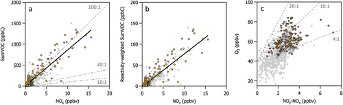
Figure 10. (a) Hourly measurements of PPN versus PAN during the entire study period (gray symbols) and when the wind is from the southeast sector (orange). An orthogonal distance regression (ODR) of the data points is shown as a solid black line. Dashed gray lines indicate a range of possible PPN:PAN ratios discussed below. (b) Histogram of hourly averaged PPN:PAN ratios.
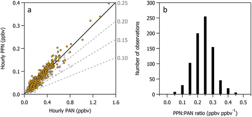
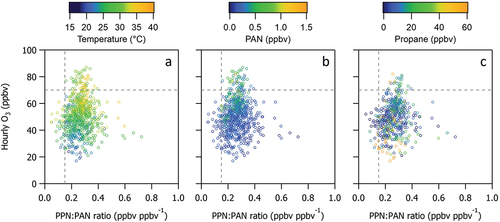
Figure 11. Scatter plots of hourly O3 versus PPN:PAN ratio. Data points are colored by (a) temperature, (b) PAN, and (c) propane.
CAVE paper_SI_Revision1.docx
Download MS Word (2.3 MB)Data availability statement
The data that support the findings of this study are openly available in a public repository entitled, Carlsbad Caverns National Park Air Quality Study 2019, and is available at https://doi.org/10.25675/10217/235481.