
Figures & data
Figure 1. PCA analysis of the M0–M7 subtypes using the FPKM of the data for the present study.
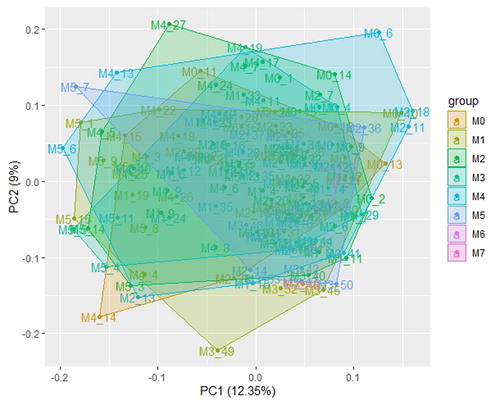
Table 1. Clinical characteristics for all patients.
Figure 2. Network topology constructed with the WGCNA package from R to evaluate the soft-thresholding power. The numbers in the figure show the corresponding soft-thresholding powers. The scale-free topology model indicates that the soft-thresholding power of 9 is optimal.
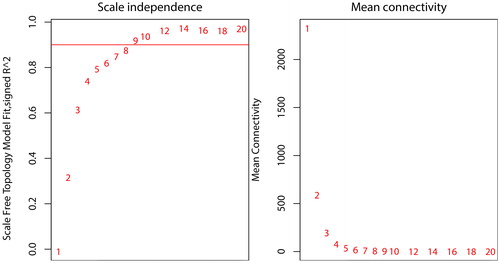
Figure 3. WGCNA of AML. (A) Gene modules identified by WGCNA are shown by clustering the dissimilarity based on the consensus topological overlap using different colours. Each colour represents a module containing a group of highly correlated genes. (B) The dendrogram of consensus module eigengenes based on the consensus correlation. The red line shows the merging threshold. The expression profiles of the module eigengenes below the threshold could be merged due to their similarity. (C) Heatmap of the adjacencies of modules. The adjacency ranged from 0 to 1 (blue to red).
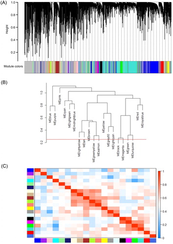
Figure 4. Correlations between consensus module eigengenes and the phenotypes of AML. Rows and columns represent the consensus module and phenotypes, respectively. In the cells, the numbers indicate the correlations of the corresponding module eigengenes and the phenotypes. The numbers in brackets show the p values. The correlation ranged from –1 to 1 (green to red).
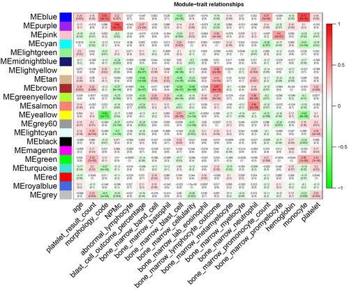
Figure 5. GO and KEGG enrichment analyses of key modules correlated with AML subtypes and the NPMc mutation. (A) The enrichment analysis of GO terms in the tan, blue and yellow modules shown as a heatmap. The colours represent p values ranging from 0.0 to 0.05 (red to white). (B) The enrichment analysis of KEGG pathways in the tan, blue and yellow modules shown as a heatmap. The colours represent p values ranging from 0.0 to 0.05 (red to white).
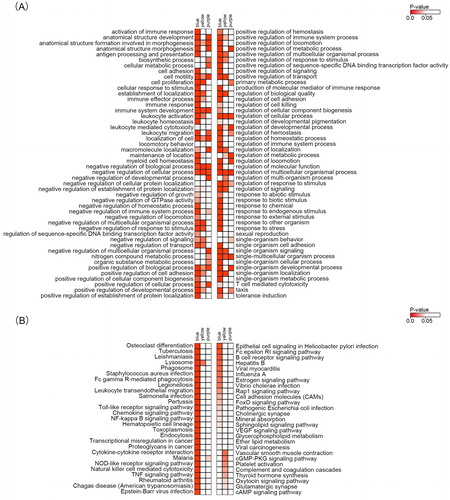
Figure 6. Protein–protein interaction networks of genes in the blue (A) and purple (B) modules constructed with Cytoscape v3.7.1 software. The red dots represent hub genes identified by cytoHubba, and blue dots represent correlated genes.
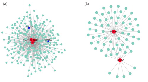
Figure 7. Prognostic analyses of hub genes (TLR8, SLC15A3, ADAP2, HOXA6 and HOXA10) in the AML TCGA dataset based on SurvExpress (n = 168). Kaplan–Meier survival analysis of AML based on the expression of the hub genes. ‘+’ on the right upper figure represents censored samples. The concordance index (CI) and p value of the log-rank test are shown in the figure. Red and green lines indicate the high- and low-risk groups, respectively. The numbers below the x-axis show the death events of individuals over time.
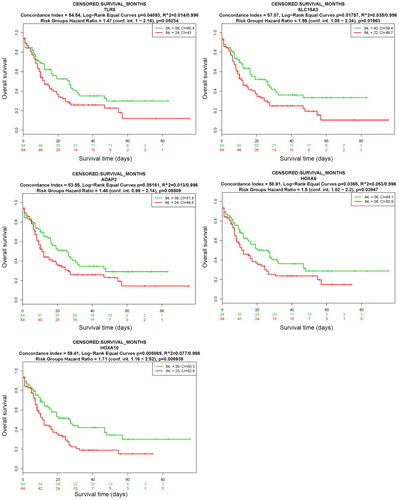
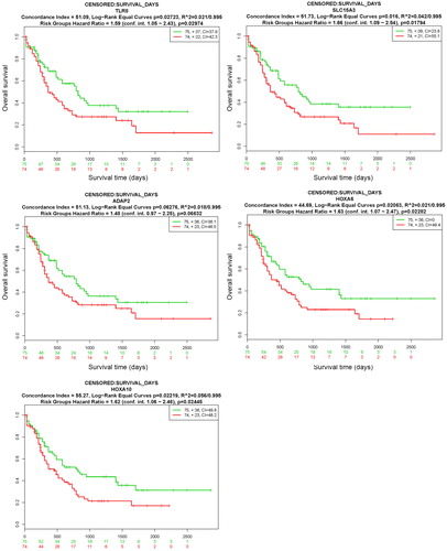
Figure 8. Prognostic analyses of hub genes (TLR8, SLC15A3, ADAP2, HOXA6 and HOXA10) in the LAML - TCGA - AML dataset based on SurvExpress (n = 149). Kaplan–Meier survival analysis of AML based on the expression of the hub genes. ‘+’ in the right upper panel represents censored samples. The CI and p value of the log-rank test are shown in the figure. Red and green lines indicate the high- and low-risk groups, respectively. The numbers below the x-axis show the death events of individuals over time.
Supplemental Material
Download MS Excel (36.1 KB)Supplemental Material
Download MS Excel (8.4 MB)Supplemental Material
Download MS Excel (25.7 KB)Supplemental Material
Download MS Excel (25.6 MB)Data availability
The gene expression profiles and phenotype datasets of this study are provided as the Supporting Information Data Sheets S1, S2.