
Figures & data
Table 1. The model inputs.
Figure 1. Graphic representation of the model. Rectangles in the graph represent events that may happen during the model horizon, which bear costs and influence quality of life. At each subsequent monthly cycle, it is checked within the model simulation whether each event would happen or not (depending on the time set in advance for onset of each event). The model ends when all of 480 cycles are completed.
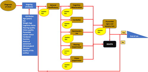
Figure 2. Base case ICERs for all virtual patients. The x-axis: difference in QALYs gained (elivaldogene autotemcel vs HSCT); the y-axis: difference in costs (elivaldogene autotemcel vs HSCT). The line lambda 1 – the RHIF’s willingness to pay one Gross Domestic Product (GDP) per capita for one more QALY gained with elivaldogene autotemcel in comparison to the HSCT. The line lambda 2 – the RHIF’s willingness to pay three GDPs per capita for one more QALY gained with elivaldogene autotemcel in comparison to the HSCT. The line lambda 3 – the RHIF’s willingness to pay nine GDPs per capita for one more QALY gained with elivaldogene autotemcel in comparison to the HSCT.
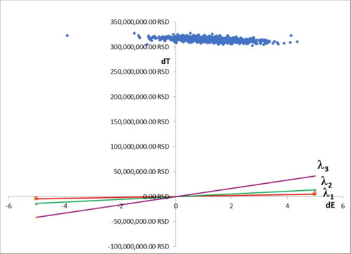
Figure 3. Acceptability curve showing probability that elivaldogene autotemcel is considered cost/effective for treatment of CALD in comparison with HSC transplantation, which depends on willingness to pay for one additional QALY by the health insurance fund.
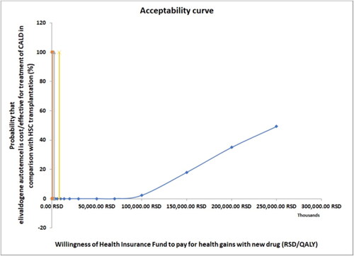
Figure 4. Tornado diagram showing results of one-way deterministic sensitivity analysis The bars in the graph represent variations of net monetary benefit caused by increase and subsequent decrease of model inputs listed in the right part of the graph.
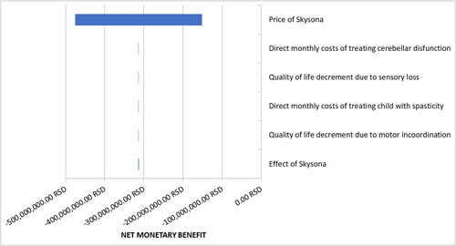
Figure 5. Probability sensitivity analysis ICERs for virtual patients. The x-axis: difference in QALYs gained (elivaldogene autotemcel vs HSCT); the y-axis: difference in costs (elivaldogene autotemcel vs HSCT). The line lambda 1 – the RHIF’s willingness to pay one Gross Domestic Product (GDP) per capita for one more QALY gained with elivaldogene autotemcel in comparison to the HSCT. The line lambda 2 – the RHIF’s willingness to pay three GDPs per capita for one more QALY gained with elivaldogene autotemcel in comparison to the HSCT. The line lambda 3 – the RHIF’s willingness to pay nine GDPs per capita for one more QALY gained with elivaldogene autotemcel in comparison to the HSCT.
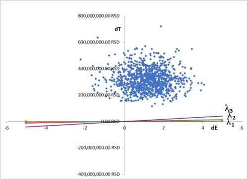
Table 2. Values of main output variables before and after the PSA (mean ± 99% confidence interval).
Supplemental Material
Download PDF (475.4 KB)Data availability statement
The data that support the findings reported in this study are available from the corresponding author upon reasonable request.