Figures & data
Figure 1. Fraction of U.S. stock market capitalization held by hedge funds.
The shaded areas are the quarters around the Quant Meltdown (2007:Q3–Q4) and Lehman Brothers’ bankruptcy (2008:Q3–Q4).
Source: Ben-David, Franzoni, and Moussawi (Citation2012).
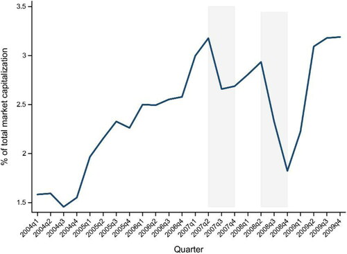
Figure 2. Time schedule.
This graph summarizes the time schedule of the players and the change in the market price over time.
t0: Market price P0 is at the fundamental price P.
t1: Each fund manager receives capital from investors and determines the proportion of risky asset xi and cash ci. Additionally, the market price diverges from the fundamental price P; P1 = 1 = P–s + fx, where s is the impact of the negative price shocks.
t2: Each fund manager decides whether to stay or exit. Then, fund investors observe λ and withdraw a proportion of λ from each fund. λ implies the proportion of defaulting and exiting funds.
t3: Market price P3 converges to the fundamental price P.
Source: The Authors.
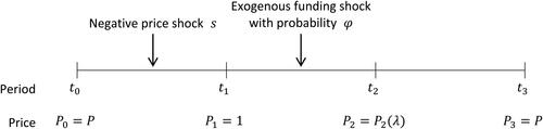
Figure 3. Graph of
This graph illustrates the decreasing function and the relationship between
and
Based on its definition,
should satisfy
Source: The Authors.
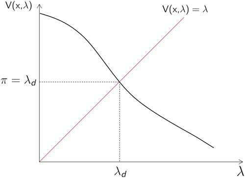
Figure 4. Net investment return from staying rather than exiting the market.
The net investment return from staying rather than exiting the market at t, is shown as a function of the aggregate proportion of exiting funds,
Here,
and
Source: The Authors.
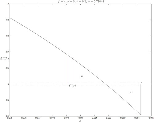
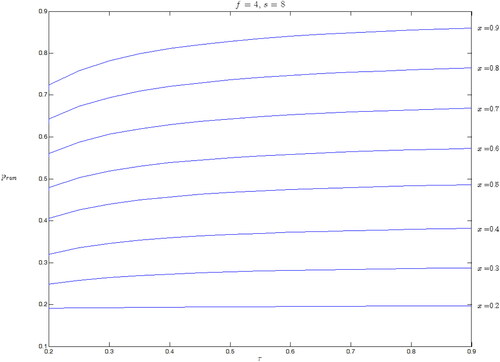
Figure 5. The probability of a market run.
This graph shows the probability of a market run, as a function of the price sensitivity,
Each curve illustrates the function for a different level of market exposure
ranging from 0.2 to 0.9. Here,
and
Source: The Authors.