
Figures & data
Table 1. Performance of an Equal-Weighted Portfolio vs. Equal-Weighted Benchmark.
Table 2. Performance of Optimized Portfolios vs. Equal-Weighted portfolios and Equal-Weighted benchmarks.
Figure 1. Equal-Weighted Portfolios vs. SPX500 Equal-Weighted.
This figure presents a line plot between the compounded rate of return and dates. The lines show the compounded total return of two equal-weighted portfolios consisting of 10 stocks (n = 10) and 50 stocks (n = 50) vs. the compounded total return of the equal-weighted S&P500 index. The sample period runs from 01/01/2010 to 31/12/2019.
Source: The Authors.
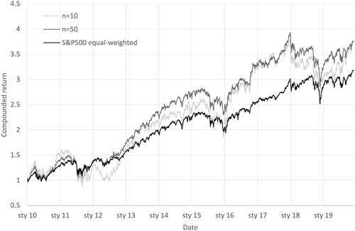
Figure 2. Optimized Portfolio Performance Depending on the Length of Historical Data.
This figure presents line plots between the Sharpe or Calmar ratios and the number of stocks in portfolios. The two upper subfigures present the Sharpe ratio on the vertical axis. The two lower subfigures present the Calmar ratio on the vertical axis. The two subfigures on the left demonstrate ratios for the mean-variance (MV) optimized portfolios. The two subfigures on the right demonstrate ratios for the HRP (HRP) optimized portfolios. Optimizers fed with
daily historical data are marked as 1-year history. Optimizers fed with
daily historical data are marked as 2-year history. Optimizers fed with
daily historical data are marked as 3-year history. The sample period runs from 01/01/2010 to 31/12/2019. The data covers stocks from the S&P500 index.
Source: The Authors.
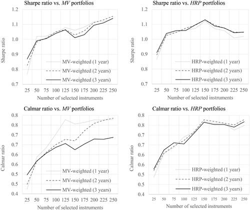
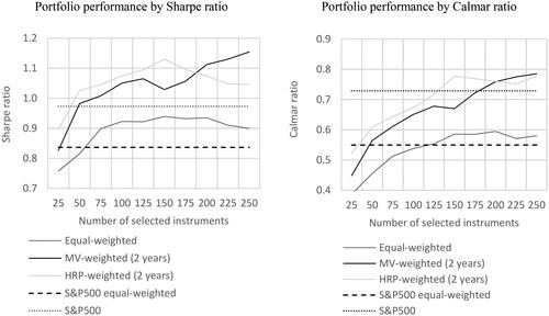
Figure 3. Portfolio Performance Depending on Creation Technique.
This figure presents line plots between Sharpe or Calmar ratios and the number of stocks in portfolios. The left subfigure presents the Sharpe ratio on the vertical axis. The right subfigure presents the Calmar ratio on the vertical axis. The equal-weighted line represents portfolios built with the 1/N rule. The MV-weighted (2 years) line represents portfolios built with the mean-variance optimizer using 2 years of daily historical prices. The HRP-weighted (2 years) line represents portfolios built with HRP optimized using 2 years of daily historical prices. The S&P500 equal-weighted broken line represents an equal-weighted portfolio of all stocks from the S&P500 index. The S&P500 dotted line represents the market portfolio of the S&P500 index. Note that for S&P500 equal-weighted and S&P500, all index constituents are taken under consideration; thus, the horizontal axis representing the different number of stocks used to create a portfolio does not impact these constants.
Source: The Authors.
Supplemental Material
Download MS Word (157.1 KB)Data availability statement
The data that support the findings of this study are available from Refinitiv. Restrictions apply to the availability of these data, which were used under license for this study. Data are available from the authors on request with the permission of Refinitiv.