Figures & data
Table 1. Results of descriptive statistics and correlation.
Table 2. Results of unit root test.
Figure 1. Results of wavelet correlation between TOR, OIL, AQI, COVID.
Wavelet Scale represent 1,2,4,8,16,32 for short, very short, medium, long, and very long run.
Source: Authors estimations and drawing.
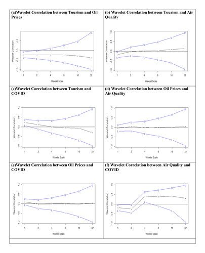
Figure 2. Results of continuous wavelet transform.
Note: X-axis represents the time whereas, Y-axis shows the period (in days). The thick black contour represents the 5% significance level against the red noise.
Source: Authors estimations and drawing.
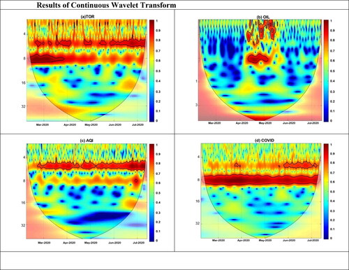
Figure 3. Results of wavelet coherence transform.
Note: X-axis represents the time whereas, Y-axis shows the period (in days). The thick black contour represents the 5% significance level against the red noise.
Source: Authors estimations and drawing.
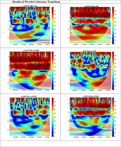
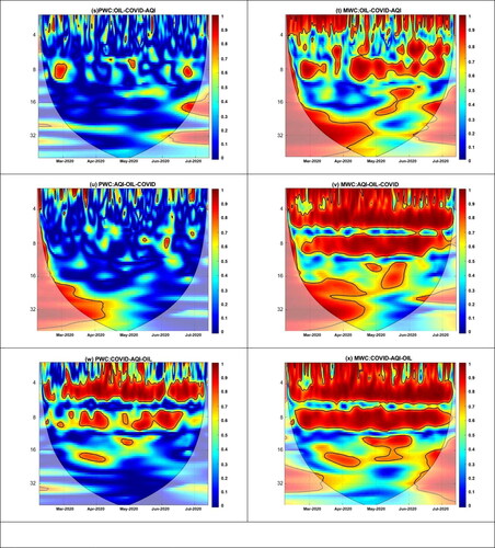
Figure 4. Results of partial and multiple wavelet coherence.
Note: X-axis represents the time whereas, Y-axis shows the period (in days). The thick black contour represents the 5% significance level against the red noise.
Source: Authors estimations and drawing.
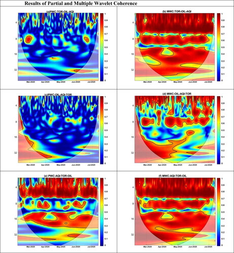
Figure 4. Continued.
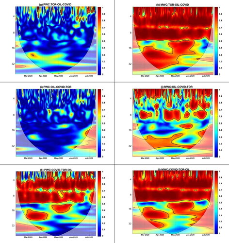
Figure 4. Continued.
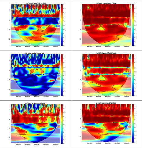
Figure 4. Continued.