Figures & data
Figure 1. Changepoints in Total Graphical Elements per Briefing (30 March–24 June 2020). Note: Changes identified by breaks in the solid lines at briefings 23 (22 April), 40 (9 May), 41 (11 May), and 51 (21 May).
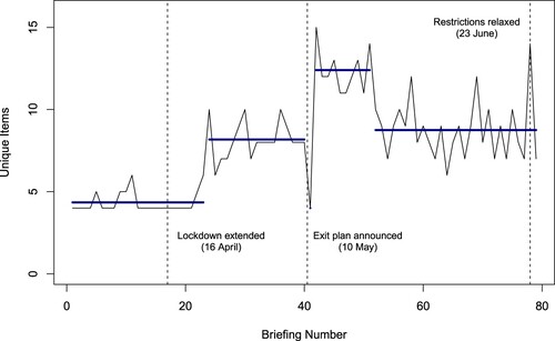
Figure 2. Timeline of Graphical Elements in UK Government COVID-19 Briefings (30 March–24 June 2021).
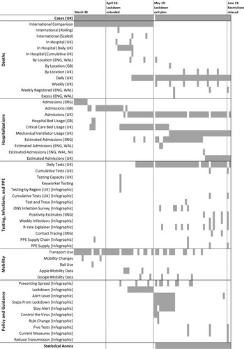
Figure 3. Chart displaying transport use changes over time, 30 March.
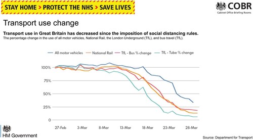
Figure 4. Chart displaying new COVID-19 cases in the UK, 10 April.
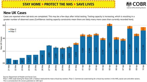
Figure 5. Charts displaying critical care patients (upper panel) and hospital bed usage (lower panel), 8 April.
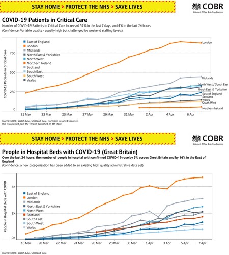
Figure 6. Charts comparing UK mortalities to other peers on 8 April (upper panel) and 3 May (lower panel).
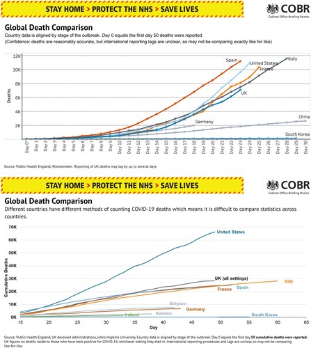
Figure 7. Charts displaying changes in transport use and attitudes (upper left), tests and case numbers (upper right), weekly deaths including by place (middle left), overall cases (middle right), hospital admissions and critical care beds (lower left), and hospitalizations by region (lower right), 12 May.
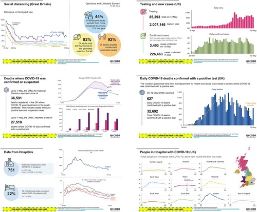
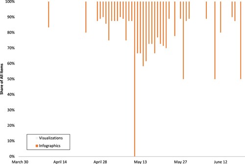
Figure 8. Shares of Visualizations and Infographics per Briefing Between 30 March–24 June 2020.